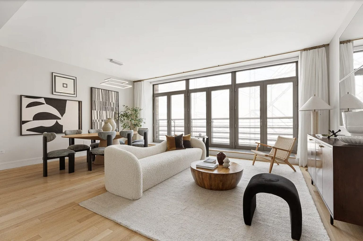
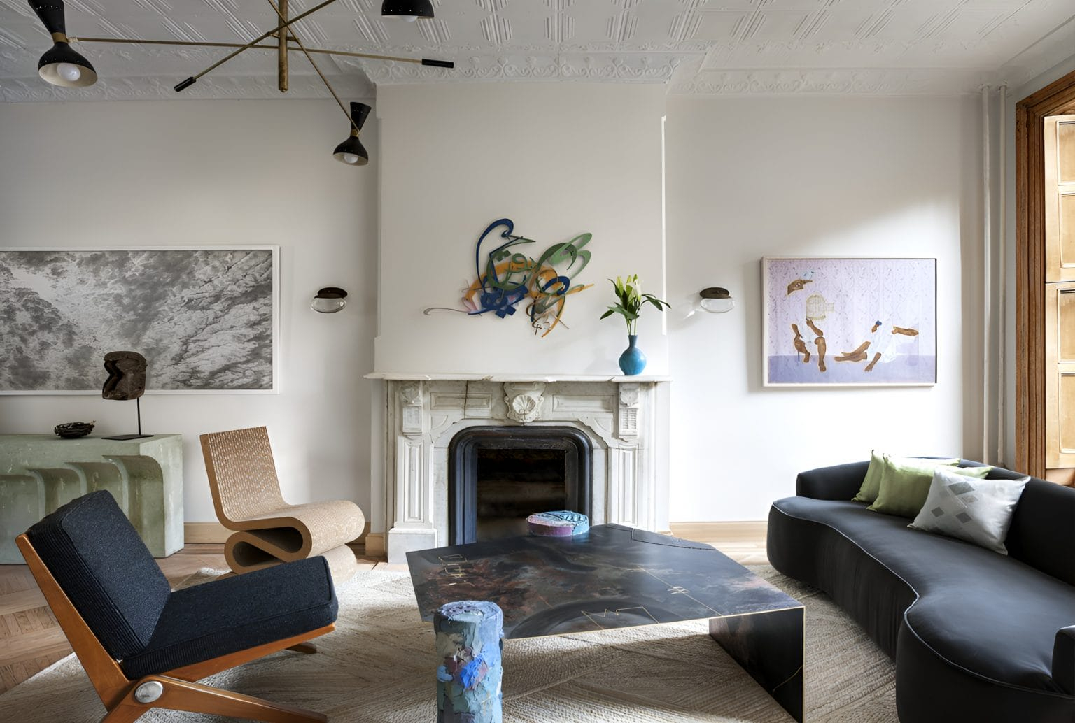
Remember that feeling when you walked into a room painted entirely in "greige" and felt… nothing? It was clean, sure. It was safe. But it didn’t hug you back. For nearly a decade, we’ve been hiding in the shadows of minimalism, wrapping our lives in layers of oatmeal, soft white, and cool gray. It made sense at the time. The world was loud, chaotic, and overstimulating. Our homes became the quiet zones, the blank canvases where we could just breathe.
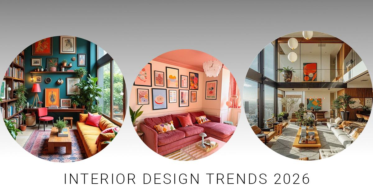
But something shifted. Maybe it was the collective fatigue of playing it safe. Or maybe we just got tired of our living rooms looking like hotel lobbies that forgot to add the art. As we settle into 2026, the tide has turned dramatically. The era of the neutral is officially waning. In its place? A vibrant, unapologetic explosion of color. We aren’t just talking about a throw pillow in teal or a single accent wall in navy. We are talking about drenching entire rooms in deep emerald, wrapping kitchens in terracotta, and letting personality bleed through the drywall. It’s brave. It’s messy. And honestly? It’s about time.
The Psychology Behind the Shift
Why now? Why, after years of swearing by the calming effects of beige, are we suddenly craving the visual shout of a saturated blue? It comes down to a deep-seated human need for authenticity. For a long time, neutrals were a shield. They allowed us to blend in, to keep our personal tastes private, to maintain a sense of control in an unpredictable world. But shields are heavy. Carrying them around for ten years gets exhausting.
In 2026, people are done with hiding. There is a growing desire for clarity and emotional resonance in our spaces. We want our environments to reflect who we actually are, not who we think we should be to sell a house or impress a guest. Color is emotional language. A bright yellow kitchen doesn’t just look cheerful; it feels like optimism. A dark, moody library in plum doesn’t just look sophisticated; it feels like a secret. Consumers are trading safe palettes for ones that tell a story. It’s less about decoration and more about identity.
This isn’t just a whim. It’s a reaction to the digital saturation we live with. When every screen is glowing with high-definition perfection, physical spaces need to offer something different. They need texture, depth, and soul. Bold colors provide that grounding. They feel real. They have weight. Unlike the flat, sterile look of all-white interiors, rich hues interact with light and shadow in ways that make a room feel alive. We are craving connection, and color is one of the most direct ways to forge it.
The Rise of Color-Drenching
If you’ve scrolled through design feeds lately, you’ve probably seen the term "color-drenching." It sounds intense, right? Like you’re going to drown in paint. But the concept is actually quite soothing. Color-drenching means painting everything in a room—the walls, the ceiling, the trim, the doors, and sometimes even the furniture—in the same bold hue. It eliminates the visual noise of contrasting lines and creates a seamless, immersive experience.
According to the 2026 Zillow Home Trend Report, mentions of color-drenched rooms are up 149% year over year. That is a massive jump. It signals that this isn’t a niche trend for the avant-garde; it’s becoming a mainstream preference. People are realizing that monochromatic boldness can be just as calming as monochromatic neutrality. In fact, it can be more so. When your eyes don’t have to constantly adjust to the boundary between a white wall and a dark floor, the mind relaxes. The space becomes a cocoon.
Take a bedroom painted in a deep, dusty rose. If you only painted the walls, it might feel like a statement piece. But if you paint the ceiling and the baseboards too, the room wraps around you. It feels intimate. Protective. This technique also has a practical side: it makes small spaces feel larger by blurring the corners, and it makes large spaces feel cozier by reducing the expansive feel of stark white. It’s a versatile tool that transforms how we perceive volume and light.
Redefining What "Neutral" Means
Let’s be clear: the death of the "safe neutral" doesn’t mean we are abandoning subtlety altogether. Instead, we are redefining what neutral means. The cool grays and sterile whites of the 2010s are out. They feel cold and dated now, like a smartphone model from five years ago. In 2026, neutrals are getting a warmth injection. They are becoming cozy, rich, and full of character.
Think of shades like burnt sienna, olive green, or deep charcoal. These colors act as neutrals because they pair well with almost anything, but they carry so much more personality than beige. They have undertones that shift with the light, creating a dynamic atmosphere throughout the day. Designers are leaning into these grounded tones to create spaces that feel established and timeless, rather than trendy and fleeting.
This shift also ties into our connection with nature. The new neutrals are inspired by the earth—clay, stone, wood, and leaves. They feel organic. When you use these richer bases, you don’t need as many accessories to make a room feel complete. The color itself does the heavy lifting. It allows for a layered look that feels curated rather than staged. It’s the difference between a room that looks like a catalog page and a room that looks like it has lived a life.
Bold Colors in Branding and Identity
This movement isn’t confined to our living rooms. It’s reshaping how brands communicate, too. For years, tech companies and startups flocked to minimalist logos and clean, white websites. It signaled efficiency and modernity. But in 2026, that aesthetic is starting to look generic. Consumers are seeking authenticity and cultural relevance, and bland design doesn’t cut it anymore.
Brands are trading safe palettes for emotionally driven ones. You’re seeing more vibrant gradients, surreal tones, and unexpected color combinations in marketing campaigns and product packaging. This is about differentiation. In a crowded market, being bold is the only way to stand out. Color is becoming a primary tool for storytelling. It tells you who a brand is before you read a single word of copy.
Consider the rise of "digital-twilight" hues and eco-luxe metallics in branding. These colors bridge the gap between the digital world we inhabit and the physical world we crave. They feel futuristic yet grounded. By adopting these bolder identities, companies are signaling that they are confident, transparent, and ready to engage on a deeper level. It’s a risk, sure. But playing it safe is riskier when no one is paying attention.
How to Make the Leap Without Fear
Okay, so you’re convinced. You want to ditch the beige. But staring at a gallon of electric blue paint can be terrifying. How do you start? The key is to stop thinking of color as an accent and start thinking of it as atmosphere. You don’t have to repaint your entire house overnight. Start small, but think big.
First, look at the lighting in your space. Bold colors behave differently depending on natural and artificial light. A dark green might look black in a north-facing room but vibrant in a south-facing one. Test samples on large boards and move them around the room. Watch them at different times of day. This takes the guesswork out of the process and helps you choose a shade that works with your environment, not against it.
Second, embrace the power of textiles and art. If painting walls feels too permanent, try color-drenching with rugs, curtains, and upholstery. A large, patterned rug in bold hues can anchor a room and give you the confidence to add smaller pops of color elsewhere. Mix textures like linen, velvet, and wool to add depth. Remember, the goal isn’t perfection. It’s expression. If you make a mistake, you can always paint over it. But you’ll never know the joy of a sunlit orange kitchen unless you take the leap.
As we move further into 2026, one thing is certain: the fear of color is fading. We are entering an era of design that celebrates individuality, emotion, and joy. The rigid rules of matching and coordinating are being replaced by intuition and feeling. Spaces are becoming more personal, more reflective of the people who inhabit them.
This shift is more than just aesthetic. It’s cultural. It reflects a society that is ready to be seen, ready to speak up, and ready to feel. Bold colors invite us to engage with our surroundings in a more active way. They challenge us to find beauty in intensity and comfort in complexity. They remind us that life isn’t black and white, or even beige and gray. It’s a spectrum.
So, look around your home. What feels flat? What feels safe but empty? Maybe it’s time to shake things up. Maybe it’s time to let some color in. Not just a drop, but a flood. Let your walls speak. Let your ceilings sing. The neutrals had their run, and they served us well. But the future is bright, bold, and beautifully uneven. And it’s waiting for you to paint it.