We’ve all been there. Staring at a paint swatch, feeling that familiar knot of anxiety tighten in our stomachs. Will it look too dark? Too bright? Too… much? For years, the safe bet was beige. Or maybe a cool, sterile gray if you were feeling adventurous. But let’s be honest—those days are over. If you’ve scrolled through your feed lately, you’ve probably noticed a shift. A warm, messy, beautiful shift. The rigid rules of interior design are crumbling, and honestly? It’s about time.
2026 isn’t just another year on the calendar; it’s a turning point for how we live in our spaces. We are collectively exhausted by aesthetics that feel like they belong in a museum rather than a home. People want rooms that hug them back. They want colors that lower their cortisol levels after a long day, not ones that make them feel like they’re living in a showroom. This year, the trend isn’t about following a strict formula. It’s about intuition. It’s about pairing things that "shouldn’t" work together and watching them sing.
So, why are we suddenly so brave with our walls? Maybe it’s because we’ve spent enough time indoors to realize that our environment directly impacts our mood. Science is finally catching up to what artists have known for centuries: color affects us physically. In 2026, we are seeing a massive move away from cool-toned minimalism toward warm, nature-derived schemes that actually support mental wellness. It’s not just about looking good for Instagram. It’s about feeling good in real life. And the best part? You don’t need a degree in design to pull it off. You just need a little courage and the right combinations.
The Psychology Behind the Shift: Why Warmth Wins
Let’s talk about why this is happening now. For a decade, we were obsessed with the "clean" look. White walls, sharp lines, zero clutter. It looked great in photos, but living in it? It felt cold. Sterile. Recent data shows a clear exhaustion with these sterile aesthetics. Homeowners are craving longevity over virality. They want designs that last, not just trends that flash and fade. This is why 2026 is prioritizing schemes that feel timeless, not just trendy. As Sarah and Rebecca Goesling of Goesling Group put it, colors are becoming less about what looks timeless and more about what feels timeless.
This emotional shift is backed by science. Studies suggest that warm, nature-derived colors can lower stress hormones and increase serotonin. It’s not magic; it’s biology. When we surround ourselves with hues found in nature—earthy browns, deep greens, soft clays—our brains relax. We feel grounded. This is why you’re seeing so many "moody earth tones" popping up in living rooms across America. It’s a reaction to the chaos of the outside world. Our homes are becoming sanctuaries, and the colors reflect that need for safety and comfort.
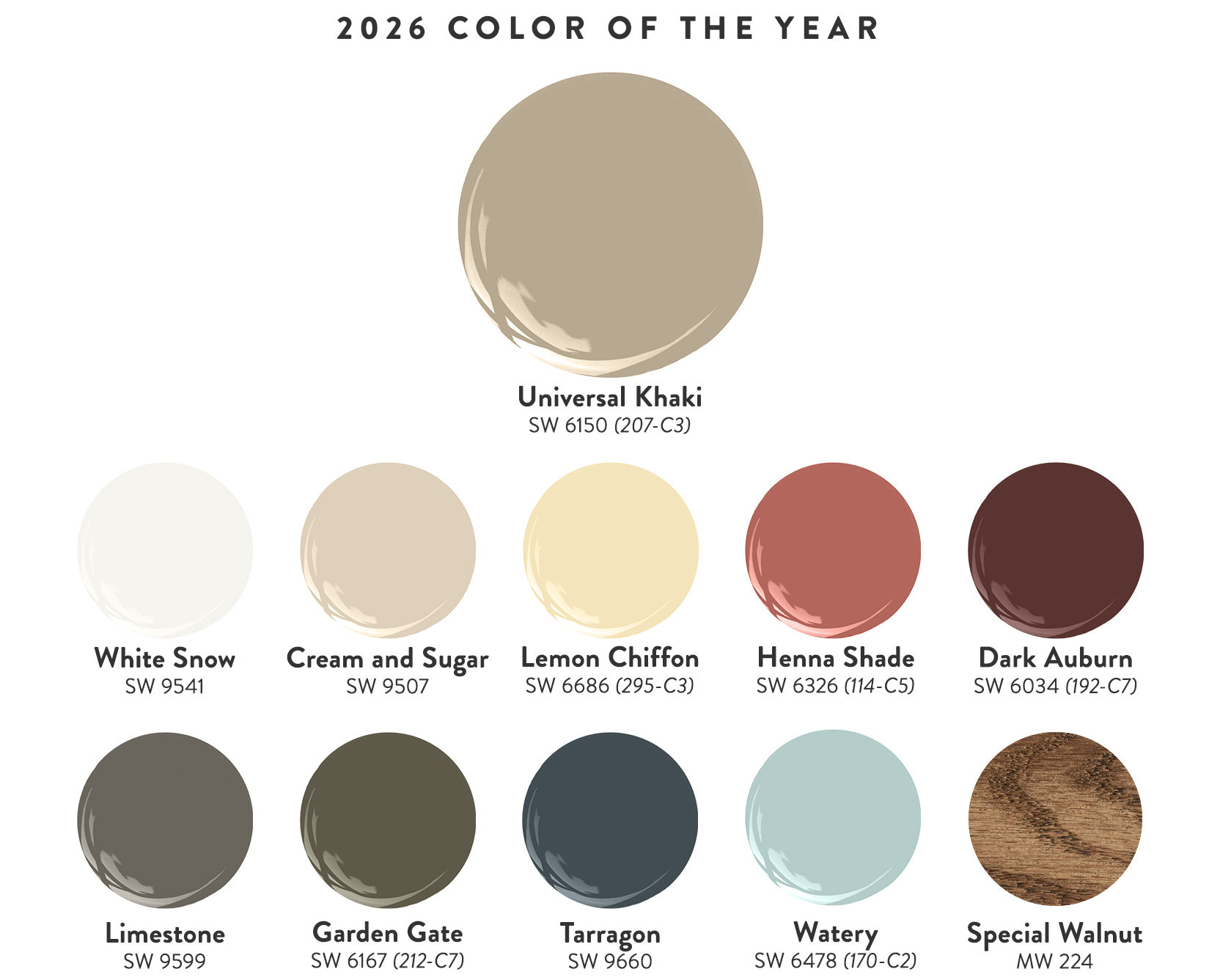
But here’s the twist: warmth doesn’t mean boring. It doesn’t mean everything has to be tan. The key takeaway for 2026 is the appeal of contrast. Designers are pairing muted, lighter tones with rich, darker hues to create depth. Think of it like layering clothes. You wouldn’t wear just a t-shirt in winter; you layer textures and weights. Same with walls. A light, airy cream paired with a deep, almost-black walnut creates a space that feels alive. It has shadows and highlights. It breathes. This approach allows for personality to shine through without overwhelming the senses.
Plum Noir and Wasabi: The Unexpected Power Couple
If you want to test the waters of bold design, look no further than the 2026 Pinterest Palette. This year, Pinterest identified five core colors, but two stand out as the most surprising duo: Plum Noir and Wasabi. On paper, this sounds like a mistake. Purple and green? Isn’t that for Easter eggs? Not when you get the shades right. Plum Noir is a deep, luxurious purple that borders on black. It’s moody and sophisticated. Wasabi, on the other hand, is a zesty, vibrant green-yellow. It’s energetic and fresh.
When you put them together, something magical happens. The darkness of the plum grounds the space, making it feel cozy and intimate. The pop of wasabi adds a jolt of energy that prevents the room from feeling too heavy. It’s a high-contrast story that feels fresh yet timeless. Imagine a dining room with walls painted in a deep plum. Now, add chairs upholstered in a subtle wasabi fabric, or perhaps a vase of fresh limes on the table. The green doesn’t clash; it illuminates the purple. It makes the dark walls feel intentional, not depressing.
This combination works because it mimics nature. Think of a ripe fig split open, or certain exotic flowers. Nature doesn’t shy away from contrast, and neither should we. If painting four walls in plum feels too committe, try an accent wall. Or better yet, use the plum on your trim and doors, and keep the walls a neutral cream. Then, bring in the wasabi through textiles—pillows, throws, or even a rug. It’s a low-risk way to dip your toe into high-impact design. The result is a space that feels curated and personal, not copied from a catalog.
Cool Blue and Terracotta: Banishing the Winter Blues
Spring 2026 is bringing a refreshing twist to the classic blue-and-orange complementary scheme. Instead of bright primary colors, designers are leaning into "Cool Blue" and earthy "Terracotta." This pairing is perfect for banishing winter blues while maintaining a sense of calm. Cool Blue, as the name suggests, is crisp and airy. It reminds us of the sky or a quiet ocean. Terracotta is warm, dusty, and rooted in the earth. Together, they create a balance that is both invigorating and soothing.
Why does this work so well in living spaces? Because it bridges the gap between the indoors and outdoors. The cool blue brings the freshness of the air inside, while the terracotta anchors the room with warmth. It’s particularly effective in rooms with lots of natural light. The sunlight hits the blue, making it shimmer, while the terracotta absorbs the light, creating a soft glow. This dynamic interplay keeps the room interesting throughout the day. You’re not just looking at static colors; you’re experiencing a changing landscape.
Practically speaking, this combo is incredibly versatile. You can go bold with a terracotta sofa against cool blue walls. Or, you can keep it subtle with blue linen curtains and terracotta pottery on the shelves. The key is to let one color dominate and the other accent. If you’re nervous, start with the accessories. A few terracotta pots on a blue-painted bookshelf can transform the whole vibe. It’s a reminder that you don’t need to renovate to refresh. Sometimes, a few well-placed objects are enough to shift the energy of a room entirely.
Walnut and Persimmon: Richness Meets Radiance
One of the most significant trends emerging in 2026 is the return of wood tones as a primary color element. Specifically, warm browns and walnut are dominating design inspiration feeds. But wood alone can feel traditional. To make it feel modern and unexpected, designers are pairing it with Persimmon. Persimmon is a vibrant, reddish-orange hue that sits somewhere between coral and pumpkin. It’s joyful, energetic, and undeniably warm.
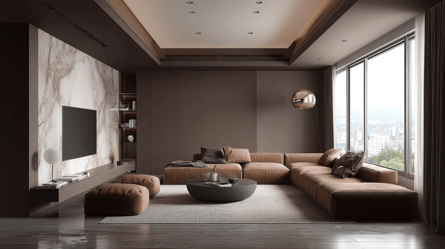
The combination of walnut and persimmon is pure luxury. The deep, grainy texture of walnut wood provides a sophisticated backdrop for the brightness of persimmon. It’s a high-end look that doesn’t feel stuffy. Imagine a mid-century modern credenza in rich walnut, styled with persimmon-colored books, a ceramic bowl, or even a piece of abstract art featuring the same orange tone. The wood grounds the color, preventing it from feeling too loud. The color, in turn, wakes up the wood, preventing it from feeling too dark.
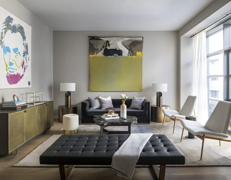
This pairing is especially powerful in open-concept kitchens and living areas. Since many homes today have grey or brown couches, adding persimmon accents can tie the space together without clashing. It works with grey because it adds warmth. It works with brown because it adds contrast. If you have walnut flooring or cabinetry, consider painting an island or a feature wall in persimmon. It’s a bold move, but one that pays off in spades. The space instantly feels more alive, layered, and personal. It’s no longer just a room; it’s a statement.
Jade and Mellow Yellow: A Serene Escape
For those who prefer a softer, more serene approach, the pairing of Jade and Mellow Yellow offers a gentle alternative. Jade is a deep, calming green that connects us to nature. It’s restful for the eyes and promotes relaxation. Mellow Yellow is not the bright, neon yellow of caution signs. It’s a subdued, buttery hue that feels like sunshine filtered through leaves. Together, they create a palette that is incredibly restorative.
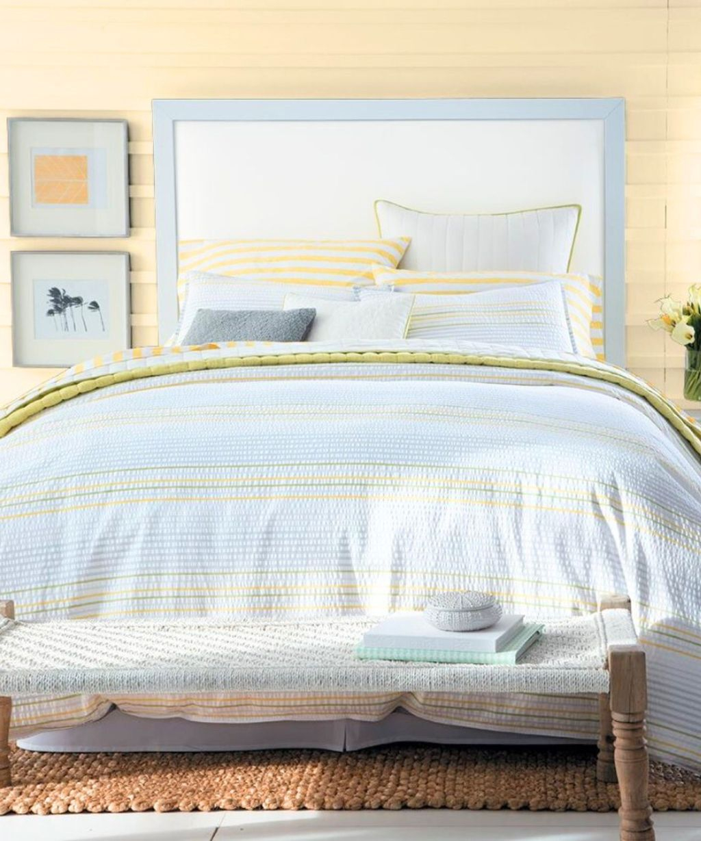
This combination is ideal for bedrooms or reading nooks—spaces where you want to unwind. The jade acts as a cocoon, wrapping you in calm. The mellow yellow adds a touch of optimism and light, preventing the green from feeling too somber. It’s a subtle contrast, more about tone than intensity. Think of a jade-painted headboard wall with mellow yellow bedding. Or, jade walls with yellow-framed artwork. The effect is understated but profound.
What makes this pairing so effective in 2026 is its alignment with the wellness trend. As people prioritize mental health, their homes are becoming spaces for recovery. Colors that lower cortisol are in high demand. Jade and mellow yellow do exactly that. They don’t shout; they whisper. They invite you to slow down. If you’re feeling overwhelmed by the pace of life, this might be the palette for you. It’s a visual deep breath. And in a world that never stops moving, that’s a luxury worth having.
Practical Tips for Trying Unexpected Combos
So, how do you actually do this without ruining your living room? Start small. You don’t need to repaint every wall tomorrow. Pick one corner. One shelf. One piece of furniture. Test the waters. Buy sample pots of paint and put large swatches on your wall. Live with them for a few days. Watch how the light changes them. Does the plum look too black at night? Does the wasabi look too neon in the morning? Adjust accordingly.
Lighting is everything. Natural light will show the truest version of your colors. Artificial light can warp them. Warm bulbs will make blues look muddy and oranges look brighter. Cool bulbs will do the opposite. Make sure you’re testing your combos under the lighting conditions you’ll actually be using. If you mostly hang out in the evening, test your colors at night. Don’t rely on daytime photos alone.
And remember, texture matters. A flat matte paint will look different than a satin finish. A velvet pillow will absorb light differently than a linen one. Layering textures adds depth to your color story. Don’t be afraid to mix materials. Wood, metal, fabric, stone—they all interact with color in unique ways. The goal is to create a space that feels cohesive, not matchy-matchy. It should feel collected over time, like a story being told. If it feels a bit disorganized, that’s okay. Perfect is boring. Human is better.
As we move further into 2026, the message is clear: perfection is out. Personality is in. The unexpected color combinations we’re seeing—from plum and wasabi to walnut and persimmon—are not just trends. They are reflections of a deeper desire for authenticity. We want our homes to tell our stories. We want them to feel like us. And since none of us are perfectly beige, our homes shouldn’t be either.
Don’t be afraid to make mistakes. Some combos won’t work. Some colors will clash in ways you didn’t expect. That’s part of the process. Design is experimental. It’s playful. If you hate it, you can paint over it. But if you love it? You’ve created something truly unique. Something that no one else has. That’s the power of color. It’s the most affordable, impactful tool you have to transform your space.
So, take a risk. Buy that weird paint color. Pair that strange pillow with that odd rug. Trust your gut. If it makes you smile, it’s right. If it makes you feel calm, it’s working. Let go of the rules. Let go of the fear. Your home is your sanctuary, your canvas, your refuge. Fill it with colors that speak to you. In 2026, the only wrong choice is playing it safe. Go ahead. Be bold. Be unexpected. Be you.