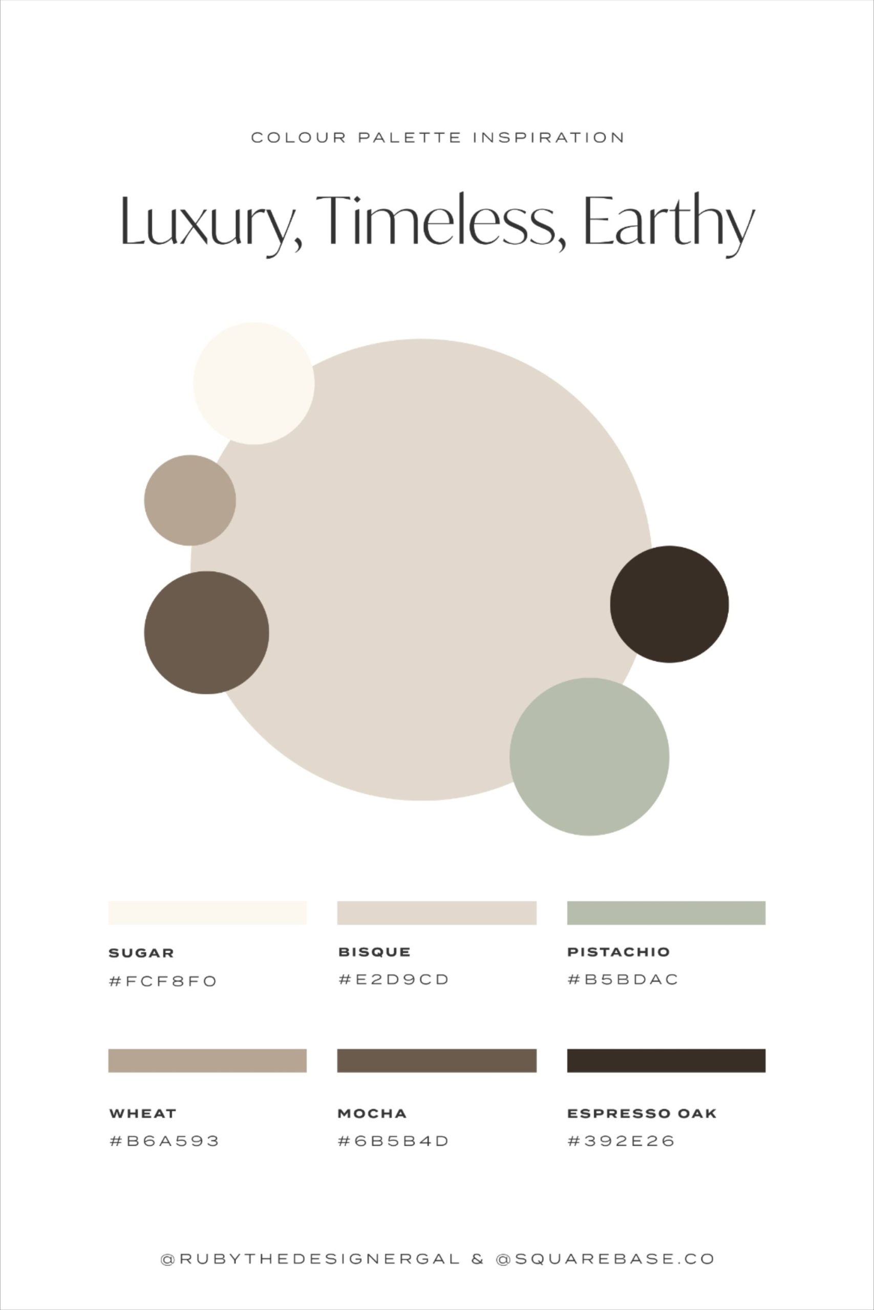
You know that feeling when you walk into a room and just… exhale? It’s not because the furniture is expensive or the art is famous. It’s something quieter. Deeper. The walls seem to hold you, not shout at you. That’s the magic of quiet luxury. It’s a vibe that’s been building for years, but by 2026, it’s not just a trend anymore. It’s how many of us want to live. We’re tired of the noise. We’re done with the flashy. We want spaces that feel like a deep breath.
But here’s the thing people get wrong. They think "quiet" means boring. Or beige. Just slapping on any old neutral and calling it a day. Nope. True quiet luxury is actually harder to pull off than bold, bright colors. It requires precision. It demands that you understand how light hits a wall at 4 PM versus 8 AM. It’s about subtle sophistication. You aren’t putting your high-end items front and center; instead, you’re designing the space itself to feel upscale without being overtly so. It’s a whisper, not a scream. And getting that whisper right starts with the paint.
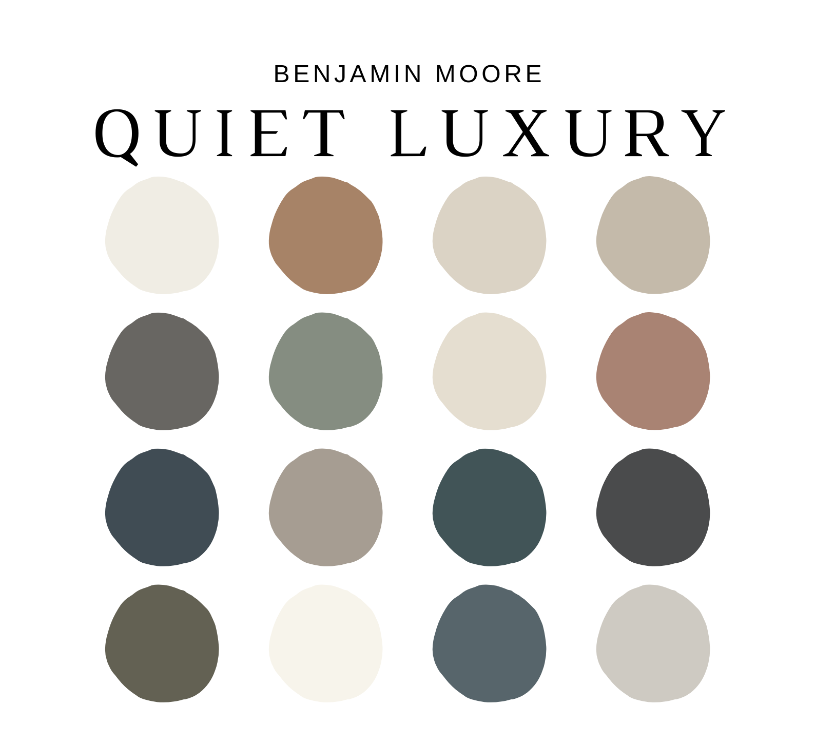
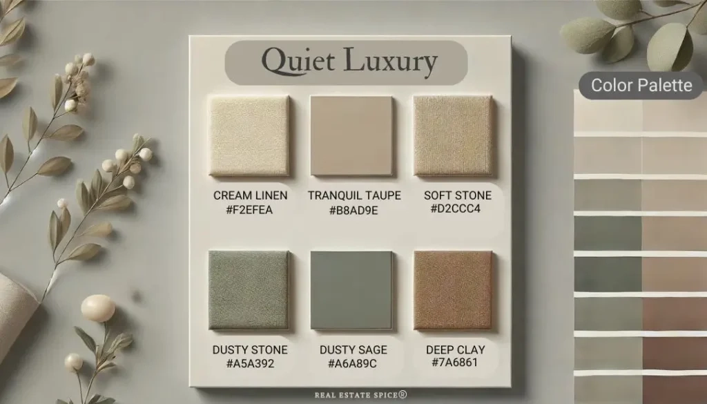
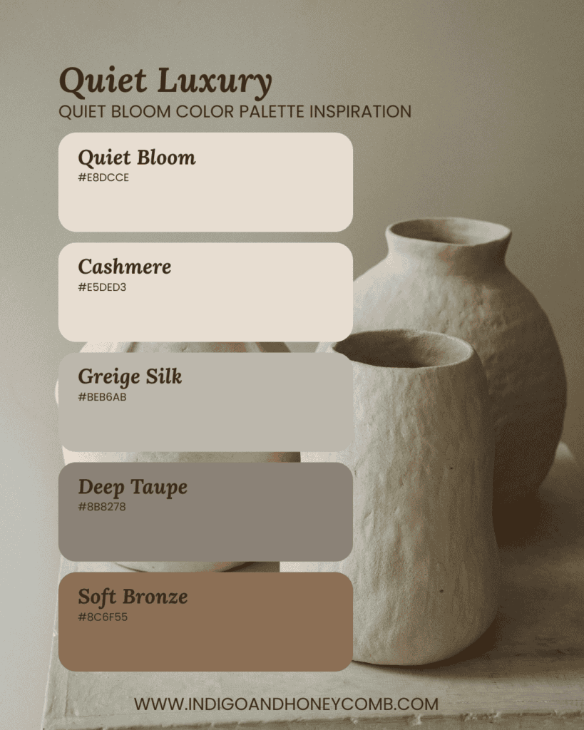
So, what are these colors? They aren’t secret codes, but they are specific. They live in the shadows between gray and beige, between cream and stone. They are the hues that make a room feel curated, calm, and incredibly rich. Let’s dig into the specific paint colors that define this aesthetic, and how you can bring that serene, timeless feel into your own home.
The Foundation: Warm Whites and Soft Ivories
Let’s start with the basics, because everything rests on them. White paint is never just white. In the world of quiet luxury, we are avoiding the stark, clinical whites that remind you of a hospital corridor. Instead, we’re looking for warmth. Think of warm ivory, soft cream, or what designers often call "greige" (a mix of gray and beige). These colors provide a backdrop that feels inviting rather than sterile.
Take Sherwin Williams’ "Greek Villa," for instance. It’s a best-seller for a reason. It’s not blindingly bright. It has a tiny hint of yellow undertone that makes it feel sunny and welcoming, even on a cloudy day. Another favorite is "Alabaster," which is slightly warmer and softer. These shades do the heavy lifting. They reflect light in a way that makes spaces feel larger and airier, but they also have enough depth to keep the room from feeling flat. When you choose a white for quiet luxury, you’re choosing a canvas that enhances everything else in the room.
The trick here is to look at the undertones. A cool white with blue undertones will feel crisp, sure, but it might lack that cozy, luxurious hug we’re after. Warm ivories and creams connect with natural materials like wood floors, linen curtains, and stone countertops. They bridge the gap between the modern and the traditional. If you’re standing in a paint store, hold the swatch up next to a piece of natural wood or a stone slab. Does it harmonize? Or does it clash? You want harmony. You want the wall to disappear just enough so you notice the texture of the room, not the color itself.
The Heart of the Palette: Beiges, Sands, and Light Mochas
If warm whites are the foundation, then beiges and sands are the soul of quiet luxury. For a long time, beige got a bad rap. People called it boring. But in 2025 and 2026, beige is back, and it’s better than ever. We’re talking about refined, low-contrast tonal harmony. This isn’t the orange-tinted beige of the 90s. This is sophisticated. Think sand, light mocha, and pale brown. These colors bring earthiness into the home. They ground you.
Imagine a living room painted in a soft taupe or a light mocha. It feels stable. Calm. It’s a retreat from the bustling world outside. These hues work because they mimic nature. Sand dunes, smooth stones, dried grasses. When you bring those colors indoors, you’re bringing that same sense of peace. Designers are leaning heavily into these tones because they pair beautifully with almost any accent color. Want to add a touch of green? A sage plant looks stunning against a sandy wall. Want to add black metal fixtures? They pop without being harsh.
The key to making these colors work is layering. You don’t just paint the walls and stop. You introduce textures. A wool rug in a slightly darker shade of brown. Curtains in a linen that’s a bit lighter than the wall. This creates depth. It stops the room from looking like a single block of color. Quiet luxury is all about that subtle variation. It’s the difference between a flat photograph and a textured painting. By using shades of beige and sand, you create a space that feels curated and thoughtful, not just painted.
The Sophisticated Edge: Stone Grays and Soft Charcoals
Now, let’s talk about gray. But not just any gray. We’re moving away from the cool, icy grays that dominated the early 2010s. The grays of quiet luxury are warm. They have hints of brown, purple, or even green. Think stone gray, slate, and soft charcoal. These colors add a bit of moodiness and sophistication. They’re perfect for spaces where you want to feel cocooned, like a bedroom, a library, or a dining room.
Stone gray is particularly versatile. It’s neutral enough to work with both warm and cool accents, but it has enough character to stand on its own. It pairs beautifully with natural wood tones, adding a modern edge to rustic elements. Soft charcoal, on the other hand, is bolder. It’s not black, but it’s dark enough to create drama. Using charcoal on an accent wall or in a powder room can make the space feel intimate and luxurious. It’s like wearing a tailored suit—it just feels put together.
One common mistake people make with these darker neutrals is ignoring the lighting. Darker colors absorb light, so if your room doesn’t get much natural sun, it can feel cave-like. That’s not always a bad thing! Some people love that cozy, den-like feel. But if you want the room to feel open, you need to balance the dark walls with plenty of artificial lighting. Layer your lights. Use floor lamps, table lamps, and sconces. Let the light wash over the textured paint. This brings out the nuances in the color. A stone gray wall might look flat in the dark, but under a warm lamp, you’ll see flecks of warmth and depth you didn’t notice before.
The Unexpected Twist: Pale Browns and Earthy Tones
Here’s where things get interesting. Quiet luxury isn’t just about grays and beiges. In 2026, we’re seeing a rise in pale browns and earthy tones that lean into the "colorful quiet luxury" trend. This doesn’t mean bright reds or electric blues. It means muted, dusty versions of earth colors. Think terracotta that’s been washed out by the sun. Olive greens that are so pale they’re almost gray. Muted clays. These colors add personality without breaking the serene vibe.
Why does this work? Because it connects us to the earth. It feels organic. A pale brown wall can feel incredibly warm and welcoming, especially in a kitchen or a family room. It’s less formal than gray, more relaxed than beige. It says, "Come in, take off your shoes, stay a while." These tones are perfect for creating a sense of history in a new home. They feel aged, lived-in, and comfortable.
When using these earthy tones, context is everything. They look best when paired with natural materials. Think rattan furniture, jute rugs, ceramic vases with imperfect glazes. The imperfection of the decor complements the muted nature of the paint. It’s about embracing wabi-sabi—the beauty in imperfection. You’re not trying to create a showroom perfect space. You’re creating a home. And homes have character. These pale browns and earthy tones allow that character to shine through without overwhelming the senses.
The Finish Matters: Beyond the Color Choice
You can pick the perfect shade of warm ivory or stone gray, but if you use the wrong finish, you’ll miss the mark. Quiet luxury is tactile. It’s about how things feel. And paint finish plays a huge role in that. Glossy paints reflect light sharply, which can look cheap or dated if not used carefully. Matte and eggshell finishes, on the other hand, absorb light softly. They hide imperfections in the wall and create a velvety, sophisticated look.
For most walls, an eggshell or low-sheen matte is ideal. It’s durable enough to wipe down but soft enough to look elegant. For trim and doors, many designers are now moving away from high-gloss semi-gloss. Instead, they’re using satin or even matte finishes on trim. This creates a seamless, modern look. The trim doesn’t shout for attention; it just frames the space quietly. It’s a subtle shift, but it makes a big difference in the overall feel of the room.
Also, consider the quality of the paint. Cheap paint often requires more coats and doesn’t hold up as well over time. It can chalk or fade. Investing in high-quality paint ensures that the color stays true and the finish remains smooth. It’s one of those invisible luxuries. You might not see the brand name, but you’ll feel the difference. The walls will look richer. The color will have more depth. It’s worth the extra cost for a space you live in every day.
Finally, let’s talk about light. Paint colors are chameleons. They change depending on the time of day, the season, and the type of light bulbs you use. A warm beige might look pinkish in the morning sun and grayish in the evening lamplight. This isn’t a flaw; it’s a feature. It keeps the room dynamic. But you need to test your colors in your specific space. Don’t just rely on a small swatch. Paint a large sample board (at least 2×2 feet) and move it around the room. Look at it in the morning, noon, and night.
Pay attention to your light bulbs, too. In 2026, LED technology allows us to choose very specific color temperatures. For quiet luxury, stick to warm whites (2700K to 3000K). Cool whites (4000K and above) can make your warm neutrals look cold and sterile. You want the light to enhance the warmth in the paint, not fight against it. Dimmers are your best friend. Being able to lower the lights in the evening transforms the mood of the room entirely. It makes those stone grays and soft charcoals feel even more intimate and luxurious.
Remember, quiet luxury is about the whole experience. It’s the combination of color, light, texture, and space. It’s about creating a sanctuary. So take your time. Test your colors. Live with them for a few days. See how they make you feel. Do they calm you? Do they make you want to linger? If the answer is yes, you’ve found your perfect shade. It’s not about following a rulebook. It’s about finding the colors that speak to you, quietly and confidently.
In the end, the specific paint colors that define true quiet luxury—warm ivories, soft taupes, stone grays, and pale earth tones—are tools. They help you build a space that reflects who you are and how you want to live. They’re not just decorations. They’re the backdrop for your life. And in a world that’s constantly shouting, having a home that whispers is perhaps the greatest luxury of all. So go ahead. Pick that soft mocha. Try that stone gray. Create your own quiet corner. You deserve it.