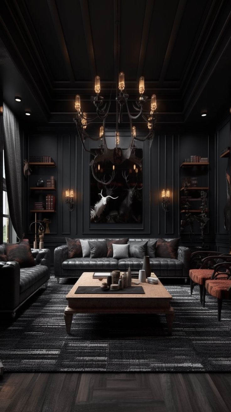
Have you ever walked into a room wrapped in deep navy or charcoal and felt an instant wave of calm. Most people think bright white is the only safe choice for walls, but deep hues hold a special kind of magic. They whisper stories instead of shouting for attention.
Designing with shadowy colors might feel risky at first. What if the room feels too small. What if it gets too dark on a rainy afternoon. We have all had those doubts. Yet, trends for 2026 show that moody, grounded aesthetics continue to captivate homeowners and designers alike because they offer a sense of sanctuary that bright shades simply cannot match.
The Psychology Behind Deep Hues
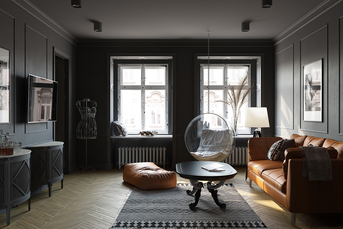
Dark colors do not shrink a room; instead, they blur the edges. When walls recede into shadow, the boundaries of a space soften. This creates a cozy, cocooning effect that lowers stress.
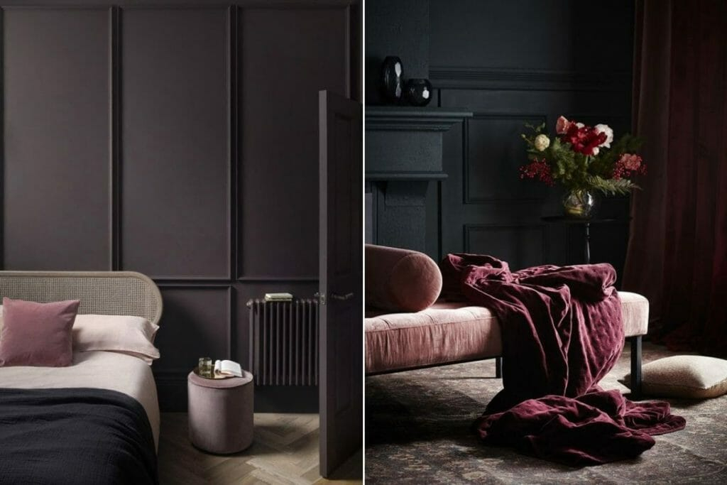
People often worry that black, forest green, or rich plum will make a house feel gloomy. In reality, these shades absorb excess light and diffuse it gently. Your favorite furniture pieces and art will actually pop more against a moody backdrop.
Choosing the Right Shade for Your Light
Every room reacts differently to sunlight. A north-facing room in 2026 gets a cool, bluish light that can make charcoal look stark. On the other hand, south-facing spaces soak up golden rays that warm up deep brown or midnight blue.
Testing swatches on your walls is crucial before you commit. Paint a large patch and watch how it shifts from morning until night. You might notice the color transforms in surprising ways.
Balancing Shadow with Texture
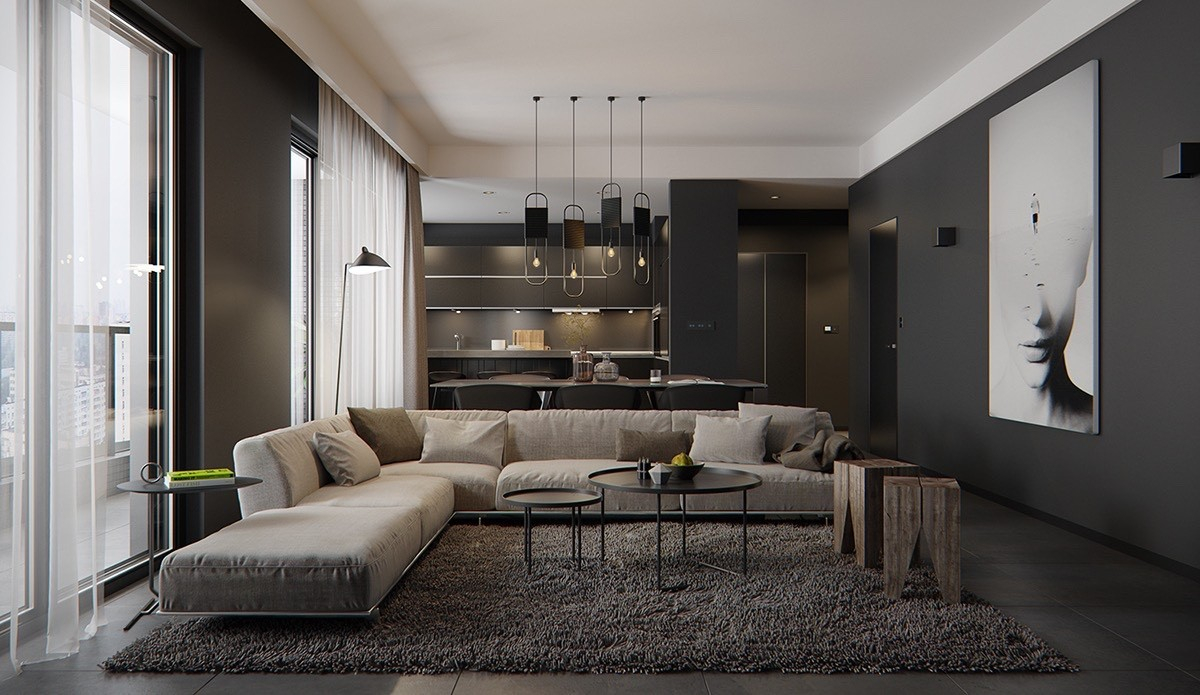
Monochrome dark rooms can fall flat if everything has the same flat finish. To keep things interesting, mix up your materials. Pair a matte wall with velvet cushions, a chunky wool rug, or raw wood furniture.
Light plays wonderfully off varied textures. When sunshine hits a textured surface against a dark background, it creates subtle highlights and shadows that add rich depth to the entire area.
Lighting Layers That Make Magic Work
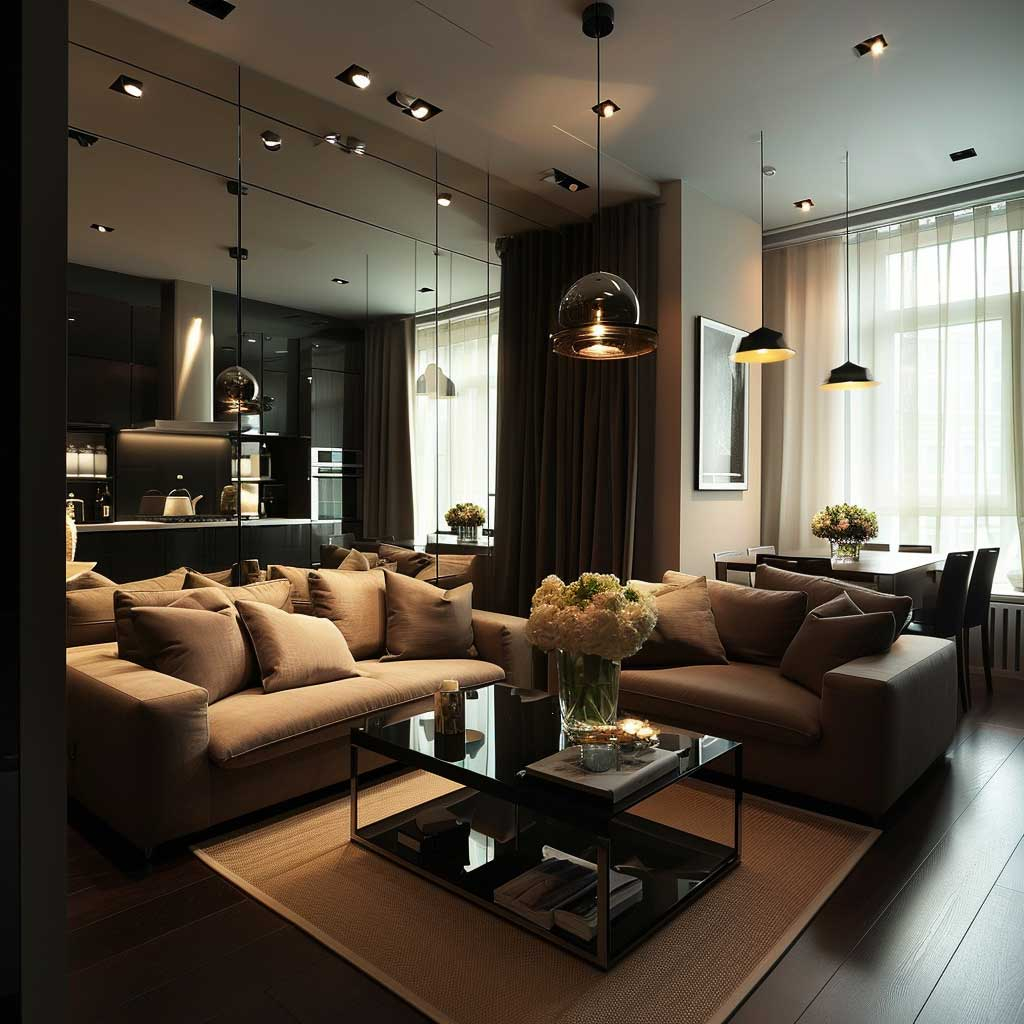
Good illumination is the secret weapon of moody design. You cannot rely on just one overhead light fixture. Instead, blend floor lamps, table lamps, and wall sconces at different heights.
Warm bulb temperatures are your best friend here. They coax out the rich undertones in deep paint colors, making the space feel welcoming instead of cold. Dimmers also let you shift the mood effortlessly.
Accents and Metals That Shine
Metallic touches look stunning against shadowy backdrops. Brushed brass, warm copper, and aged bronze catch what little light is available and bounce it softly around the room.
You do not need much. A few brass picture frames or a sleek hardware pull can tie the whole look together. Natural elements like green houseplants also provide a gorgeous contrast against dark walls.
Design styles shift, but a well-executed deep color scheme remains classic. Avoid chasing every fleeting micro-trend. Stick to grounded, earthy tones inspired by nature.
If you ever feel like updating the space, you can easily swap out smaller accessories like throw blankets or artwork. The foundational dark base will always hold strong as a versatile canvas.
Embracing deep tones is about more than just following a trend. It is about creating a personal retreat that feels authentic and enduring. When you design with intention, your dark spaces will look stunning today and for many years ahead.
Take a moment to look around your home. Is there a corner waiting for a touch of bold, beautiful color. Trust your instincts and enjoy the transformative power of the dark side.