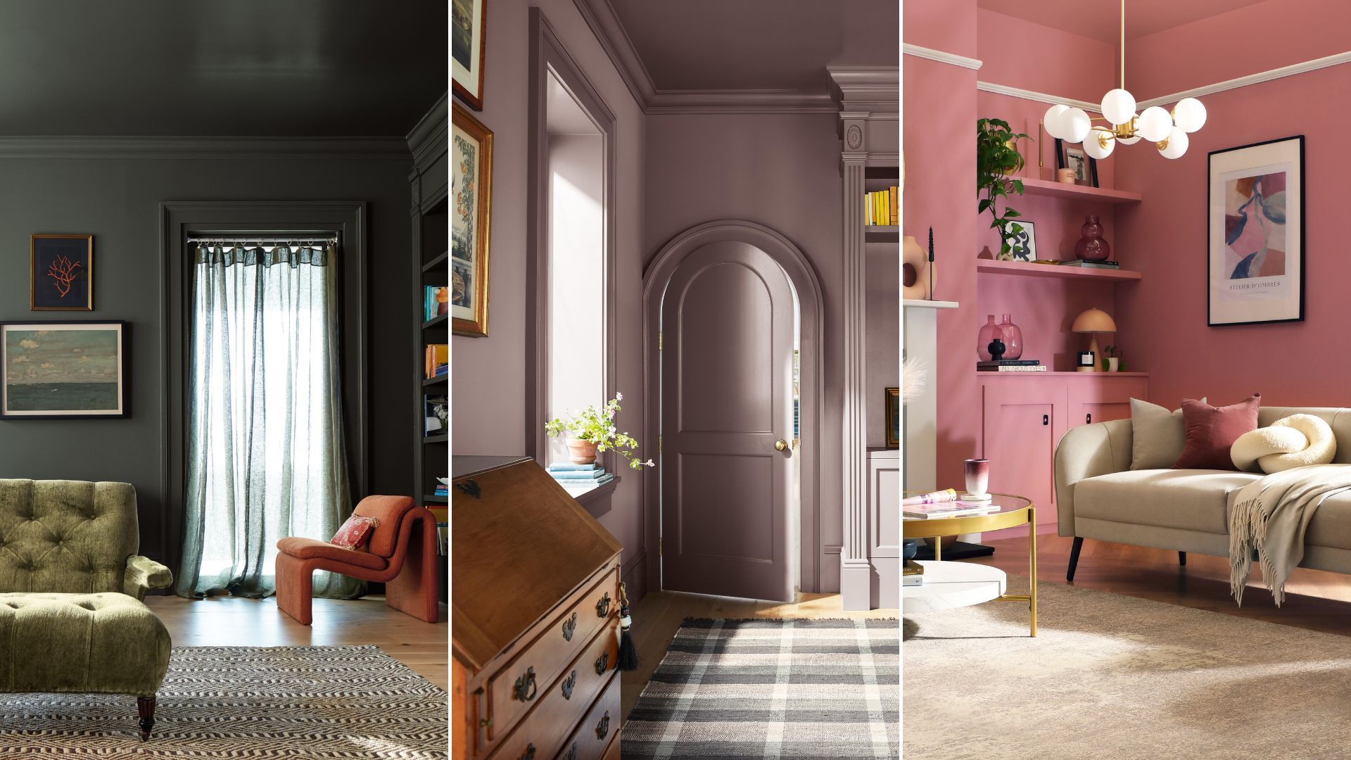
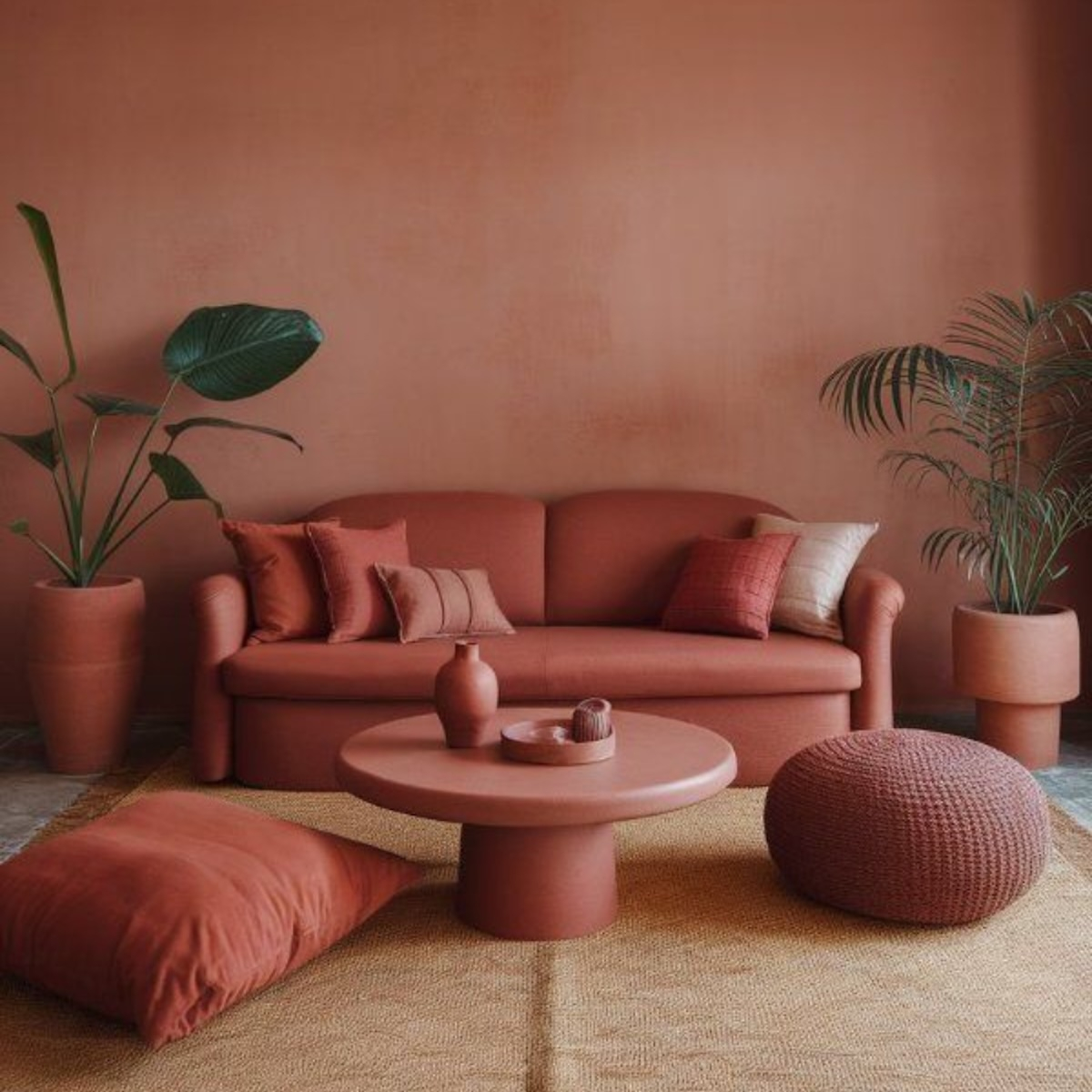
You walk into a room and feel it before you see it. It’s not just a wall; it’s an embrace. The ceiling, the trim, the baseboards, even the door frames—they’re all wrapped in the same deep, rich hue. There are no sharp white lines cutting through your vision. No visual clutter demanding attention. Just pure, unadulterated color. This isn’t a mistake or a lazy paint job. It’s intentional. It’s bold. And in 2026, it is everywhere.
For years, we were told to play it safe. White walls were the canvas, and furniture was the art. We obsessed over accent walls, thinking a splash of navy or emerald was enough to make a statement. But look around now. The pendulum has swung hard in the other direction. We are drowning in color, quite literally, and we have never felt more at peace. If you’ve been scrolling through design feeds or walking through showrooms lately, you’ve noticed the shift. The era of the "safe neutral" is officially on pause. Welcome to the age of color drenching.
The Psychology Behind the Hue
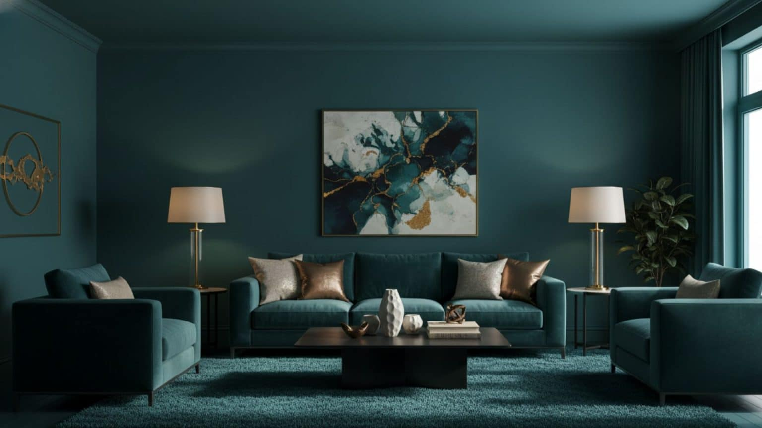
Why are we doing this? Why are we painting our ceilings the same dark teal as our walls? It comes down to how our brains process space and emotion. In a world that feels increasingly chaotic—where notifications ping every second and news cycles move at breakneck speed—our homes have become sanctuaries. We don’t just want them to look good; we need them to feel like a hug. Color drenching removes visual noise. When your eyes don’t have to stop and start at every corner because of contrasting trim, your brain relaxes. It’s a subtle trick, but a powerful one.
Think about the last time you walked into a room with stark white trim against colored walls. Your eye naturally follows those lines. It maps the architecture. It calculates the dimensions. Now, imagine that same room with the trim painted to match the walls. The edges soften. The corners blur slightly. The room feels less like a box and more like a cocoon. Psychologists and designers alike have noted that this seamless approach reduces cognitive load. You aren’t processing as many visual boundaries. It creates a sense of infinity, making small rooms feel larger and large rooms feel more intimate.
This trend also taps into our desire for authenticity. In 2026, people are tired of the "staged" look. The perfect, sterile showroom aesthetic feels cold and unreachable. Color drenching feels personal. It feels lived-in. Whether it’s a moody chocolate brown or a vibrant terracotta, wrapping a room in one shade signals confidence. It says, "I know what I like, and I’m not afraid to live with it." That emotional resonance is why this isn’t just a fad; it’s a response to the times we are living in. We crave comfort, and color delivers it in spades.
Breaking the Rules of Trim and Ceiling
Let’s talk about the elephant in the room: the white ceiling. For decades, interior design dogma stated that ceilings must be white. It was the rule. Breaking it felt risky, like wearing socks with sandals. But in 2026, that rule is not just broken; it’s shattered. Painting the ceiling the same color as the walls is the cornerstone of color drenching. It draws the eye upward and downward simultaneously, creating a unified field of vision. It eliminates the "lid" effect that a white ceiling can sometimes create, especially in rooms with low heights.
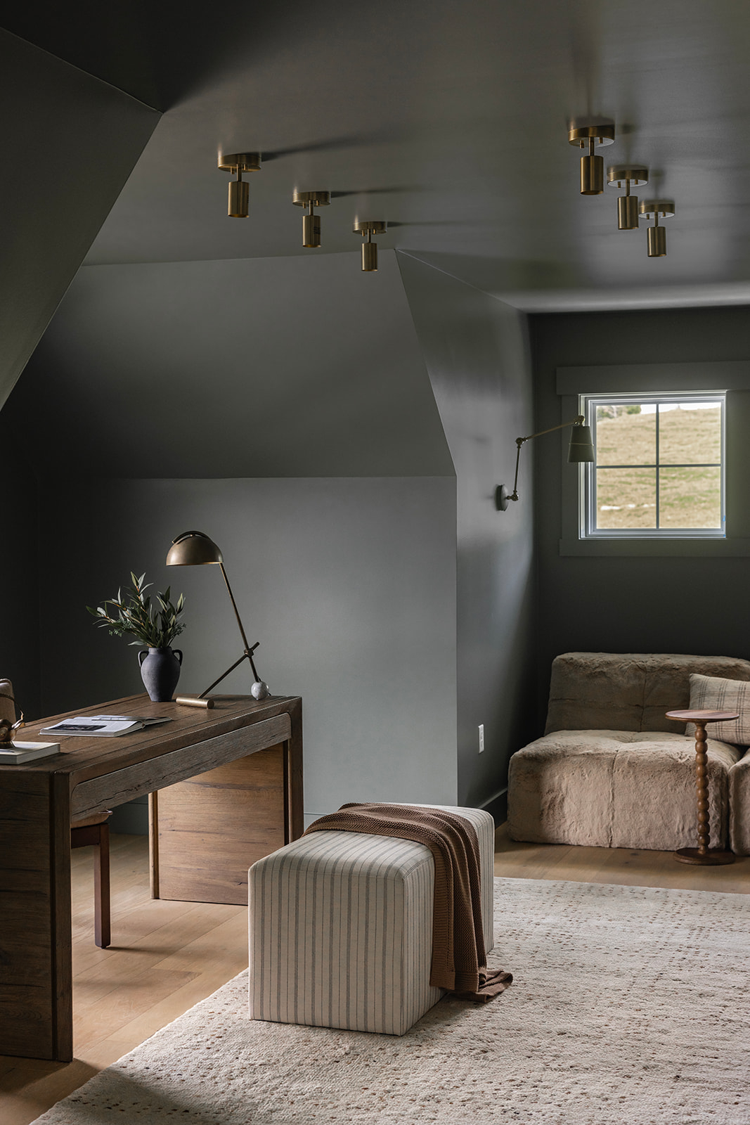
And it doesn’t stop at the ceiling. The trim—the crown molding, the baseboards, the window casings—is next. Traditionally, these elements were highlighted in bright white to "clean up" the look. But highlighting them actually chops up the space. By painting them the same color, you allow the architecture to recede. The details are still there, sure. You can see the shadow lines and the depth of the molding. But they don’t scream for attention. They whisper. This subtle interplay of light and shadow on a monochromatic surface adds texture without adding chaos. It’s sophisticated in a way that high-contrast designs often miss.
Some homeowners worry that this will make their space feel dark or cave-like. It’s a valid concern, especially if you’re choosing a deep, saturated shade. But here’s the secret: it’s all about the finish. Using different sheens can add dimension. Maybe the walls are matte, absorbing the light, while the trim is satin, catching it just enough to define the edge without breaking the color flow. Or perhaps you keep the ceiling a slightly lighter tint of the same color to lift the space. The goal isn’t to erase architecture, but to harmonize it. Once you try it, you’ll wonder why you ever tolerated those stark white borders.
Choosing Your Palette: From Moody to Bright
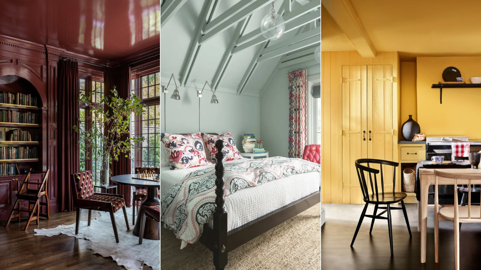
So, what colors are working best in 2026? You might assume that color drenching is only for the brave souls who love dark, brooding spaces. While jewel tones like sapphire blue, forest green, and charcoal are incredibly popular, the trend is surprisingly versatile. It works with pastels, too. Imagine a bathroom drenched in a soft, buttery yellow. It feels like sunshine trapped in a jar. Or a bedroom wrapped in dusty rose, creating a romantic, dreamlike haze. The intensity of the color changes the mood, but the technique remains the same.
Earthy tones are having a massive moment this year. Terracotta, olive green, and warm beige are being used to drench living rooms and kitchens. These colors connect us to nature, grounding the space. They feel organic and timeless. On the other end of the spectrum, we’re seeing bold primaries. A kitchen drenched in a vibrant cobalt blue feels energetic and modern. It’s playful. It challenges the idea that serious design must be subdued. The key is to choose a color you can live with, not just one that looks good in a photo. Since the color is everywhere, you can’t escape it. You have to love it.
Testing is crucial. Never pick a paint chip and assume it will look the same on four walls and a ceiling. Light changes everything. A color that looks cozy in the morning might feel oppressive at night. Buy sample pots. Paint large swatches on different walls. Live with them for a few days. Watch how the light moves across the surface. Remember, when you drench a room, the color reflects off itself. A blue room will cast a blue glow on everything inside it. This can be beautiful, but it can also skew the appearance of your furniture and art. Make sure the undertones work with your existing pieces, or be prepared to swap them out.
Texture and Layers: Avoiding the Flat Look
One common misconception is that color drenching results in a flat, one-dimensional space. If done poorly, it can. But when done right, it’s a masterclass in texture. Since you’re removing color contrast, you must introduce textural contrast. This is where the magic happens. Think about the materials in the room. A velvet sofa against a matte painted wall. A rough-hewn wooden table against smooth plaster. A wool rug against polished floors. These differences in surface quality create interest. They give the eye something to explore without needing a new color to grab onto.
Lighting plays a huge role here, too. In a monochromatic room, shadows become your best friend. They define the shape of objects and the contours of the room. Use layered lighting to enhance this. Ambient light sets the mood, task lighting provides function, and accent lighting highlights textures. A well-placed floor lamp can graze a textured wall, revealing the brushstrokes or the subtle imperfections in the plaster. These imperfections are desirable. They add character. In 2026, perfection is boring. We want rooms that feel handcrafted and human.
Don’t forget about metals and natural elements. Brass, black steel, or brushed nickel fixtures pop beautifully against a drenched background. They act as jewelry for the room. Plants are another essential layer. The green of a leaf stands out vividly against a deep purple wall, bringing life and organic shape into the structured space. Artwork, too, needs to be considered carefully. You don’t need to remove all art, but busy, multi-colored pieces might get lost or clash. Opt for pieces that complement the hue or use black-and-white photography for a striking contrast. The goal is balance, not monotony.
Practical Application: Where to Start
If you’re intimidated by the idea of painting your entire living room in one go, start small. Powder rooms are the perfect testing ground. They are small, enclosed spaces where you can take risks without committing to a major overhaul. Try a deep navy or a dramatic black. See how it feels. Notice how the space transforms. Many people find that once they experience the coziness of a drenched powder room, they want to try it elsewhere. It builds confidence. You learn how the color behaves in your specific light conditions.
Bedrooms are another great candidate. Since this trend is rooted in creating a sanctuary, applying it to the place where you sleep makes sense. A soft, muted green or a warm taupe can promote relaxation. The lack of visual distraction helps calm the mind before bed. Plus, bedrooms often have less natural light than living areas, so a darker, drenched scheme can feel intentional and snug rather than gloomy. Just ensure you have adequate artificial lighting for reading and getting ready. Layered lamps with warm bulbs are essential to keep the space inviting after sunset.
Kitchens require a bit more planning. Cabinets, backsplashes, and countertops introduce multiple surfaces. You don’t necessarily have to paint the cabinets the same color as the walls, but you can drench the walls and ceiling while keeping the cabinets neutral. Or, go all in and paint the cabinets the same color as the walls for a truly seamless look. This works particularly well in modern kitchens with sleek, handle-less cabinetry. It minimizes the visual weight of the storage, making the kitchen feel more like a living space and less like a workspace. Just be mindful of durability. Kitchens get dirty. Choose paints with washable finishes, especially for lower walls and areas near the sink.
Is color drenching just a flash in the pan? Unlikely. Trends come and go, but this shift feels deeper. It aligns with a broader movement towards sustainability and longevity. When you love a color enough to wrap your whole room in it, you’re likely to keep it longer. You’re not chasing the next quick fix. You’re investing in a space that resonates with you emotionally. This longevity is key. In 2026, we are moving away from fast furniture and fast decor. We want things that last. A well-executed color-drenched room feels timeless because it relies on fundamental principles of light, shadow, and proportion rather than fleeting stylistic quirks.
We are also seeing this trend influence exterior design. Homes with exteriors painted in a single, bold hue, including trim and shutters, are gaining popularity. It creates a striking curb appeal that stands out in neighborhoods dominated by beige and gray. The psychology is the same: unity, confidence, and a break from the norm. As we look toward the late 2020s, expect to see more experimentation with finishes and effects within the drenching framework. Limewash paints, textured plasters, and even wallpaper used on ceilings and trim will expand the definition of what it means to drench a space.
Ultimately, this trend is about freedom. It frees us from the rigid rules of the past. It encourages us to trust our instincts. If a color makes you happy, use more of it. Don’t dilute it. Don’t apologize for it. Embrace it. The beauty of color drenching is that it is deeply personal. Your version of it will look different from your neighbor’s, and that’s the point. It’s not about following a prescription; it’s about creating an environment that supports your well-being. And in a world that often feels disjointed, there is something profoundly healing about surrounding yourself with wholeness.
So, where does that leave us? Color drenching is more than a design choice; it’s a mindset. It asks us to slow down, to look closely, and to feel deeply. It challenges us to let go of the need for constant contrast and instead find beauty in unity. As we navigate the rest of 2026 and beyond, this trend serves as a reminder that our homes are reflections of our inner lives. If you’re feeling overwhelmed, maybe your space needs to be simpler. If you’re feeling dull, maybe it needs more vibrancy. Listen to what your home is telling you. Pick up a brush. Take a risk. And let the color wash over you. It might just change the way you see everything.