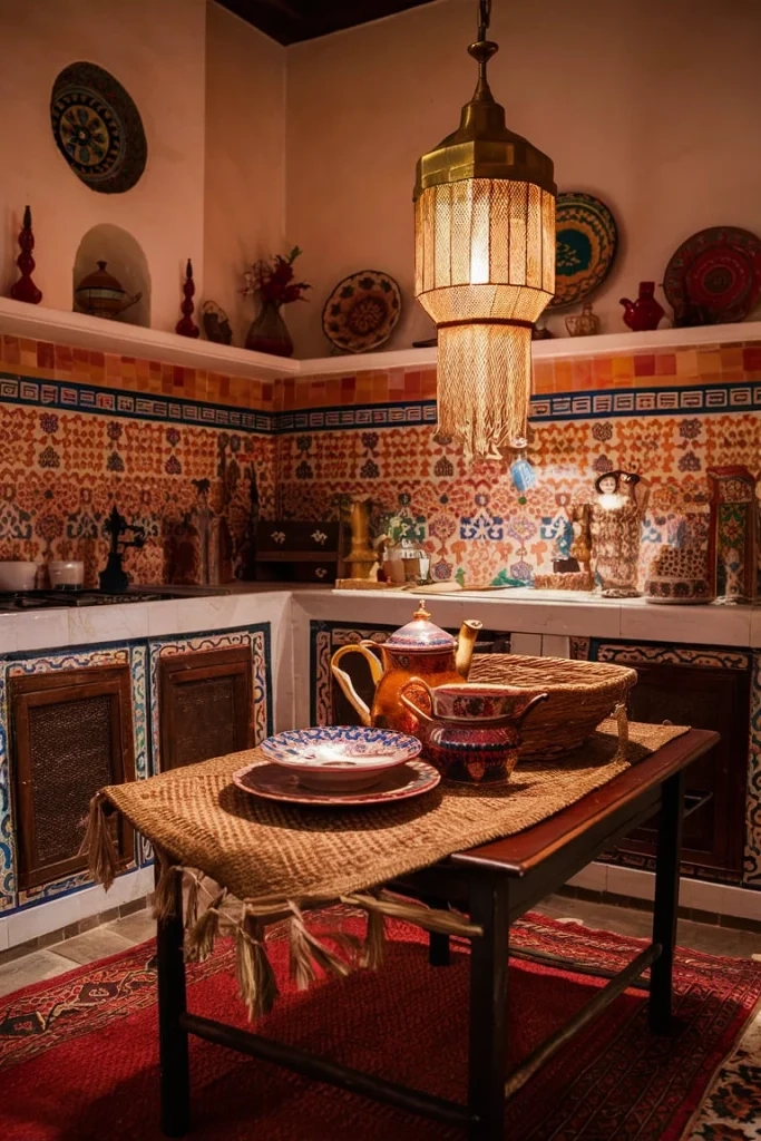
Ever walked into a room and felt like your eyes were trying to escape? You know the feeling. It’s that moment when too many things are shouting for attention at once. Now, imagine walking into a riad in Marrakech. The tiles on the floor are intricate. The cushions are embroidered. The lanterns cast shadowy, complex shapes on the walls. Yet, you don’t feel overwhelmed. You feel calm. You feel held by the space.
How does that work? It seems like a contradiction, doesn’t it? Moroccan design is famous for being bold. It’s loud. It’s colorful. But it’s rarely messy. There is a rhythm to it. A secret handshake between the eye and the object. If you’ve ever tried to bring this style into your own home and ended up with a headache instead of a haven, you’re not alone. It’s tricky. But it’s not magic. It’s method.
In 2026, we’re seeing a huge surge in people wanting more soul in their homes. We’re tired of the sterile, all-white minimalist look that dominated the last decade. We want warmth. We want stories. And Moroccan design delivers that in spades. But to get it right, you have to understand the balance. You have to learn how to let the patterns breathe. Let’s dig into how you can do that, without losing your mind or your budget.
The Foundation: Understanding the "Why" Behind the Pattern
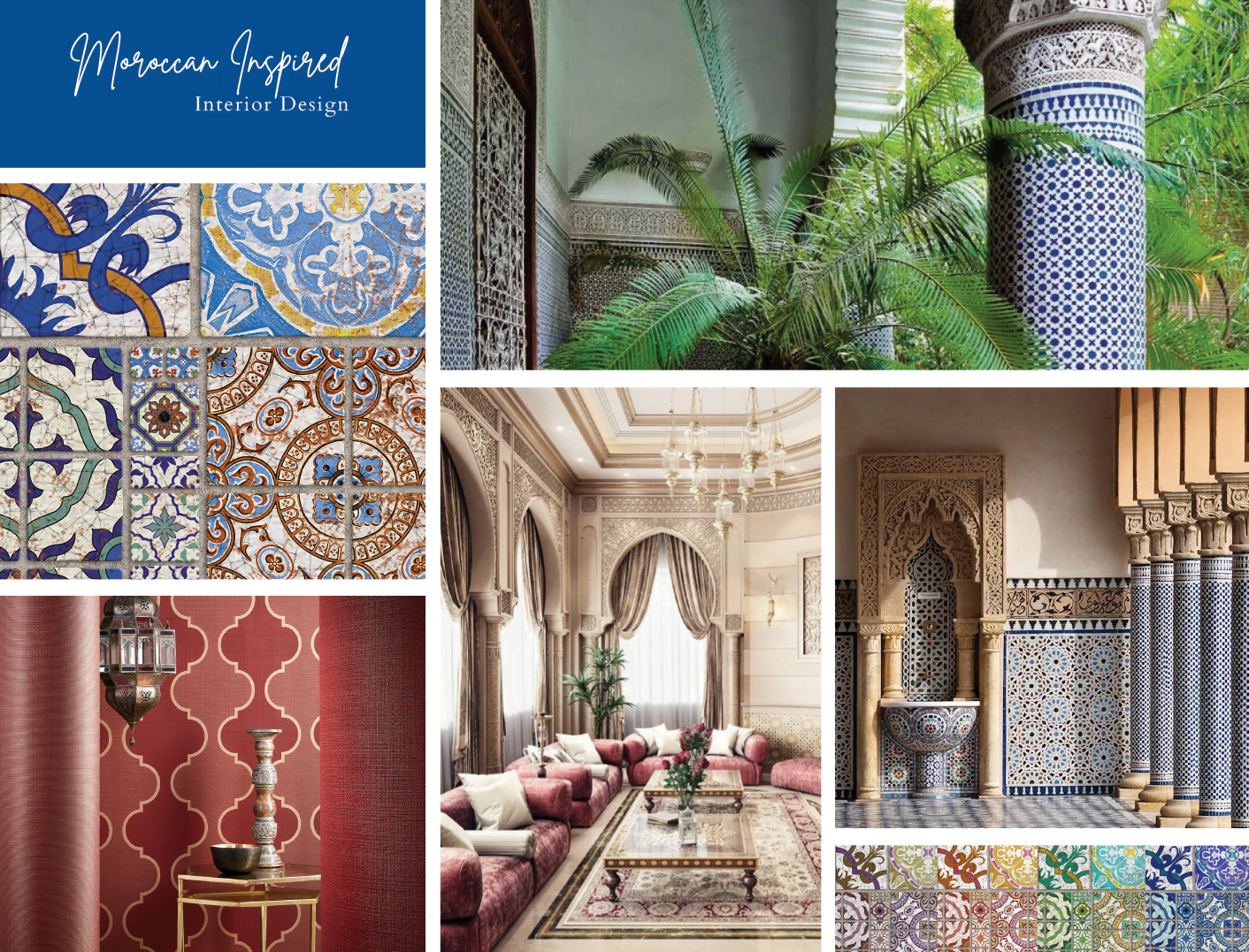
Before you buy a single tile or throw pillow, you need to get inside the head of the design. Moroccan patterns aren’t just decoration. They’re language. Historically, Islamic art avoided depicting living beings in religious contexts, so artists turned to geometry. They created infinite, repeating patterns that represented the infinite nature of the universe. That’s why you see those starbursts and interlacing lines everywhere. It’s meant to be meditative.
When you look at a zellige tile wall, you aren’t supposed to focus on one specific flower or bird. You’re supposed to let your eye wander across the whole surface. This is key to balancing it in your home. If you treat every pattern as a "statement piece," you’ll fail. Instead, think of them as a background hum. A texture. The boldness comes from the cumulative effect, not from one single item screaming "look at me."
This mindset shift changes everything. In recent years, designers have moved away from treating Moroccan elements as exotic curiosities. They’re now seen as foundational design principles. It’s about craftsmanship and human touch. When you understand that the imperfection in a hand-chiseled tile is part of its beauty, you stop trying to make everything match perfectly. And that’s where the balance starts. It’s organic. It’s rooted in centuries of Berber, Arab, and Moorish influences that prioritized harmony over uniformity.
Rule One: Vary the Scale Like a Pro
Here is the number one mistake people make. They pick three different patterns, and they are all the same size. Maybe they’re all small, intricate geometrics. Or maybe they’re all large, bold florals. When the scale is the same, the patterns fight. They vibrate against each other. It creates visual noise. Your brain doesn’t know where to rest.
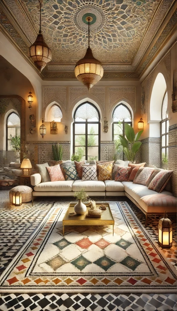
To fix this, you need a hierarchy. Think of it like music. You need a bass line, a melody, and maybe some high-hat cymbals. In design terms, this means mixing large-scale patterns with medium and small ones. Start with a big anchor. This could be a large Moroccan rug with a bold diamond motif. That’s your bass line. It grounds the room.
Then, layer in medium-scale patterns. Maybe these are your curtains or a larger upholstery piece on a sofa. Finally, add the small, intricate details. These are your throw pillows, your lamp shades, or the border on a tray. By varying the size, you give the eye a path to travel. It moves from the big shape to the medium shape, then rests on the tiny detail. It’s a journey, not a collision. This technique was highlighted in several 2025 design guides as the most effective way to tame bold aesthetics.
Don’t be afraid to mix shapes either. A circular lantern pattern can sit beautifully next to a square tile pattern, provided the scales are different. The contrast in geometry adds interest, but the contrast in size keeps it readable. If you’re unsure, hold the items up next to each other. Squint your eyes. If they blur into one muddy mess, the scales are too similar. Swap one out for something bigger or smaller. Simple as that.
The Power of Neutral Breathing Room
You can’t have a party if everyone is talking at once. Someone needs to listen. In Moroccan design, neutral spaces are the listeners. They provide the visual break your eyes desperately need. This doesn’t mean you have to paint your walls white. Although, honestly, white walls do work wonders with colorful tiles. But "neutral" can also mean a deep, solid terracotta. Or a warm, sandy beige.
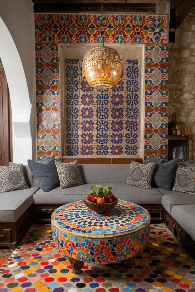
The key is solidity. If your floor is covered in complex zellige tiles, keep your walls simple. If your walls are covered in intricate plasterwork (think moucharabieh screens), keep your furniture upholstery solid. You need pockets of silence in the visual conversation. This is where texture becomes your best friend. A plain, cream-colored linen sofa might seem boring on its own. But placed against a backdrop of blue and white geometric tiles? It becomes a luxurious, calming anchor.
In 2026, we’re seeing a lot of "tonal neutrality." This means using different shades of the same color to create depth without adding pattern. For example, a room might feature a dark chocolate brown leather pouf, a medium tan wool rug, and light beige walls. No patterns. Just tone and texture. This allows the one or two bold patterned items in the room to truly shine.
Think about the flow of the room. Where does your eye go first? Make that the patterned spot. Then, ensure the surrounding areas are quiet. If you have a bold patterned headboard, skip the patterned sheets. Go for crisp, solid cotton. If you have a statement rug, let the coffee table be simple wood or metal. Don’t compete with yourself. It’s about confidence. Knowing when to stop is just as important as knowing what to add.
Color Coordination: The Glue That Holds It Together
Patterns can be wild. Colors can be tamed. One of the biggest secrets to balancing bold Moroccan patterns is sticking to a curated color palette. Moroccan design is known for jewel tones—emerald green, sapphire blue, ruby red, saffron yellow. These are intense. If you mix a red pattern, a blue pattern, and a green pattern, you’re going to have a circus. Not a sanctuary.
Instead, pick two or three main colors and stick to them. Let’s say you choose cobalt blue and white. You can have a blue and white tile floor. You can have blue and white striped cushions. You can have a blue painted ceiling. Because the colors are consistent, the patterns feel related. They feel like a family. Even if the geometric shapes are totally different, the color link ties them together.
Another approach is the "monochromatic plus one" method. Choose one dominant color, like terracotta. Use various shades of terracotta for your major pieces. Then, introduce one contrasting accent color, like teal, in your patterns. This limits the chaos. It gives the eye a predictable framework. Research from interior design trends in the mid-2020s shows that consumers are increasingly drawn to these restrained palettes within maximalist styles. It’s maximalism with boundaries.
Also, consider the temperature of your colors. Warm colors (reds, oranges, yellows) advance toward the eye. Cool colors (blues, greens) recede. If you have a small room, using cool-colored patterns can make it feel larger and calmer. If you have a large, cold room, warm patterns can make it feel cozy. Balance isn’t just about pattern density; it’s about how the color makes you feel physically in the space. Don’t ignore the emotional weight of hue.
Texture: The Unsung Hero of Pattern Balance
Sometimes, the best way to balance a pattern is to not use a pattern at all. Use texture. Moroccan design is incredibly tactile. It’s about how things feel. Think of the roughness of a hand-woven Beni Ourain rug. The smoothness of polished brass lanterns. The coolness of stone tiles. The softness of velvet cushions.
When you have a visually busy pattern, pair it with a texturally rich but visually simple material. For instance, if you have a wall with intricate carved plaster, pair it with a rough, nubby wool throw. The eye sees the pattern on the wall, but the hand feels the wool. This distributes the sensory input. It prevents visual fatigue.
Layering textures is also a way to add depth without adding more ink. A silk pillow might have a subtle sheen. A leather pouf has a matte finish. A wooden table has grain. These variations catch the light differently. They create interest through shadow and reflection, rather than through printed lines. This is a crucial distinction. In 2026, sustainability is also driving this trend. Natural materials like wood, stone, wool, and cotton are preferred over synthetic prints. They age better. They feel more authentic.
Don’t underestimate the power of metals. Brass, copper, and silver are huge in Moroccan design. A metallic lantern casts patterned shadows. That’s a "ghost pattern." It’s there, but it’s ephemeral. It changes with the time of day. This adds complexity without adding physical clutter. It’s a dynamic element that keeps the room feeling alive. So, if you’re worried about too many printed fabrics, swap one out for a metal accessory. It breaks up the flatness.
Knowing the theory is one thing. Doing it is another. Let’s talk about how this looks in real life. Start with the entryway. This is often a small space. Don’t go crazy here. A bold tiled floor is classic. Keep the walls plain. Maybe add one small patterned runner if the tiles are simple. If the tiles are complex, skip the runner. Let the floor be the hero.
In the living room, you have more surface area. This is where you can layer. Start with the rug. This is usually the biggest pattern. Build your sofa color around the rug. If the rug is busy, keep the sofa solid. Add patterned pillows, but vary the scale. Remember the music analogy. Bass, melody, cymbals. Add a patterned throw blanket draped over the arm. This introduces a third scale. Keep the curtains simple or semi-sheer to let light in. Light helps dissolve visual weight.
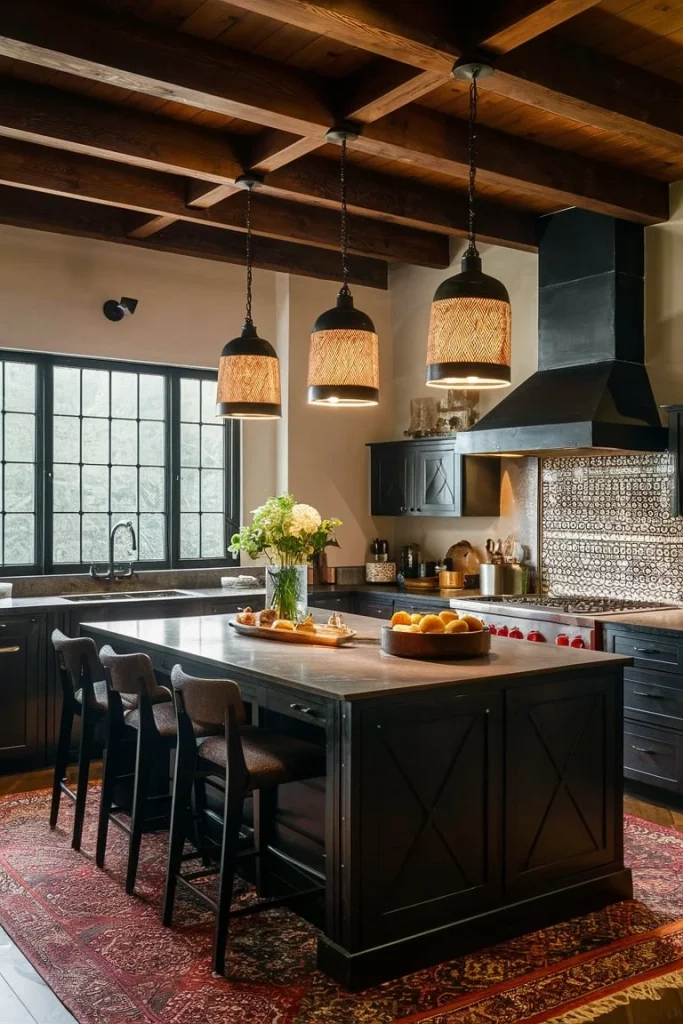
Bedrooms should be sanctuaries. Be careful here. Too much pattern can disrupt sleep. Consider a patterned headboard or a patterned bedspread, but not both. If you love bold tiles, maybe use them only in the ensuite bathroom, visible through an open door. This frames the pattern like art. In the kitchen, backsplashes are the perfect place for zellige tiles. Keep the cabinets simple. Shaker style or flat panel works well. The contrast between the ornate tile and the simple cabinet is striking and balanced.
Finally, don’t forget the outdoors. Moroccan design spills onto patios. Use weather-resistant rugs with bold patterns. Pair them with simple wrought-iron furniture. Add plenty of plants. Greenery is a natural neutral. It softens the hard lines of geometric patterns. It connects the indoor design to the natural world. This was a major theme in 2025 landscaping trends, emphasizing the blur between inside and outside.
So, there you have it. The secret isn’t avoiding boldness. It’s managing it. It’s about respect for the eye. Give it places to rest. Give it a path to follow. Use color to unify. Use texture to deepen. And always, always vary the scale. It takes practice. You might get it wrong the first time. That’s okay. Move a pillow. Swap a rug. Live with it for a week. See how it feels.
Moroccan design is forgiving because it’s rooted in imperfection. It’s handmade. It’s human. If it feels a bit off, it’s probably just needs a little tweaking. Don’t strive for magazine perfection. Strive for comfort. Strive for a space that tells your story. When you walk into your room, do you feel energized? Do you feel calm? If yes, you’ve balanced it. If no, take something away. Less is often more, even in a maximalist style.
Embrace the process. Collect pieces you love over time. Don’t rush to fill every corner. Let the room evolve. That’s the true spirit of the style. It’s layered. It’s lived-in. And now, you have the tools to make it work for you. Go forth and mix those patterns. Your home is waiting.