There’s a specific kind of silence that falls over a room when you get the color right. It’s not empty. It’s full. Full of breath, full of space, full of the permission to just be. For years, we chased the stark white, the cool gray, the bold statement wall that demanded attention. But lately? The mood has shifted. We’re tired of performing. We want our homes to hold us, not judge us.
Enter Universal Khaki. If you’ve been scrolling through design feeds or walking into showrooms in 2026, you’ve seen it. Sherwin-Williams named it their Color of the Year, and honestly, it feels less like a trend and more like a homecoming. It’s that shade that sits on the wall and doesn’t shout. It whispers. It’s the visual equivalent of a deep exhale after a long week. But why does this specific mix of beige, taupe, and hint-of-green work so well for lasting comfort? Let’s dig in.
Understanding the Soul of SW 6150
Universal Khaki isn’t just "beige." Calling it beige is like calling a symphony "noise." It’s technically a mid-tone neutral, but it has a complexity that keeps it from feeling flat. With a Light Reflectance Value (LRV) of 40, it sits right in the sweet spot. It’s not so dark that it swallows the light, but it’s not so pale that it disappears. It has weight. Grounded depth, as some experts call it.
The magic lies in the undertones. Depending on the light in your room, SW 6150 can shift. In north-facing light, which tends to be cooler and bluer, the subtle olive and green-taupe notes come out to play. This prevents the color from looking muddy or dirty. Instead, it looks organic. Like dried grass. Like stone warmed by the sun. In south-facing light, those warm beige tones glow, making the room feel cozy without feeling closed in. It’s a chameleon, but a predictable one. You know what you’re getting: warmth with a side of earthiness.
This balance is why it’s being hailed as a bridge between natural simplicity and modern livability. It doesn’t fight with your furniture. It doesn’t compete with your art. It just exists, providing a backdrop that lets everything else breathe. That’s the core of lasting comfort. When your walls aren’t fighting for attention, your nervous system relaxes. It’s science, really. Soft, natural hues lower cortisol. Universal Khaki is basically a hug for your eyes.
Lighting and the Living Room Test
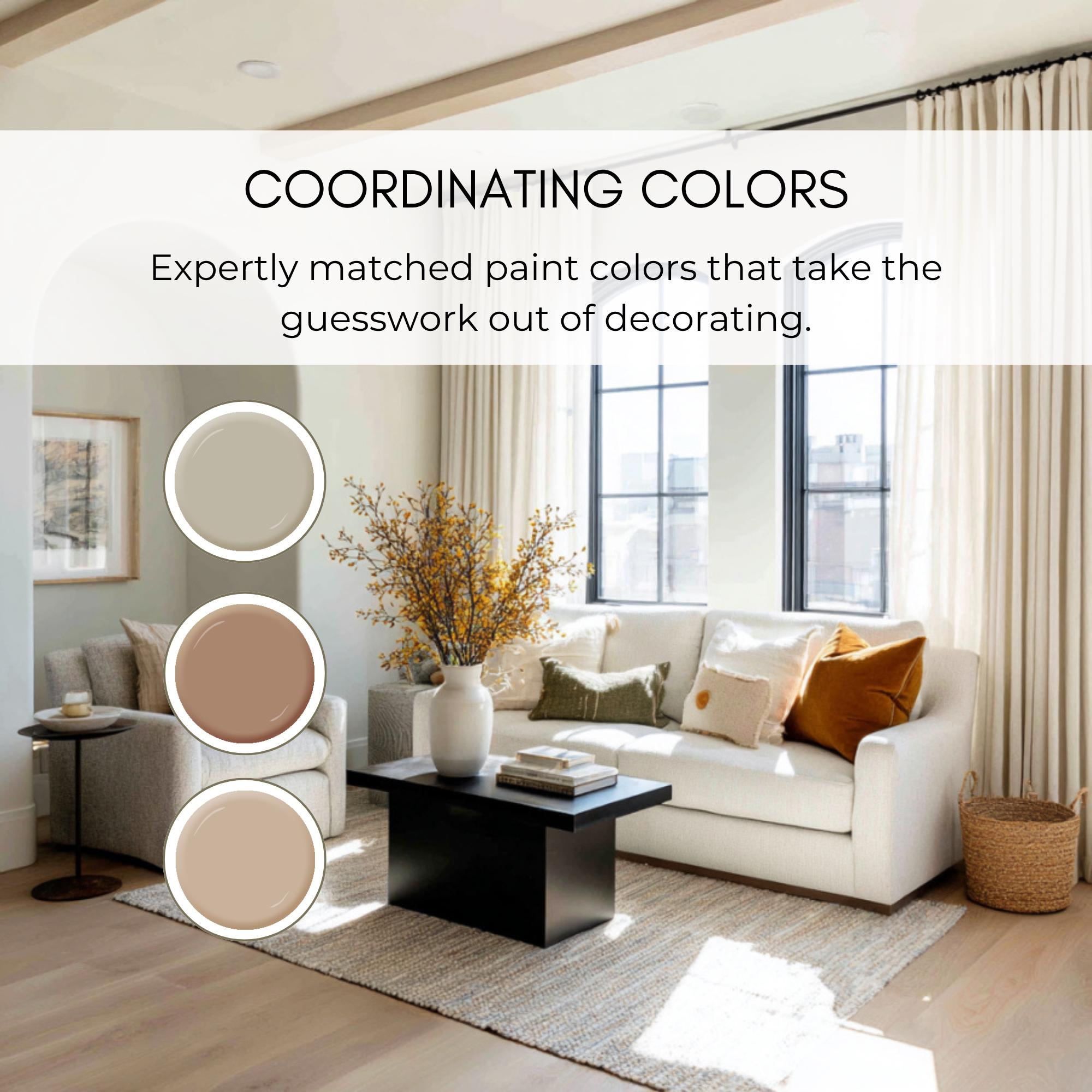
Let’s talk about where this color truly shines: the living room. This is the heart of the home, the place where we decompress. Using Universal Khaki here creates a sophisticated neutral space that feels curated but not stiff. But here’s the thing about neutrals—they live and die by the lighting. You can’t just slap it on and hope for the best. You have to work with the sun.
If you have a room with lots of natural light, SW 6150 will look lighter and airier. It’ll feel expansive. Pair it with sheer linen curtains and let the light filter through. The color will shift throughout the day, moving from a soft morning cream to a richer, warmer taupe in the late afternoon. It’s dynamic. It keeps the room feeling alive. But what if your living room is darker? Don’t panic. Because it’s a mid-tone, it won’t turn cave-like. Instead, it will feel intimate. Cocooning. Just make sure you layer your artificial lighting. Warm bulbs (2700K to 3000K) are non-negotiable here. Cool white bulbs will clash with the green undertones and make the wall look sickly. Stick to warm light, and the khaki will glow.
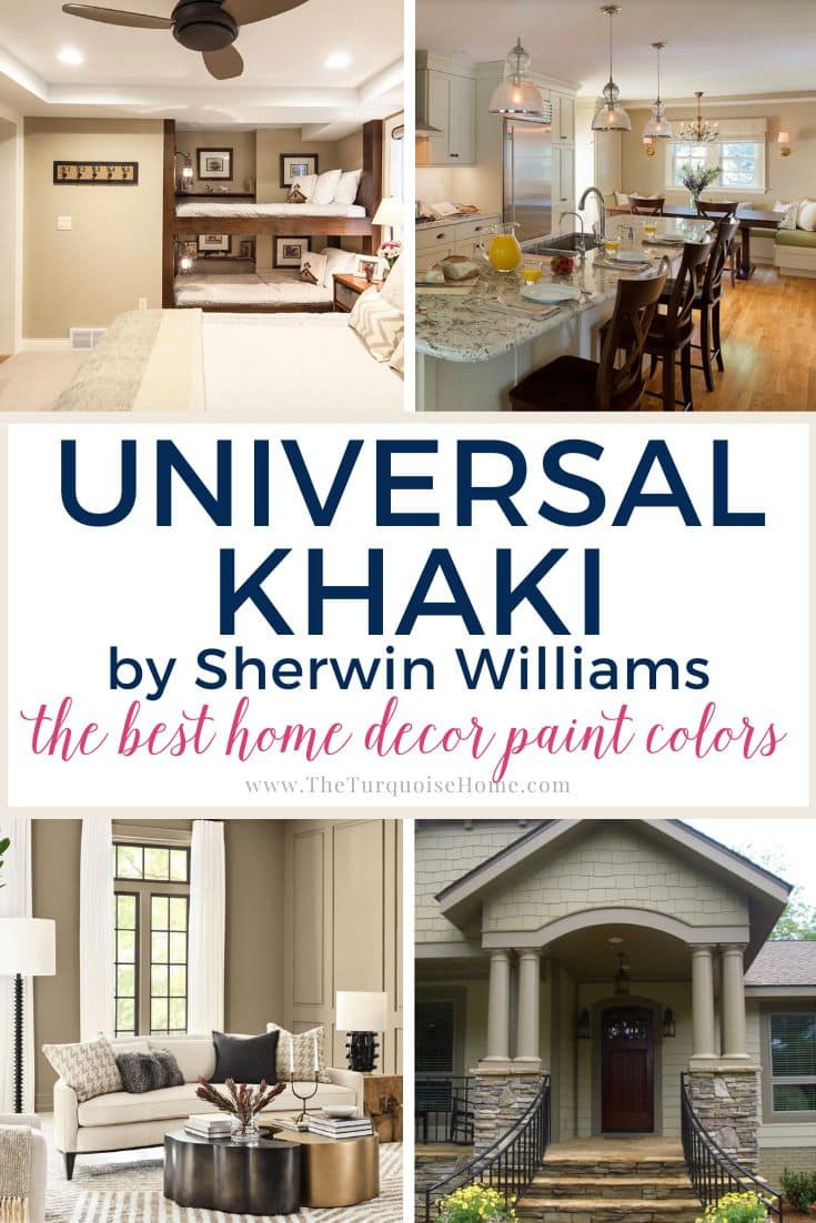
Real-world examples show this working beautifully in open-concept spaces. One designer noted how SW 6150 tied together a living area with hardwood floors and a stone fireplace. The color picked up the warmth of the wood and the coolness of the stone, acting as the glue that held the room together. It didn’t dominate. It harmonized. That’s the goal. You want people to notice how good they feel in the room, not necessarily pinpoint the paint color. Although, they will ask. They always do.
Pairing with Nature: Wood, Stone, and Textiles
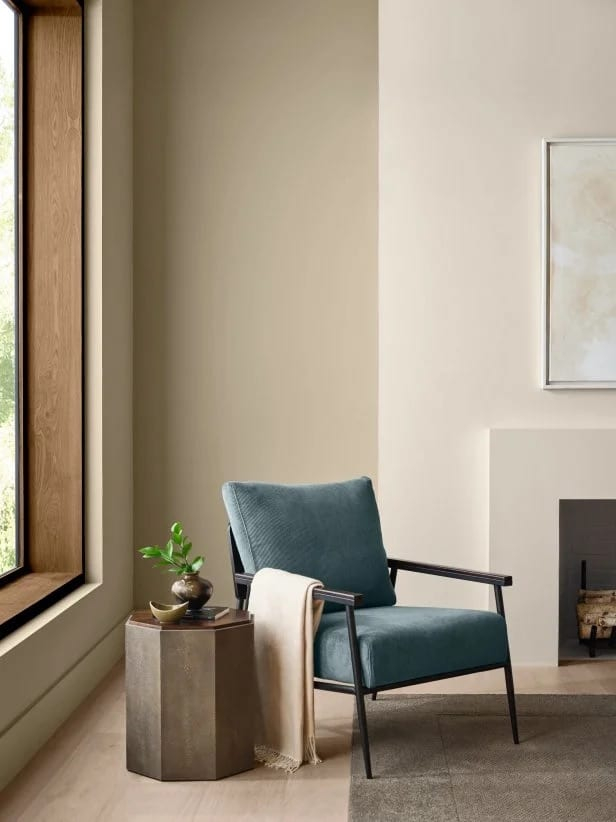
Universal Khaki is an earth tone at its core. So, what pairs better with earth than other elements from nature? This is where you build texture. Since the color itself is quiet, you need variation in surface to keep things interesting. Think about the materials around you. Wood is the obvious partner. Whether it’s light oak, rich walnut, or even reclaimed barn wood, the grain pops against the smooth, matte finish of the paint. The contrast between the organic irregularity of wood and the uniformity of the wall creates visual tension that is pleasing, not stressful.
Stone and brick also sing with SW 6150. If you have a brick accent wall or a stone hearth, the khaki pulls out the warmer tones in the masonry. It makes the stone feel softer, less industrial. For those without natural stone, bringing in textiles is key. A chunky wool throw in a cream or oatmeal shade. A jute rug. Leather armchairs in a cognac or saddle brown. These materials add tactile comfort that matches the visual comfort of the paint. It’s about engaging all the senses.
Don’t be afraid to mix metals, either. While gold and brass are popular, Universal Khaki has a certain humility that works wonderfully with matte black or oil-rubbed bronze fixtures. It grounds the space. Imagine a kitchen with SW 6150 cabinets, black hardware, and marble countertops with gray veining. The khaki softens the starkness of the marble and the hardness of the black. It’s a triad that feels timeless. You could leave this combination in place for twenty years and it wouldn’t look dated. That’s the promise of "lasting" design. It’s not about next year’s trend. It’s about next decade’s comfort.
The Art of Contrast: Trim and Accent Colors
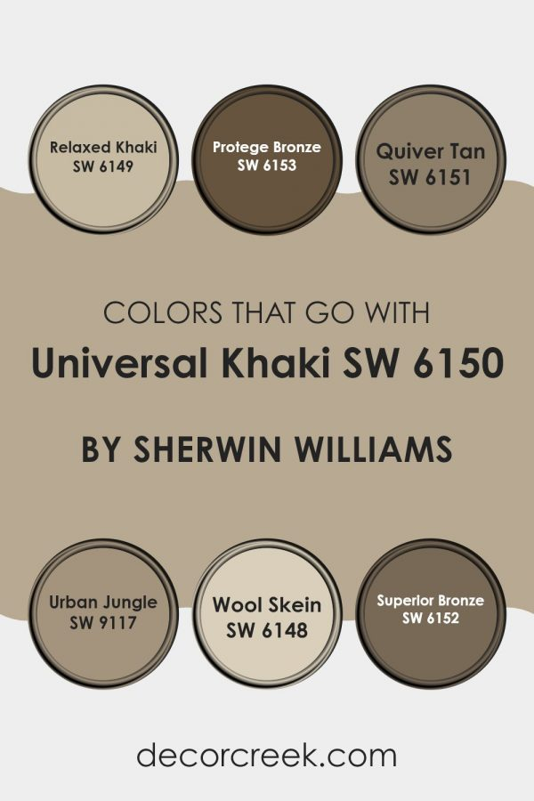
One of the biggest mistakes people make with warm neutrals is pairing them with stark, bright white trim. It can look cheap. It creates a harsh line that breaks the spell. With Universal Khaki, you want a softer transition. Consider using a creamy white for your trim, like Sherwin-Williams Alabaster or Pure White. These whites have their own warmth, so they blend seamlessly with the khaki rather than clashing with it. The result is a monochromatic flow that makes ceilings feel higher and rooms feel larger. It’s subtle, but the impact is huge.
But what if you want a pop of color? Universal Khaki is versatile enough to handle it. Because it has those green undertones, it pairs beautifully with deep, moody greens like Hunter Green or Olive. This creates a serene, library-like vibe. Perfect for a study or a bedroom. On the other hand, if you want something lighter, try soft blues. A sky blue or a dusty teal can bring a fresh, airy feel that contrasts nicely with the warmth of the khaki. It’s like the sky meeting the earth. Natural. Expected. Calming.
For a bolder look, don’t sleep on terracotta or rust. These orange-based tones are complementary to the green hints in the khaki. A few throw pillows in rust, or a piece of abstract art with burnt orange hues, can energize the space without overwhelming it. The key is moderation. Let the khaki remain the hero. Let the accents be the supporting cast. If everything is loud, nothing is heard. By keeping the majority of the surface area in SW 6150, you give your eyes a place to rest. And in a world that never stops scrolling, rest is a luxury.
Beyond Walls: Cabinetry and Exteriors
We often think of paint as just for walls. But Universal Khaki is tough. It’s durable. And it looks incredible on cabinetry. In kitchens and bathrooms, painted cabinets in SW 6150 offer a softer alternative to the all-white kitchen trend that dominated the 2010s. White kitchens are beautiful, sure, but they show every crumb, every fingerprint, every smudge. Khaki hides life. It forgives. It feels more lived-in from day one. Plus, it pairs wonderfully with quartz countertops that have beige or gray veining, tying the whole room together.
Exteriors are another frontier for this color. If you have a home with stone, brick, or wood siding, Universal Khaki can be a stunning choice for the main body color. It blends with the landscape. Instead of standing out against the trees and the lawn, it integrates. It makes the house feel like it grew there. This is especially effective for Craftsman-style homes or modern farmhouses. The warm neutrality complements the natural materials often used in these styles.
However, a word of caution. Always test samples. Paint looks different on a chip than it does on a large surface. And it looks different on your house than it does on your neighbor’s. Buy a sample pot. Paint a two-foot square on different sides of your house. Watch it for three days. Morning, noon, and night. Does it look too green? Too brown? Trust your gut. If it feels right, it probably is. This step saves regret. And regret is not comfortable.
Creating a Mood of Intentional Living
At its heart, choosing Universal Khaki is about more than aesthetics. It’s about intention. In 2026, we are seeing a massive shift toward intentional living. People are curating their lives, removing clutter, and focusing on what matters. Your home should reflect that. SW 6150 supports this mindset. It’s not chaotic. It’s not frantic. It’s steady. It encourages you to slow down. To sit. To read a book. To have a conversation without checking your phone.
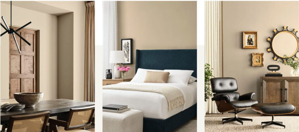
This color works well in bedrooms, too. A bedroom painted in Universal Khaki feels like a sanctuary. It signals to your brain that it’s time to wind down. Pair it with soft, breathable linens and minimal decor. Keep the surfaces clear. Let the color do the work. You don’t need a gallery wall. You don’t need a statement headboard. The wall itself is the statement. It says, "You are safe here. You can rest here."
It also extends to hallways and entryways. These are transitional spaces, often overlooked. But they set the tone for the entire home. Walking into a hallway painted in this warm khaki feels welcoming. It’s a gentle transition from the outside world to your private sphere. It wipes the stress off your shoulders before you even kick off your shoes. That’s the power of environment. We are shaped by our surroundings. Choose surroundings that shape you into a calmer, more centered version of yourself.
So, why does Universal Khaki matter? Because trends fade. Comfort doesn’t. We’ve spent decades chasing the new, the now, the next. But there’s a growing recognition that true style is about longevity. It’s about choosing things that age well. SW 6150 is one of those choices. It’s not flashy. It won’t get you a million likes on Instagram overnight. But it will make you love your home for years to come.
It’s accessible, too. You don’t need to be a designer to use it. You don’t need a huge budget. You just need the willingness to embrace warmth. To let go of the need for perfection. To accept that a little bit of earthiness brings a lot of peace. Whether you’re painting a single accent wall or your entire exterior, this color invites you to participate in a slower, more thoughtful way of living.
In the end, design is personal. There are no rules, only guidelines. But if you’re looking for a place to start, a foundation upon which to build a life of comfort, Universal Khaki is a solid bet. It’s timeless. It’s versatile. And most importantly, it’s kind. Kind to your eyes, kind to your spirit, kind to your home. Give it a try. You might just find that the quietest corner of your house becomes your favorite place to be.