Have you ever walked into a room and felt instantly hugged, yet somehow completely refreshed at the exact same time. It sounds a bit weird, right. Most of us think we need to pick a side. Either you go all in on cozy beige and mustard, or you commit fully to crisp grays and icy blues. But what happens when you throw out the old design rulebook and let them mingle.
Color is sneaky. It plays tricks on our eyes and our moods every single day. When you bring fiery reds, buttery yellows, and earthy terracotta together with soothing blues, crisp greens, and sleek purples, something wild happens. The room stops feeling flat. It wakes up.
Why Pure Monochrome Can Feel Boring
Let’s be real for a second. Sticking to just one temperature of color often leaves a space feeling a little dead. If your entire living room is drenched in cool gray from the walls down to the couch, it might look like a sterile science lab.
We crave contrast because our brains are wired to notice differences. Adding a splash of warmth breaks up the chill without ruining the peaceful vibe. It injects life into an otherwise ghost-town aesthetic.
The Dance of Visual Energy
When warm and cool shades share the same floor plan, they create a silent conversation. Warm hues like rust or amber naturally pull your attention forward. They feel heavy and energetic. Cool shades like sage or slate tend to recede. They feel light and distant.
This push and pull gives a room depth. Instead of everything sitting flat against the walls, corners pop and shadows feel intentional. Your eye wanders around the space naturally, never getting stuck in one heavy zone.
Finding Your Anchor Piece
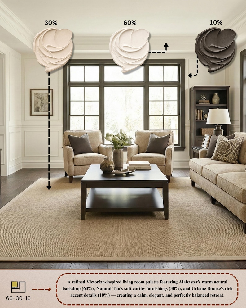
You cannot just throw random pillows around and hope for the best. You need a anchor. That might be a large patterned rug that features both icy blue tones and rich chocolate browns.
Once you have that bridge element, the rest of the puzzle pieces fall into place. It stops the room from looking like a chaotic art project gone wrong. It creates a unified story that makes sense to anyone walking through your front door.
Lighting Changes Everything
Natural sunlight is a fickle beast. A cool north-facing window makes blue paint look even frostier. Meanwhile, a bright south-facing room turns warm yellows into blazing beacons.
You have to watch how the sun moves through your house in 2026. If a room gets freezing winter light, balance it out with a few warm wood textures or brass lamps. If it gets blasted by afternoon heat, a cool mint accent wall can help you chill out.
Avoiding the Clashing Trap
Sometimes mixing goes wrong. If you pick a bright, neon cool tone and slap it next to a dusty vintage warm tone, they might fight for dominance. Your eyes won’t know where to look.
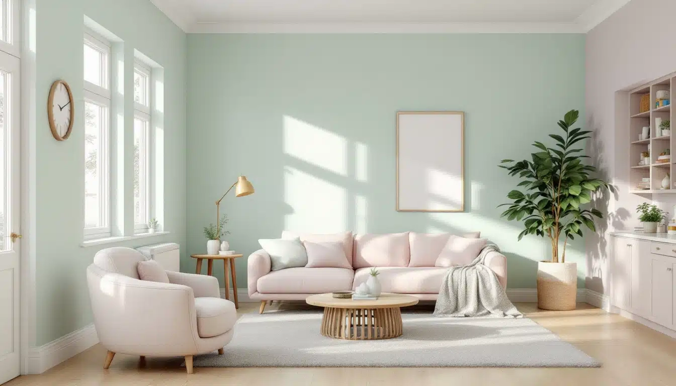
The trick is matching intensities. Muted warm tones love muted cool tones. Think dusty rose paired with a soft eucalyptus green. They speak the same quiet language, even if they come from opposite sides of the color wheel.
Your home doesn’t need to look like a glossy magazine spread. In fact, spaces that feel too matched often feel unwelcoming. Mixing temperatures brings a layer of human error and charm that feels authentic.
Allow yourself to experiment. Bring home that odd emerald lamp even if your walls are terracotta. See how it feels. Design is a journey, not a final exam.
Mixing warm and cool tones in your home is all about balance and trusting your gut. You do not need a degree in color theory to make it work. Just pay attention to how a space makes you feel when you sit down with your morning coffee.
If the room feels too hot, cool it down with some leafy greens or blue glass accents. If it feels too stark, toss on a chunky knit blanket or a warm wooden stool. Trust the process, and let your home evolve into a space that reflects every part of your personality.