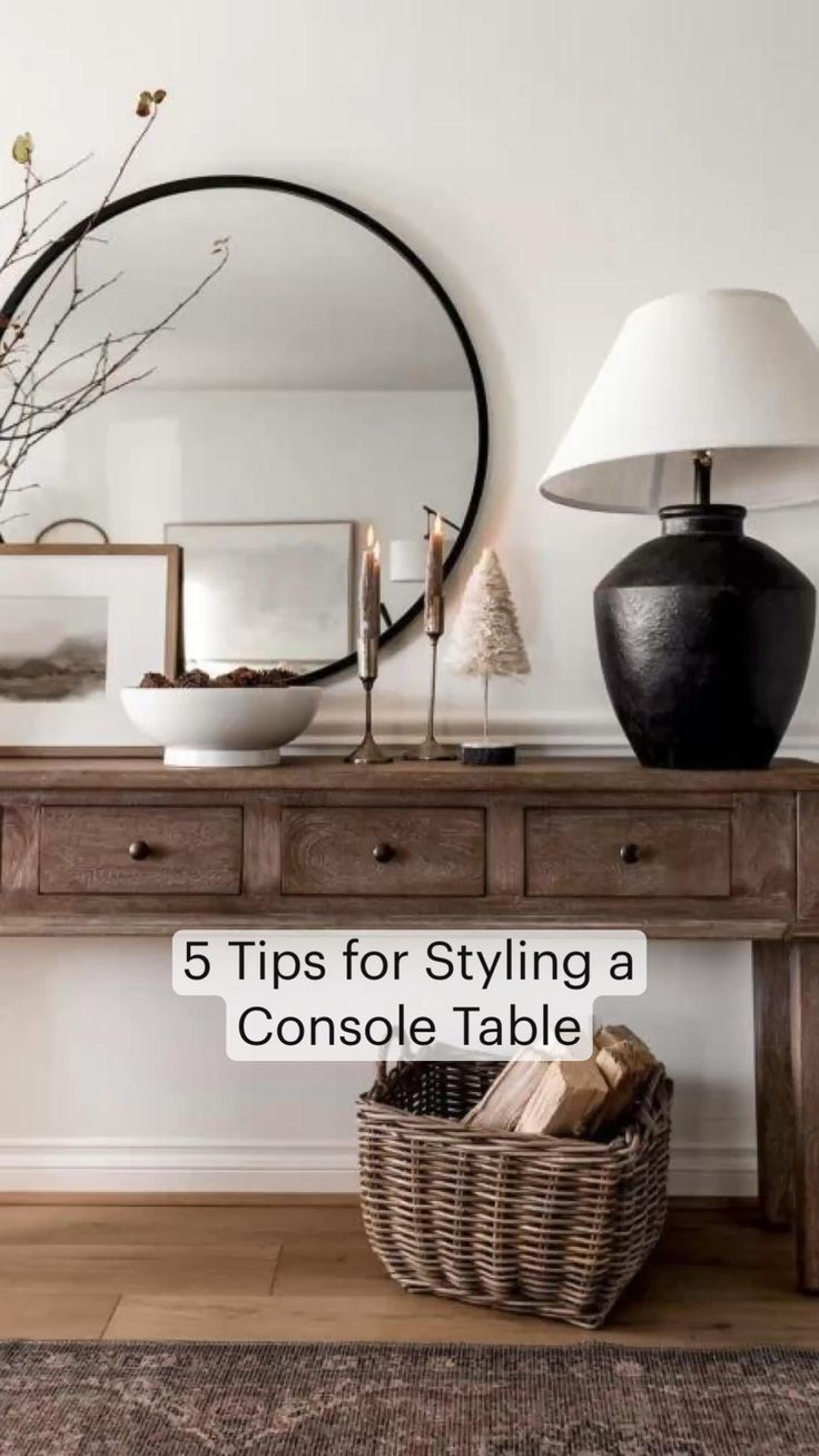
You’ve done it again. You spent twenty minutes moving that vase three inches to the left. You swapped the candle for the stack of books. You even tilted the mirror just so, hoping the light would catch it differently. But when you step back, wiping your hands on your jeans, it still looks… off. It’s not ugly. The pieces are nice. In fact, you love each item individually. Yet together, they sit there like actors who forgot their lines, staring blankly into the void. It feels flat. Two-dimensional. Like a screenshot of a room rather than the room itself.
It is frustrating, isn’t it? We see these perfect vignettes on social media or in magazines, and they look effortless. Effortless is a lie, by the way. But it’s a lie we keep buying into. The truth is, most of us miss one crucial ingredient. We focus on color. We obsess over symmetry. We worry about whether the lamp matches the rug. But we forget about touch. We forget about the physical weight and surface quality of objects. That missing "filter" Artera Home talks about? It’s usually texture. Without it, your eye has nowhere to rest and nothing to explore. It slides right off the surface.
Let’s fix that. Today. You don’t need to buy a whole new table or hire a decorator. You probably have everything you need in your house already. The secret isn’t in adding more stuff; it’s in changing how the stuff sits together. It’s about creating a landscape, not just a lineup. By the end of this, you’ll look at that lonely stretch of wood or stone differently. You’ll see potential where you once saw a problem. Ready to dig in? Good. Let’s make that table breathe.
The Invisible Problem: Why Smooth Surfaces Kill Vibe
Think about walking into a room with all white walls, white floors, and white furniture. Even if the shapes are interesting, your eyes get tired. They search for contrast. They look for edges. A console table often suffers from the same issue, but on a smaller scale. If your table is sleek glass, polished marble, or smooth painted wood, and you place smooth ceramic vases and glossy books on top, you have created a visual echo chamber. There is no friction. No tension. The eye glides over it without stopping because there is no variation in how light hits the surfaces.
This is what designers mean when they say a space lacks "depth." Depth isn’t just about physical distance; it’s about visual complexity. When everything reflects light the same way, the brain registers it as a single plane. It’s boring. In 2026, we are seeing a huge shift away from the ultra-minimalist, sterile looks of the early 2020s. People want warmth. They want homes that feel lived-in and tactile. A flat console table feels cold because it denies that human desire for touch. It feels like a display case, not a part of your life.
The fix starts with acknowledging that smooth is safe, but safe is invisible. To break the flatness, you need to introduce materials that absorb light, scatter it, or cast shadows. Think about the difference between a silk pillow and a chunky knit blanket. One shines; the other has nooks and crannies. Your decor needs that same variety. If your table is shiny, your decor needs to be matte. If your table is rough-hewn wood, your decor might need some sleek metal to bounce light back. It’s a dance of opposites. Without that push and pull, you’re just arranging objects, not designing a moment.
Layering Is Not Just Stacking: The Art of Elevation
Here is a common mistake: placing items directly on the tabletop. Sure, it’s functional. But it’s also the fastest way to look amateur. When everything sits on the same horizontal plane, you lose the z-axis. You lose height variation within the objects themselves. This is where trays, stacks of books, and small pedestals come in. They aren’t just clutter; they are risers. They lift your key pieces up, creating a second tier of visual interest. Suddenly, your vase isn’t just sitting there; it’s perched atop a leather-bound book, commanding attention.
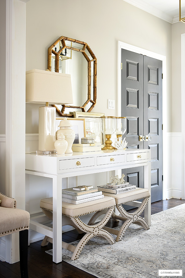
Layering creates shadows. And shadows are your best friend when fighting flatness. A shadow proves that an object has volume. It anchors it to the space. Try taking a simple bowl and placing it on a folded linen napkin or a small wooden board. Instantly, it feels more intentional. The napkin adds softness; the board adds structure. You’ve created a mini-stage for your object. This technique, often highlighted by stylists like those at White Cliff Studio, transforms a static arrangement into a dynamic composition. It invites the viewer to look closer, to see the relationship between the base and the object.
Don’t be afraid to overlap things either. In nature, things rarely sit in neat, separate rows. Leaves overlap branches; rocks pile against each other. Bring that organic chaos indoors. Let the edge of a book peek out from under a vase. Let a trailing plant spill over the side of a pot onto the table surface. This breaking of boundaries softens the rigid lines of the furniture. It makes the arrangement feel like it grew there, rather than being placed there. It’s subtle, but it adds a richness that straight lines can’t achieve. Remember, perfection is stiff. Life is messy. Let your table be a little bit messy.
The Texture Trinity: Mixing Hard, Soft, and Organic
If you want a cheat code for instant depth, memorize this trio: Hard, Soft, and Organic. Most people stick to one or two. They do hard (ceramic, metal) and maybe some organic (wood, stone). But they forget soft. Or they do soft and organic but miss the hard accent. You need all three to create a balanced sensory experience. Hard materials like glass, metal, or glazed ceramic provide structure and reflectivity. They catch the eye. Soft materials like linen, wool, paper, or dried grasses absorb light and add warmth. They invite touch. Organic materials like wood, stone, shells, or branches bring irregularity and natural imperfection.
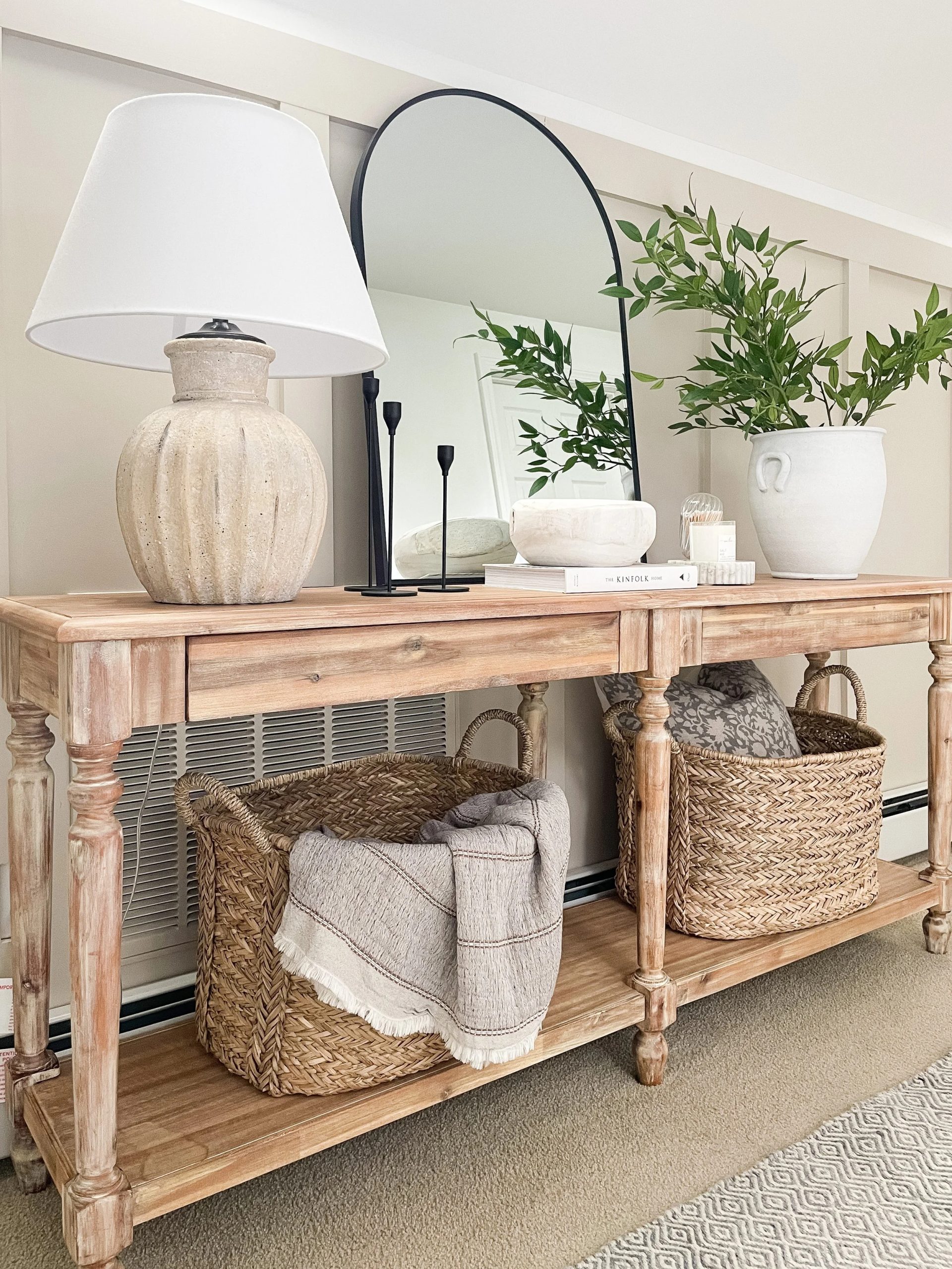
Let’s look at a practical example. Say you have a modern, sleek console. Start with a hard element: a metallic lamp or a glossy vase. That’s your anchor. Now, add something soft. Maybe a stack of books wrapped in textured paper, or a small woven basket tucked underneath. Finally, bring in the organic. A piece of driftwood, a stone sculpture, or a branch with dried leaves. See what happened? You now have shine, matte, rough, and smooth all in one small area. The eye jumps from one texture to another, keeping the brain engaged. It’s visually stimulating without being loud.
This mix is crucial for neutral palettes. If you are working with whites, creams, or beiges—which are hugely popular right now for their calming effect—texture is the only thing saving you from boredom. As noted by Restored Style, neutral styling relies heavily on varying finishes. A cream ceramic vase looks totally different next to a cream linen runner than it does next to a cream plastic box. One feels luxurious and deep; the other feels cheap and flat. By consciously rotating through these three categories, you ensure that every corner of your vignette has a different tactile story to tell. It’s about richness, not just color.
Playing with Height: The Triangle Rule and Beyond
We’ve talked about layering up, but let’s talk about the overall shape. The human eye loves triangles. It’s a stable yet dynamic shape. When styling a console, try to arrange your main items so they form a triangular silhouette. This doesn’t mean you need three identical items. It means you need a high point, a medium point, and a low point. Usually, the tallest item (like a lamp or tall vase) goes on one side or in the center. Then, you step down in height as you move outward. This creates a slope that guides the eye across the table, rather than letting it get stuck in the middle.
Why does this work? Because it creates movement. A flat line is static. A triangle has direction. It leads you somewhere. If you have two tall items on either end, make sure the middle is lower to create a U-shape, which is also pleasing but feels more encompassing. Avoid the "soldier line" where everything is the same height. That is the death of depth. It looks like a shelf in a store, not a home. Varying heights creates pockets of negative space, too. Those empty spots are important. They let the eye rest. They highlight the shapes of the objects around them.
Also, consider the height of the objects relative to the wall behind them. If you have a large mirror or artwork, your decor shouldn’t compete with it. If the art is busy, keep the decor lower and simpler. If the wall is bare, you can go taller and bolder. The goal is harmony between the vertical plane (the wall) and the horizontal plane (the table). Think of it as a stage set. The backdrop matters. If your mirror is huge, maybe you only need one tall sculptural piece in front of it, rather than a cluster. Let the reflection add depth for you. The mirror doubles the space, literally, so use it to amplify your textures, not clutter them.
The Power of Imperfection: Wabi-Sabi and Lived-In Charm
In 2026, we are finally moving past the era of the "showroom home." People are tired of spaces that look like no one actually lives there. They want character. They want stories. This is where the Japanese concept of Wabi-Sabi comes in handy. It’s the appreciation of the imperfect, the impermanent, and the incomplete. A chipped mug. A weathered book. A vase with a slight asymmetry. These flaws add soul. They break the monotony of machine-made perfection. When your console table looks too pristine, it feels cold. Adding items with history or visible hand-making marks adds instant warmth and depth.
Look for items that show their age or their process. Hand-thrown pottery often has ridges or uneven glazes. These catch the light in unpredictable ways, creating micro-shadows that smooth factory-made items lack. Wooden bowls with visible grain patterns or knots add visual noise in a good way. Even paper—like old maps, sheet music, or handwritten letters framed or stacked—adds a delicate, fragile texture that contrasts beautifully with heavy stone or wood. It reminds us that humans made these things. Humans touched them.
Don’t be afraid to rotate items seasonally or even weekly. A console table shouldn’t be a museum exhibit. Change the books. Swap the greenery. Put out a bowl of pinecones in winter and sea glass in summer. This constant evolution keeps the space feeling fresh and alive. It also prevents you from getting "blind" to your own decor. When you change things up, you notice new textures and combinations you hadn’t seen before. It keeps the creative juices flowing. And honestly? It’s fun. Styling should be play, not a chore. If it feels like a test you’re failing, you’re overthinking it. Just put something there that makes you smile.
You can have the perfect mix of textures and heights, but if the lighting is wrong, it will still fall flat. Lighting is the paintbrush that highlights your textures. Overhead lighting is usually terrible for consoles because it casts harsh downward shadows that hide details. Instead, use a table lamp. The warm glow from a bulb at eye level rakes across the surfaces of your objects, exaggerating their textures. It makes the roughness of a stone pop. It makes the weave of a basket visible. It creates a cozy, inviting pool of light that draws people in. If you don’t have an outlet, battery-operated puck lights tucked behind decor or LED candles work wonders too.
Then, there’s greenery. Nothing adds life like actual life. Plants introduce irregular, organic shapes that soften the hard lines of furniture and decor. A trailing pothos spilling over the edge breaks the rectangular boundary of the table. A tall fiddle leaf fig behind the table adds vertical depth and fills the space between the table and the ceiling. Even a simple branch in a vase works. The key is to let the plants be a bit wild. Don’t trim them into perfect spheres. Let them reach and twist. Their shadows on the wall behind add another layer of visual interest, especially in the evening when the lamp is on.
Finally, step back. Look at the whole picture. Is there a spot that feels empty? Is there a spot that feels crowded? Adjust. Move things an inch. Tilt a book. Fluff the linen. Styling is an iterative process. It’s not about getting it right the first time; it’s about listening to what the space is telling you. If it feels heavy on one side, add something light and airy on the other. If it feels dark, add something reflective. Trust your gut. You know what feels good to you. The goal isn’t to impress a magazine editor; it’s to create a little corner of your home that makes you pause and appreciate the beauty in the everyday. That’s the real win.
So, there you have it. The mystery of the flat console table isn’t a mystery at all. It’s just a lack of conversation between materials. By mixing hard, soft, and organic elements, playing with height and layers, embracing imperfection, and using light wisely, you can transform a boring surface into a focal point. It doesn’t require a big budget or a degree in design. It just requires a little attention to detail and a willingness to experiment. Go look at your table again. Really look at it. What’s missing? Maybe it’s just a little bit of roughness. Or a little bit of shadow. Go find it. Your home is waiting.