You know that feeling when you buy a beautiful sweater online? It looks like a rich, deep emerald green on your screen. But when the package arrives, you pull it out under your kitchen lights and… it’s kinda muddy. Maybe even teal. You feel cheated. That disconnect between expectation and reality? That is exactly what bad lighting does to your entire home, every single day.
For years, we’ve obsessed over lumens. We want bright rooms. We want energy efficiency. But we’ve ignored the quality of that light. Artists and interior designers have known this secret for decades. They don’t just care if a room is lit; they care how the light tells the truth. In 2026, as our homes become our studios, offices, and sanctuaries all at once, understanding this nuance isn’t just for pros. It’s for anyone who wants their space to feel right.
What Is CRI and Why Should You Care?
Let’s strip away the jargon. CRI stands for Color Rendering Index. It sounds technical, but the concept is simple. It’s a score from 0 to 100 that measures how accurately a light source shows colors compared to natural sunlight. Sunlight is the gold standard. It has a CRI of 100. It shows every color exactly as it is meant to be seen.
Most standard LED bulbs you find in big-box stores have a CRI of around 80. That might sound high, but think about it. If sunlight is 100, an 80 is missing 20 points of accuracy. That’s where the distortion happens. Reds look dull. Blues look washed out. Skin tones can look gray or sickly. When designers talk about "high CRI," they usually mean a rating of 90 or above. Some premium bulbs hit 95 or 97. The difference is subtle to the untrained eye at first, but once you see it, you can’t unsee it.
Why does this matter to you? Because light is the medium through which we experience our homes. If the light is lying to you, your whole environment feels slightly off. You might not know why your living room feels cold or why your art looks flat. It’s likely the CRI. By choosing lighting with a higher score, you’re essentially upgrading the resolution of your vision. You see more detail. More depth. More life.
The Artist’s Eye: Seeing Colors As They Truly Are
Ask any painter or photographer about their studio lights, and they’ll get passionate fast. For them, color accuracy isn’t a luxury; it’s a necessity. Imagine trying to mix a specific shade of ochre for a landscape painting, but your overhead light masks the yellow undertones. You’d end up with a muddy mess on the canvas. High CRI lighting eliminates that guesswork. It allows artists to trust what they see.
But you don’t have to be a professional painter to benefit from this. Think about the hobbies you do at home. Maybe you love knitting with vibrant yarns. Under low CRI light, a burgundy yarn might look brown. You could accidentally mismatch colors in your project. Or perhaps you’re into interior styling, arranging flowers or setting a table. High CRI light makes those reds pop and the greens look lush. It honors the effort you put into choosing those items.
It’s also about respect for the objects we love. We spend money on nice things—art prints, rugs, ceramics. When we illuminate them with poor quality light, we’re actually diminishing their value. A high-CRI bulb acts like a clear window, letting the true character of your belongings shine through. It’s a small change that makes your home feel more curated and intentional.
Designers’ Secret Weapon for Interior Spaces
Interior designers swear by high CRI because it changes the mood of a room instantly. Lighting isn’t just about visibility; it’s about emotion. A space lit with high-quality light feels warmer, more inviting, and more luxurious. It’s hard to pinpoint why, but clients often describe these rooms as feeling "cleaner" or "more alive." That’s the color fidelity at work.
Consider the texture of materials. Fabric, wood grain, stone veins—these details rely on contrast and shadow to be seen. Low CRI light flattens everything out. It creates a visual noise that makes a room feel chaotic or tired. High CRI light enhances the depth of textures. That velvet sofa looks softer. The marble countertop looks more dramatic. It elevates the design without adding a single new piece of furniture.
In 2026, open-concept living is still huge. We want our kitchens to flow into our living rooms. But different tasks need different light qualities. Designers use high CRI fixtures strategically. They might use them in pendant lights over a kitchen island to make food look appetizing (nobody wants to eat gray-looking chicken). Then they might use dimmable high-CRI recessed lights in the living area to create a cozy evening vibe that still retains color richness. It’s about layering light with purpose.
Beyond the Studio: Everyday Moments That Change
Let’s talk about the bathroom. This is arguably the most important place for high CRI lighting in your home, yet it’s often overlooked. Think about your morning routine. Applying makeup, shaving, checking your skin. If your vanity lights have a low CRI, you are literally seeing a distorted version of yourself. You might apply too much foundation because the light washes you out. Or you might miss a spot while shaving because the shadows are wrong.
High CRI bulbs in the bathroom help you see natural skin tones accurately. It’s not about vanity; it’s about functionality. You leave the house confident that you look like you think you do. No surprises when you step into natural daylight outside. It’s a small comfort, but it starts your day on a grounded note.
Then there’s the kitchen. Cooking is a sensory experience, and sight is a huge part of that. We judge the freshness of produce by its color. Is that basil bright green or wilting yellow? Is that steak seared to a perfect brown or still raw? High CRI lighting makes food look vibrant and fresh. It turns meal prep from a chore into a more enjoyable ritual. Plus, cleaning up is easier when you can actually see if the counter is clean.
How to Choose the Right Bulbs for Your Home
So, how do you actually buy this stuff? It’s getting easier. In recent years, manufacturers have started labeling CRI more clearly. Look for the box. You want to see "CRI 90+" or "High CRI." Sometimes it’s written as R9 value, which measures how well reds are rendered. A high R9 is crucial for warm, inviting spaces. Don’t just look at the wattage or lumens. Flip the box over.
Start small. You don’t need to rewire your whole house overnight. Pick one room that matters most to you. Maybe it’s your reading nook or your workspace. Swap out the bulbs there first. Notice the difference. Pay attention to how the colors of your books, plants, or decor change. You’ll likely find the space feels calmer. Once you feel the impact, expand to other areas.
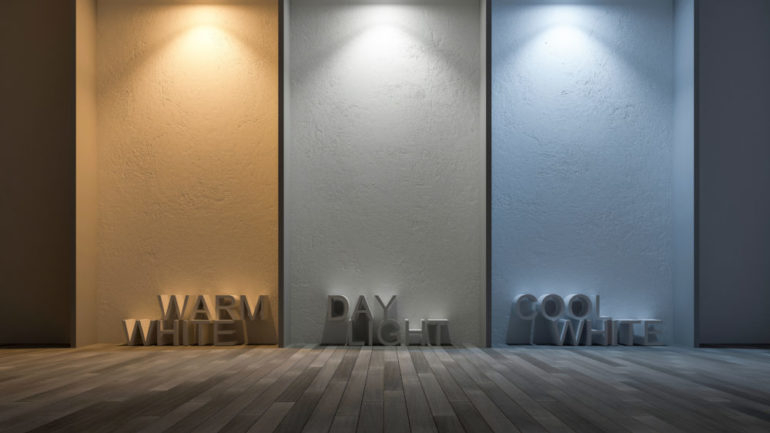
Be wary of cheap LEDs. Just because it says LED doesn’t mean it’s good quality. Some budget brands sacrifice CRI to keep costs down. Stick to reputable lighting brands that specialize in quality. It might cost a few dollars more per bulb, but the longevity and visual comfort are worth it. Also, consider the color temperature. High CRI works best when paired with the right Kelvin rating. 2700K to 3000K is usually ideal for homes, giving that warm, sunlight-like glow.
There’s a psychological component to this that we rarely discuss. Poor lighting causes eye strain. When our brains have to work harder to interpret distorted colors, we get fatigued. It’s subtle, but it adds up. By the end of the day, you might feel more tired than you should. High CRI lighting reduces this cognitive load. It’s easier on the eyes. It feels natural because it mimics the light we evolved under.
In a world that’s increasingly digital and artificial, bringing natural-quality light into our homes is a form of self-care. It connects us to the rhythm of the day. It makes our spaces feel like sanctuaries rather than just boxes we live in. Artists and designers know this intuitively. They understand that environment shapes behavior. A well-lit room encourages creativity, relaxation, and connection.
Think about the last time you sat in a cafe with great natural light. Everything looked better. The coffee, the people, the pastries. You felt good. High CRI lighting tries to replicate that feeling indoors, at night, or on cloudy days. It’s about reclaiming that sense of clarity and warmth. It’s not just about seeing; it’s about feeling seen. And isn’t that what a home should do?
Lighting is often the last thing we think about in design, but it should be the first. It’s the invisible architect of our daily lives. By choosing high CRI bulbs, you’re making a choice to see your world clearly. To honor the colors you love. To create a space that supports rather than drains you. It’s a simple switch, literally and figuratively. So go ahead. Check your bulbs. Your eyes, and your home, will thank you.