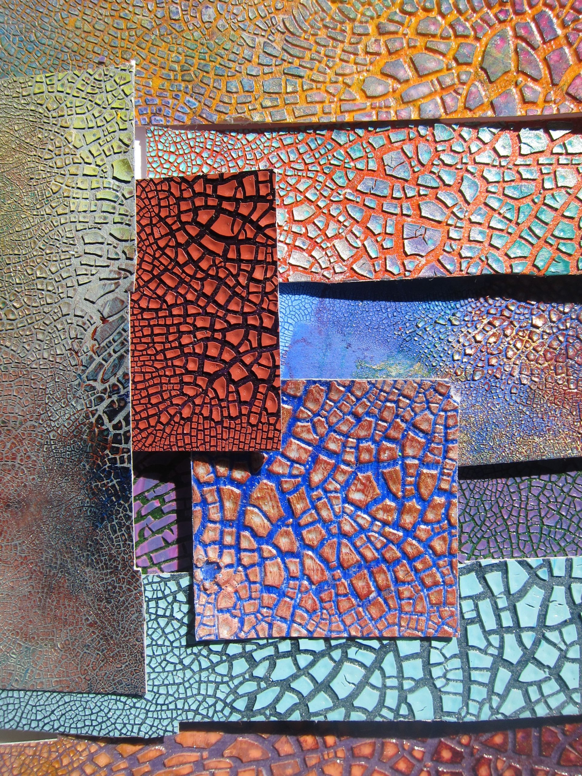
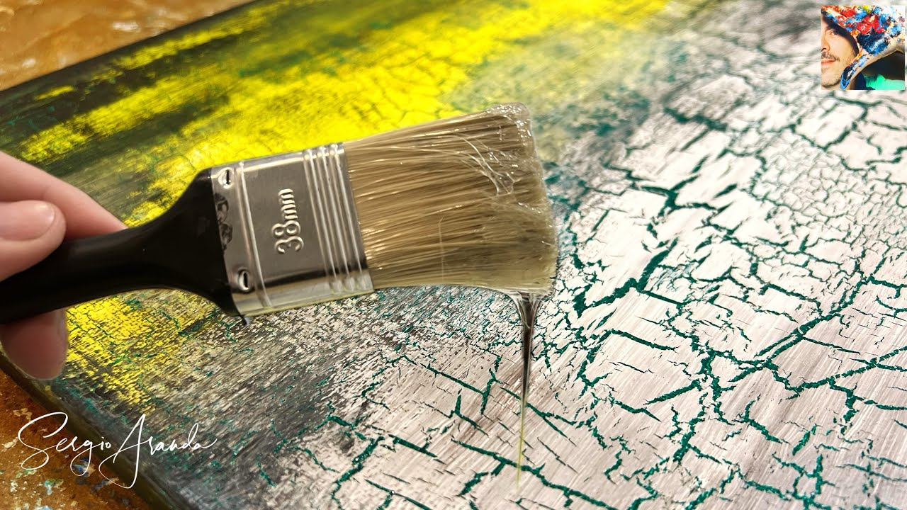
There is something deeply satisfying about imperfection. We spend so much time trying to make things smooth, flawless, and uniform. But then you see a piece of pottery with a web of fine lines running across it, or an old wooden chair with paint that has aged into a map of tiny fissures. It stops you. It makes you look closer. That’s the magic of crackle. It’s not just a defect; it’s a texture. It’s history written in miniature.
But here is the thing. A crackle pattern on its own can be subtle. Sometimes too subtle. If you have a white glaze with white cracks, or beige paint on beige wood, the effect gets lost. It whispers instead of sings. This is where the old masters—and modern crafters who love a bit of drama—reach for ink. Specifically, traditional inks like India ink, iron oxide washes, or even homemade pigment suspensions. By rubbing these dark, fluid mediums into the cracks, you turn a quiet texture into a bold graphic statement. It’s like tracing over a pencil sketch with a pen. Suddenly, the design pops.
This technique isn’t new. Potters in Asia have been doing it for centuries, accentuating the crazing in celadon glazes. Furniture restorers in Europe used pigmented waxes and inks to make age look intentional rather than accidental. Today, in 2026, we have more tools than ever, but the core principle remains the same. You need a contrast. You need something dark and fluid to seek out the low points. And you need a little bit of patience. Let’s dive into how you can master this ancient yet timeless skill, whether you are working with clay, wood, or canvas.
Understanding the Canvas: Why Crackle Happens
Before you can highlight a crack, you have to understand why it’s there. It’s not random chaos. It’s physics. Crackle happens when two layers of material shrink at different rates. Think of it like a tug-of-war. You have a base layer—maybe a coat of paint, a layer of glue, or a ceramic glaze fused to clay. Then you have a top layer. If the top layer dries or cools faster than the bottom, it wants to shrink. But the bottom layer holds it back. So, the top layer snaps. It breaks apart to relieve the tension. Those breaks are your cracks.
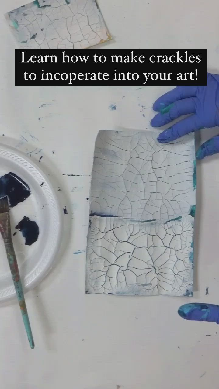
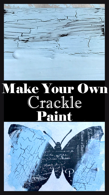
In ceramics, this is often called "crazing." It happens when the glaze has a higher coefficient of thermal expansion than the clay body underneath. As the pot cools down after firing, the glaze contracts more than the clay. Snap. Webbed lines appear. In painting, especially with acrylics, we often force this effect using a "crackle medium." This is a special goo that sits between two coats of paint. As it dries, it pulls the top coat apart. The thicker you apply the medium, the bigger the cracks. Thin application means tiny, spiderweb-like fractures.
Why does this matter for inking? Because the depth and width of the crack determine how well the ink will hold. A shallow, hairline crack might only catch a whisper of pigment. A deep, wide fissure can hold a lot of ink, creating a bold, black line. If you are planning your project, think about the scale. Do you want a delicate, antique lace look? Go for thin cracks. Do you want a rugged, weathered barn-wood vibe? You’ll want wider gaps. Knowing this helps you choose the right ink viscosity later on. Thick ink might bridge over small cracks, missing them entirely. Thin, watery ink will flow right in.
Choosing Your Ink: From India Ink to Iron Oxide
Not all inks are created equal. When we talk about "traditional" techniques, we are usually talking about carbon-based or iron-based pigments suspended in a liquid binder. The most common hero here is India ink. It’s dense, black, and permanent once it dries. It’s made from soot (carbon) and a binder like shellac or gelatin. Because it’s so dark, it provides maximum contrast against light-colored crackles. It’s also water-resistant when dry, which is great if you plan to seal your piece later. But be warned: it stains everything. Your hands, your table, your soul. Wear gloves.
Then there is iron oxide. This is what gives rust its color, but in a controlled form, it creates rich browns, reds, and blacks. Artists often mix iron oxide powder with water or a mild acid to create a wash. This feels more organic than India ink. It doesn’t look like a sharp black line; it looks like dirt that has settled into the crevices over decades. It’s perfect for that "found in an attic" aesthetic. You can buy pre-made iron oxide stains, or you can make your own by soaking steel wool in vinegar for a few weeks. It’s slow, but the color is unbeatable.
For those who want to get really historical, you might look into oak gall ink or walnut ink. These were the standard writing inks for centuries. Walnut ink, in particular, is a favorite among bookbinders and paper artists. It’s translucent and warm. When rubbed into crackles, it doesn’t shout; it murmurs. It adds depth without looking like someone drew on your project with a marker. The downside? These natural inks can fade over time if exposed to strong sunlight. If your piece is going to sit in a window, stick to carbon-based India ink or synthetic acrylic inks designed for permanence.
The Application Dance: Rubbing, Wiping, and Waiting
Here is where the magic happens. You have your cracked surface. You have your ink. Now what? You don’t just paint it on. That would cover the cracks and the surface alike, defeating the purpose. The technique is all about subtraction. You apply the ink generously, forcing it into every nook and cranny. Then, you remove the excess from the high points. It’s a dance of addition and removal.
Start by applying the ink with a soft cloth, a sponge, or even your fingers (if you don’t mind the stain). Rub it in circular motions. You want to feel the ink sinking into the fissures. Don’t be shy. Cover the whole area. Let it sit for a minute or two. This dwell time allows the liquid to penetrate deep into the cracks. If you wipe it off too soon, the lines will be faint. If you let it dry completely, you’ll never get it off the surface. Timing is everything.
Now, take a clean, lint-free rag and start wiping. Wipe with the grain if you are on wood. Wipe in broad, sweeping strokes if you are on ceramic or canvas. You’ll see the dark ink come off the flat surfaces, leaving the background color visible. But the ink stays in the cracks. Keep wiping until you are happy with the contrast. Some people like a heavy, dramatic look where the cracks are thick and black. Others prefer a ghostly hint of gray. You can control this by how hard you wipe. If you wipe too much, you can always add more ink and repeat the process. It’s forgiving.
Ceramic Secrets: Highlighting Glaze Crazing
Ceramics offer a unique challenge because the surface is non-porous (usually) and hard. Unlike wood, which can absorb some ink, glazed pottery repels liquid. This means the ink sits on top until you wipe it away. This is actually an advantage. It gives you total control. In 2026, many studio potters are revisiting traditional Raku-style finishes, even without the Raku firing process. They create crackle glazes in standard electric kilns and then use ink to mimic the smoked, carbon-trapped look of traditional Raku.
The key here is cleanliness. Before you even think about ink, your piece must be spotless. Any dust or grease on the surface will resist the ink unevenly, creating blotches. Wash your fired piece with warm soapy water and let it dry completely. Some artists even wipe it down with alcohol to ensure there is no residue. Then, apply your India ink or iron wash. Because the glaze is glass-like, the ink will wipe off very cleanly from the highs. This creates a crisp, sharp line that looks almost printed.
One pro tip for ceramics: use a stiff brush, like an old toothbrush, to scrub the ink into the cracks before wiping. Glaze cracks can be very fine. A soft cloth might glide over them without pushing the ink in. A stiff brush agitates the liquid and forces it down. After wiping, if you find some areas are still too light, you can repeat the process. Just make sure the first layer is totally dry if you are using a water-based ink, otherwise you’ll just muddy it up. For a permanent finish, some artists fire the piece again at a low temperature after inking, but this is risky as the ink can burn off or discolor. Most prefer to seal it with a clear matte spray varnish instead.
Wood and Furniture: Creating Age on Demand
Wood is different. It breathes. It absorbs. When you are working with furniture or wooden crafts, the crackle effect is usually created with paint and medium, not natural cracking. But the inking principle is similar, with one big twist: the wood grain itself can trap ink. If you aren’t careful, your piece won’t just look cracked; it’ll look dirty. To avoid this, you need a good sealant before you start the crackle process, or you need to be very strategic with your wiping.
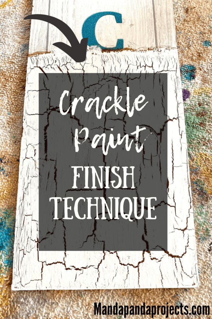
Let’s say you’ve painted a wooden box with a base coat of blue, applied crackle medium, and topped it with white paint. Now you have white cracks showing the blue underneath. To highlight this, you might use a dark brown walnut ink or a black wax. Apply it gently. Don’t scrub it in like you would on ceramic. Instead, dab it on and immediately wipe it off. You want the ink to stay only in the paint cracks, not sink into the wood pores exposed by sanding or wear.
Another popular method for wood is using colored waxes instead of liquid ink. As mentioned in restoration circles, mixing pigment into clear paste wax creates a controllable, blendable highlighter. Wax doesn’t soak in as fast as ink. It sits on the surface longer, giving you more time to work it into the cracks and buff it off. It also adds a sheen that protects the paint. This is ideal for furniture that will be handled frequently. The wax fills the cracks slightly, protecting them from accumulating real dirt later on. It’s a functional beauty.
Troubleshooting and Finishing Touches
So, you tried it. And maybe it didn’t go perfectly. Maybe the ink smeared. Maybe the cracks disappeared. Don’t panic. This is part of the process. One common issue is "bridging," where the ink forms a film over the cracks instead of staying inside them. This usually happens if the ink is too thick or if you didn’t let it penetrate long enough. The fix? Dilute your ink slightly with water (if it’s water-based) and try again. Or, use a finer tool, like a cotton swab, to trace the cracks individually. It’s tedious, but it works for small projects.
Another issue is over-wiping. You wiped so hard you removed the ink from the cracks too. If this happens, let the piece dry completely. Then, apply a very thin wash of ink over the whole thing again. This time, wipe lightly and quickly. You’re just tinting the surface slightly while leaving the darker accumulation in the cracks. It’s about building layers.
Finally, think about protection. Ink, especially India ink, can be water-soluble if it’s not fully cured or if it’s a cheaper brand. If your piece is going to be touched, washed, or exposed to humidity, you need to seal it. Use a clear acrylic sealer for painted items. For ceramics, a clear matte glaze spray works well. For wood, a topcoat of polyurethane or wax will lock the ink in place. Test your sealer on a scrap piece first. Some sealers can reactivate the ink, causing it to bleed. A light mist coat first, let it dry, then a heavier coat is usually safer.
At the end of the day, highlighting crackle patterns with ink is about celebration. You are celebrating the break. The flaw. The moment where tension became visible. In a world that often demands seamless perfection, there is a quiet rebellion in making a crack the star of the show. It reminds us that things change. They age. They bear the marks of their creation and their use.
Whether you are a potter pulling a bowl from the kiln, a painter experimenting with acrylics, or a restorer bringing new life to an old chair, these techniques connect you to a long line of makers. From the Song Dynasty potters who prized the "gold thread" crackles in their Guan ware, to the Victorian furniture makers who faked age for style, the desire to highlight texture is universal. It’s tactile. It invites the eye to travel across the surface, following the lines like roads on a map.
So go ahead. Make a mess. Get ink on your hands. Let the cracks happen. And then, take that dark, rich ink and show them off. You might find that the broken pieces are the most beautiful ones of all. And if you mess up? Well, just paint over it and start again. That’s the beauty of craft. There’s always another layer.