Ever walk into a room and feel like something is just… off? Maybe the bed is made, the floors are clean, but the vibe feels flat. Often, the culprit is that big, blank rectangle against the wall: the dresser. It’s functional, sure. We shove socks and t-shirts in there. But the top? That’s prime real estate. In 2026, we’re seeing a huge shift away from sterile, showroom-perfect surfaces toward spaces that actually feel lived-in and loved.
Styling a dresser isn’t about buying expensive decor you don’t need. It’s about intention. It’s about taking a surface that usually collects junk mail and loose change and turning it into a little sanctuary. You don’t need a degree in interior design to get it right. You just need a eye for balance and a willingness to play around. Let’s dive into how you can make that space work for you, not against you.
Start With a Clean Slate and a Clear Mind
Before you buy a single vase or frame, you have to clear the deck. I mean really clear it. Take everything off. Wipe it down. Look at the wood grain or the paint finish. What are you working with? This step is crucial because clutter is the enemy of style. If your dresser top is covered in half-empty water glasses, charging cables, and old receipts, no amount of styling will fix it. You need a canvas.
Once it’s bare, think about function. Do you actually use this surface every morning? If you do your makeup there, you’ll need good light and maybe a tray for your essentials. If it’s just a place to drop your keys when you walk in, keep that zone clear. In 2026, the trend is "functional beauty." It’s not enough for it to look good; it has to work for your life. Don’t force a delicate glass sculpture onto a surface where you routinely toss your wallet. That’s a recipe for disaster and frustration.
Take a moment to assess the scale too. A tiny nightstand-sized dresser needs different treatment than a massive nine-drawer unit. Measure the width and depth. Know your limits. This helps you avoid buying decor that’s either comically small or so large it overwhelms the piece. Think of it as setting the stage before the actors arrive. You want the foundation to be solid.
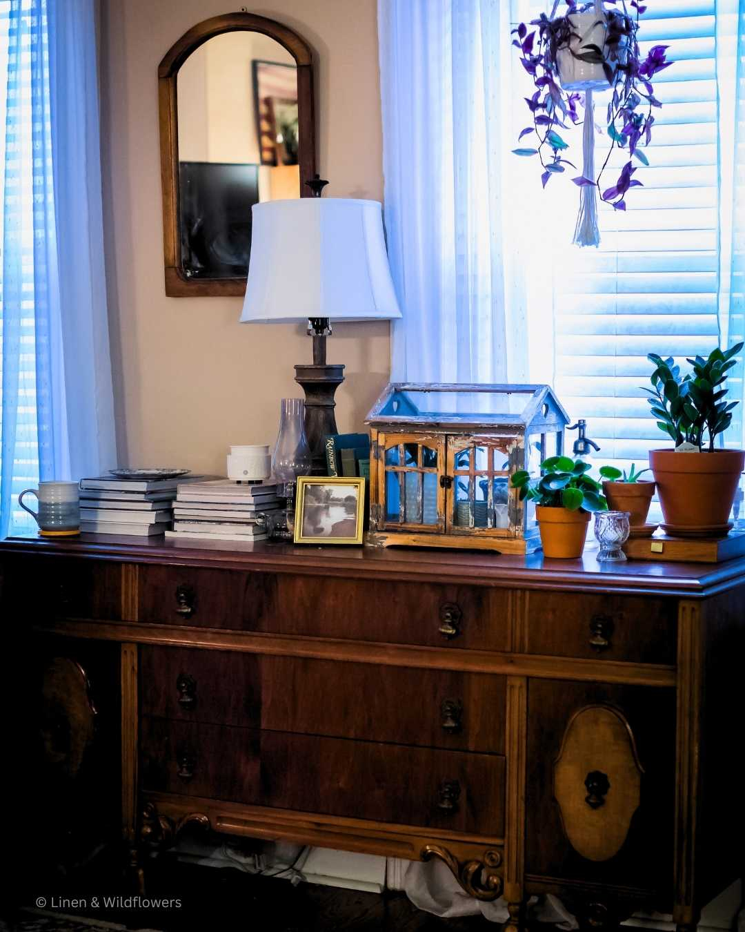
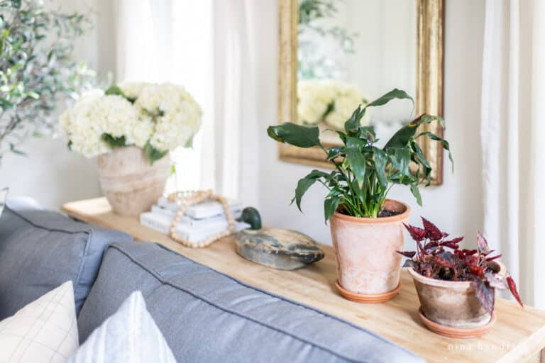
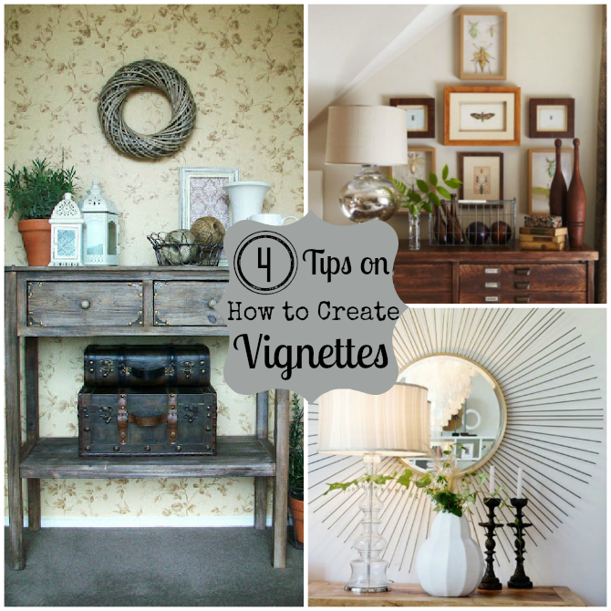
Anchor the Space With Height and Reflection
Every good vignette needs an anchor. This is the tallest item in your arrangement, and it draws the eye up. Without it, your display looks flat and spread out. The most classic choice? A mirror. But not just any mirror. In recent years, we’ve moved away from the standard rectangular bathroom mirror look. Think organic shapes, arched tops, or even leaning floor mirrors propped safely behind the dresser if the wall allows.
Mirrors do double duty. They reflect light, making the room feel bigger and brighter, and they add depth. If a mirror isn’t your thing, consider a large piece of art leaned against the wall. Or a tall, sculptural vase. The key is height. You want something that breaks the horizontal line of the dresser. This creates vertical interest and stops the eye from just sliding off the edge.
Placement matters here. If you center the mirror, you get a symmetrical, formal look. It’s calm and orderly. If you offset it to one side, you create dynamic energy. It feels more casual and modern. There’s no wrong answer, only what feels right for your room. Just make sure whatever you choose is secure. Nobody wants a crashing sound at 2 AM.
Layering Textures for Visual Interest
Now that you have your anchor, it’s time to build around it. This is where texture comes in. If everything is smooth and shiny, it feels cold. If everything is rough and matte, it feels heavy. You need a mix. Think about materials: wood, metal, glass, ceramic, fabric, stone. The contrast between these elements is what makes a display feel curated rather than just "placed."
For example, if your dresser is dark wood, try a light-colored ceramic lamp or a woven rattan tray. If the dresser is painted white, add warmth with brass accents or a wooden box. In 2026, natural materials are having a major moment. People are craving connection to nature, so incorporating stone, dried branches, or linen adds that organic touch. It softens the hard lines of the furniture.
Don’t be afraid to mix eras too. A vintage brass candlestick next to a modern minimalist clock creates tension and interest. It tells a story. It says you’ve collected these things over time, not bought them all in one go from a catalog. This layering adds richness. It invites people to look closer. It makes the space feel personal and unique to you.
The Rule of Three and Asymmetrical Balance
Here’s a secret designers use all the time: the rule of three. Our brains find odd numbers more appealing and memorable than even numbers. So, when grouping items, think in threes. A lamp, a stack of books, and a small plant. Or a tray, a perfume bottle, and a jewelry dish. It creates a natural rhythm.
But balance doesn’t always mean symmetry. In fact, asymmetrical balance is often more interesting. Imagine a tall lamp on the left side. To balance it, you don’t need another tall lamp on the right. Instead, you might use a group of smaller items on the right—a horizontal stack of books, a small bowl, and a framed photo. The visual weight is equal, but the shapes are different. It feels effortless and chic.
Play with height within these groups too. You want variation. Don’t line up three items of the exact same height. It looks like a soldier parade. Stagger them. Let one item peek out from behind another. Create depth by placing some items closer to the wall and others near the front edge. This layering makes the display feel three-dimensional and inviting. It’s like composing a photograph; you want foreground, midground, and background.
Lighting: The Unsung Hero of Ambiance
Lighting can make or break a dresser display. Yet, it’s often an afterthought. Don’t rely solely on overhead lights. They cast harsh shadows and flatten the room. Instead, add a table lamp. It provides warm, localized glow that makes the bedroom feel cozy and intimate. In 2026, we’re seeing a rise in sculptural lamps that act as art pieces even when they’re turned off.
Consider the color temperature of your bulbs. Stick to warm whites (around 2700K to 3000K). Cool, blue-toned light feels clinical and sterile. Warm light enhances skin tones, which is great if you use the dresser for getting ready, and it makes wood tones and fabrics look richer. It sets the mood for relaxation.
If space is tight, you don’t need a traditional lamp. Try a small plug-in sconce mounted on the wall above the dresser. Or use battery-operated puck lights inside a glass cloche or under a tray. These subtle touches add magic. They highlight your favorite objects and create pools of light that draw the eye. It’s about creating atmosphere, not just illumination. Think about how the light hits your textures. Does it glint off the glass? Does it soften the fabric? Use light as a tool to enhance your other choices.
Finally, and most importantly, make it yours. A perfectly styled dresser that looks like a hotel lobby is boring. It lacks soul. Inject your personality. Display photos of loved ones, but don’t just line them up. Lean them against the mirror or tuck them into a stack of books. Show off souvenirs from travels. A weird rock you found on a hike. A handmade pot from a local artist.
These items spark joy and conversation. They remind you of who you are and what you love. In a world that moves so fast, having these tangible connections to your memories is grounding. Don’t worry if they don’t "match" perfectly. Eclectic is in. Mismatched frames add character. A quirky figurine adds whimsy.
Rotate these items seasonally or whenever you feel the urge for a change. It keeps the space feeling fresh without requiring a total overhaul. Swap out a summer shell collection for winter pinecones. Change the book stack to reflect what you’re currently reading. This flexibility is key to maintaining a space that feels alive and evolving. It’s your sanctuary, after all. It should reflect the current chapter of your life.
So, take a look at your dresser today. Really look at it. See the potential. Clear the clutter, add some height, mix those textures, and throw in a bit of yourself. It doesn’t have to be perfect. It just has to feel right. And honestly? That’s the best kind of design there is.