We’ve all been there. You stand in front of your bookcase, holding a ceramic vase in one hand and a stack of hardcovers in the other, feeling that familiar knot of anxiety tighten in your chest. It looks… off. Maybe it’s too busy? Or perhaps it feels sterile, like a showroom nobody is allowed to touch. In 2026, where our digital lives are increasingly chaotic, our physical spaces have become sanctuaries. We crave order, but we also crave personality. The struggle isn’t just about storage; it’s about storytelling. How do you tell your story without shouting?
The secret isn’t in buying new things. It’s rarely about having the "right" decor. It’s about editing. It’s about understanding how the eye moves across a surface and giving it places to rest. When you mix books and objects correctly, the shelf doesn’t just hold stuff; it breathes. It becomes a backdrop that makes the whole room feel lighter, calmer, and more inviting. Let’s dive into how you can transform that chaotic jumble into a curated display that actually reflects who you are.
The Power of Negative Space
Most people make the mistake of thinking empty space is wasted space. It’s not. In design, negative space is active. It’s the silence between the notes that makes the music. If every inch of your shelf is covered, the eye has nowhere to land. It gets exhausted. Think of your shelves like a gallery wall. You wouldn’t hang paintings edge-to-edge until they touched, right? You’d leave breathing room so each piece could stand out. The same logic applies here.
Start by removing everything. Yes, everything. Take it all down and put it on the floor. This feels drastic, but it’s necessary. Now, before you put anything back, ask yourself: what are the absolute essentials? What brings me joy or serves a function? As you begin to place items back, aim to fill only about 60-70% of the shelf. Leave gaps. Let the back of the bookcase show through in spots. This transparency creates depth and prevents that heavy, boxed-in feeling that makes a room look smaller than it is.
This approach also makes maintenance way easier. A streamlined setup means dusting is a breeze, and swapping out pieces seasonally doesn’t feel like a headache. When you showcase fewer objects, each one carries more weight. That single sculptural bowl becomes a statement rather than getting lost in a crowd of knick-knacks. It’s about intentionality. Every item should earn its spot. If it doesn’t spark joy or serve a purpose, it probably doesn’t belong there.
Anchor with Books, Elevate with Objects
Books are the heavy lifters of shelf styling. They provide structure, color, and scale. But if you just line them up spine-out from left to right, it can look a bit like a library archive—functional, sure, but maybe lacking warmth. To mix them with objects effectively, you need to vary their orientation. Try stacking some horizontally and standing others vertically. This creates visual interest and breaks up the monotony of vertical lines.
Horizontal stacks act as pedestals. They are perfect for placing smaller objects on top, like a small plant, a candle, or a unique stone you found on a hike. This elevates the object, literally and figuratively, drawing the eye to it. Meanwhile, vertical rows of books provide height and rhythm. You don’t need to fill the entire vertical space either. Leave some air above the tallest book. This connects the shelf to the one above it, creating a flow rather than distinct, isolated boxes.
When choosing which books to display, consider their covers. In 2026, we’re seeing a return to appreciating book design as art. If you have beautiful editions, face them outward. If not, don’t worry. You can turn some spines inward for a neutral, textured look, though purists might cringe. It’s your home, after all. The key is balance. If you have a large stack of dark-spined books on the left, try balancing it with a lighter-colored object or a smaller stack on the right. It’s a seesaw, not a symmetrical mirror.
The Rule of Three and Visual Triangles
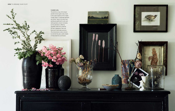
Designers love the rule of three, and for good reason. Odd numbers are more dynamic and natural to the human eye than even numbers. When grouping items, try to arrange them in threes. For example, a tall vase, a medium-sized stack of books, and a small decorative box. This creates a triangle shape, which is visually stable and pleasing. Your eye naturally moves between the three points, keeping the viewer engaged without overwhelming them.
Think about height variation within these groups. You want a mix of tall, medium, and short. If everything is the same height, the shelf looks flat and boring. If everything is wildly different heights with no connection, it looks chaotic. The triangle method helps bridge this gap. Place your tallest item at the back or to one side, and layer shorter items in front or towards the center. This creates depth and makes the arrangement feel layered and thoughtful.
Don’t be afraid to break the triangle occasionally, but use it as a starting point. It’s a safety net when you’re unsure. If a shelf feels "off," check your grouping. Are you using even numbers? Is everything the same height? Adjusting these small details can make a huge difference. It’s about creating a rhythm that guides the eye smoothly across the shelf, rather than letting it jump around randomly. This subtle structure is what separates a curated look from a cluttered one.
Color Coordination Without Being Matchy-Matchy
Color can make or break a shelf. Too many clashing colors create visual noise. But going too monochrome can feel cold and impersonal. The sweet spot lies in a cohesive palette with intentional pops. Start by looking at the dominant colors in your room. Do you have warm woods? Cool grays? Earthy greens? Let those tones guide your book and object choices. You don’t need to match perfectly, but you do want harmony.
One effective technique is to group books by color. This creates blocks of color that are soothing to the eye. You can then intersperse objects that complement or contrast these blocks. For instance, a stack of blue books might pair beautifully with a white ceramic vase and a touch of greenery. The green adds life, the white adds brightness, and the blue provides the anchor. It’s a simple formula that works time and again.
However, don’t be rigid. Some of the most interesting shelves have a bit of eclecticism. Maybe you have a vibrant yellow book that you love. Instead of hiding it, let it be a focal point. Surround it with neutrals to let it shine. The key is balance. If you have one bright pop, keep the rest of the shelf relatively subdued. This prevents the "rainbow effect" that can look childish or disorganized. Remember, neutral tones work well for a clean look, while pops of color add personality. It’s about controlling the visual volume.
Texture is the Secret Ingredient
Flat surfaces are boring. Texture adds richness and tactile appeal, making a shelf feel cozy and inviting. This is where materials like wood, metal, glass, ceramic, and fabric come into play. If your books are mostly paper and cardboard (smooth/matte), introduce objects with different finishes. A glossy vase, a rough-hewn wooden bowl, or a woven basket can add significant depth.
Greenery is a fantastic way to add texture and life. A trailing pothos or a small succulent can soften the hard lines of books and shelves. It brings an organic element that contrasts nicely with the structured nature of a bookcase. Even dried branches or pampas grass can work if you prefer low-maintenance options. The goal is to avoid having everything look like it came from the same factory.
Mixing textures also helps to define zones. A woven basket can corral smaller items, keeping them tidy while adding a natural fiber element. A metal sculpture can add a sleek, modern touch against rustic wood shelves. Don’t underestimate the power of a framed textile or a small piece of art leaned against the back of the shelf. These elements break up the solidity of the books and add a layer of sophistication. It’s the little details that make a space feel collected over time, rather than bought in a day.
Here’s the hardest part: editing. We all have sentimental attachments to things. That souvenir from a trip ten years ago, the gift from an aunt, the book you haven’t read but feel guilty about tossing. But clutter is often just delayed decision-making. To achieve a clean, curated look, you must be willing to edit ruthlessly. If an item doesn’t fit the aesthetic or bring you joy, store it elsewhere or let it go.
Rotate your items. You don’t need to display everything at once. Keep a box of "shelf reserves" in a closet. Swap things out every few months. This keeps the display fresh and allows you to appreciate different items at different times. It also prevents the shelf from becoming static and stale. In 2026, flexibility is key. Our lives change, and our homes should reflect that evolution.
Finally, step back and look. Really look. Take a photo with your phone. Sometimes, seeing it through a lens reveals imbalances you missed with your naked eye. Is one side too heavy? Is there too much color in one spot? Tweak until it feels right. Trust your gut. If it feels chaotic, it probably is. Remove one thing. Then another. Stop when it feels balanced. It’s a process, not a one-time task. And that’s okay. Your shelves are a living part of your home, not a museum exhibit.
Creating a shelf that mixes books and objects without looking cluttered is less about strict rules and more about developing an eye for balance. It’s about giving things space to breathe, playing with height and texture, and being brave enough to edit. When you get it right, the result is a space that feels both personal and peaceful. It invites you to sit down, pick up a book, and stay a while. And really, isn’t that what a home is supposed to do?