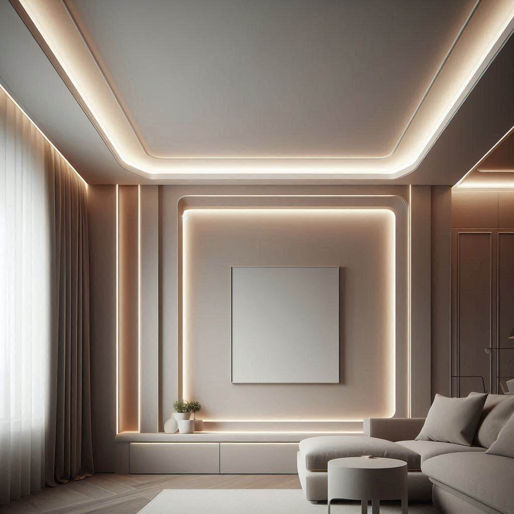
You walk into a room. It feels… off. Maybe it’s too sterile, like a hospital waiting area. Or perhaps it’s so dim and yellow that you feel like you’re squinting through old sunglasses. You can’t quite put your finger on why, but the vibe is wrong. Chances are, the problem isn’t the furniture or the paint color. It’s the light. Specifically, the light you aren’t supposed to see.
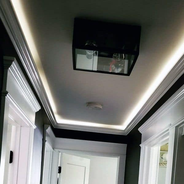
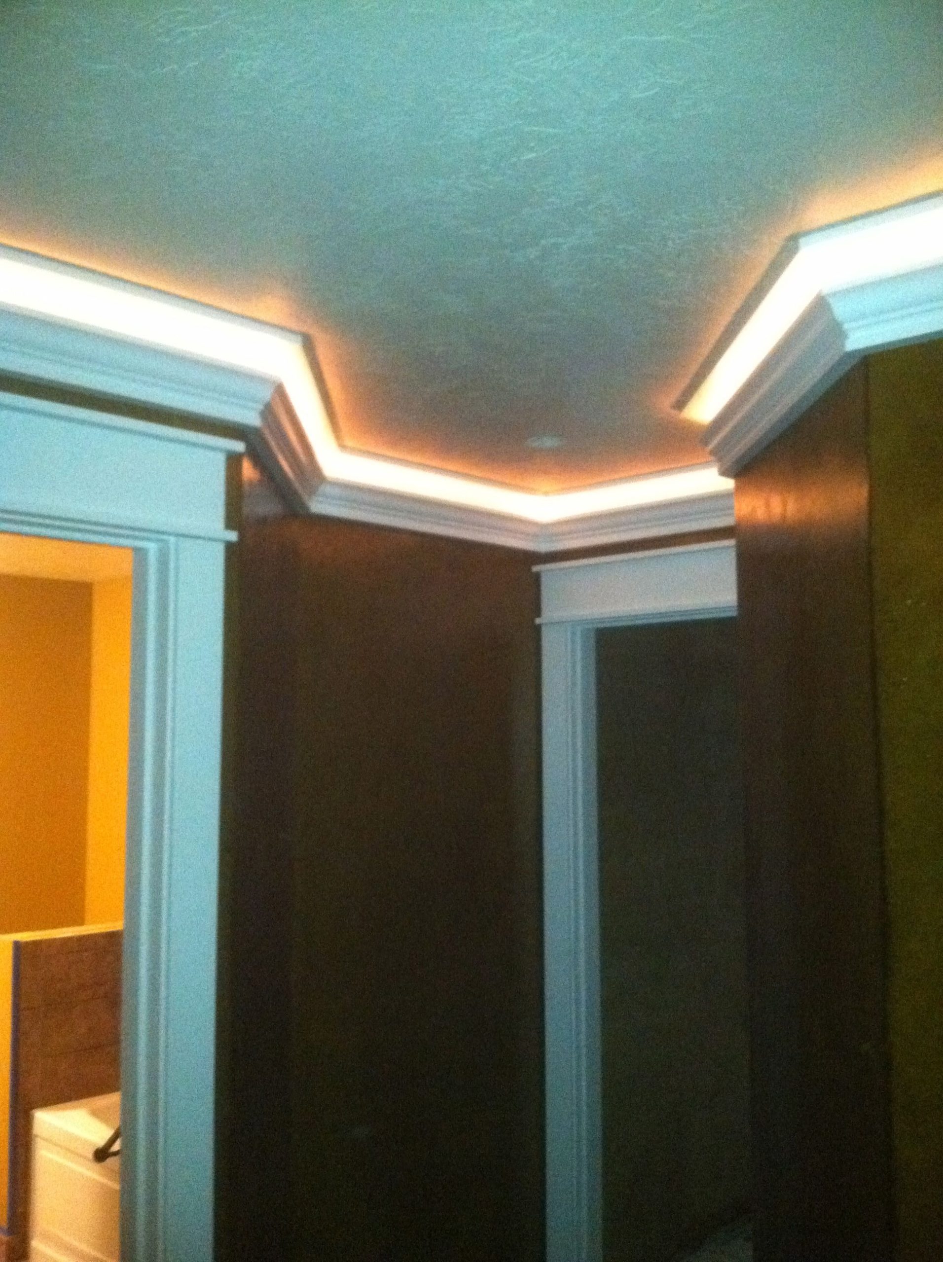
Cove lighting is the unsung hero of interior design. It’s the glow that washes up a wall, the soft halo around a ceiling perimeter, the subtle lift under a kitchen cabinet. Because the source is hidden, the effect relies entirely on the quality of the light itself. And the single most important variable in that equation? Color temperature. Get it right, and the space breathes. Get it wrong, and it feels flat, cold, or just plain weird.
In 2026, we aren’t just picking bulbs anymore. We’re crafting experiences. Designers know that the Kelvin scale isn’t just a technical spec sheet item; it’s an emotional dial. Whether you’re retrofitting a vintage home or specifying a high-tech office, understanding how warmth and coolness interact with architecture is the difference between a room that works and a room that wows. Let’s pull back the curtain on what the pros actually look for when they’re hiding the lights.
The Psychology of Warmth vs. Coolness
Let’s start with the basics, but let’s keep it real. When we talk about color temperature, we’re talking about Kelvin (K). Lower numbers mean warmer, yellower light. Higher numbers mean cooler, bluer light. It’s counterintuitive because we associate "warm" with fire (which is technically hot) and "cool" with ice, but in lighting, 2700K feels like a candlelit dinner, while 5000K feels like noon on a cloudy day.
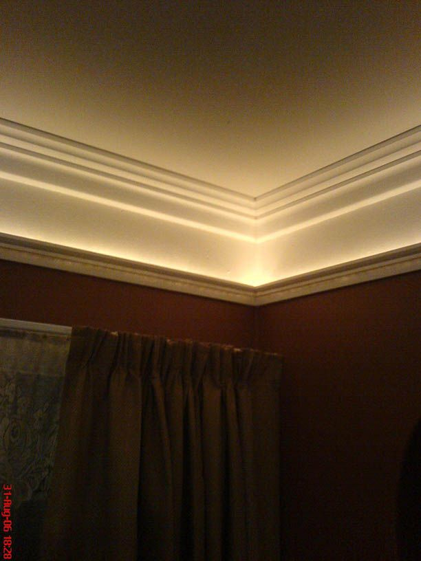
For residential spaces, the sweet spot has historically been 2700K to 3000K. Why? Because humans are wired to relax when the sun goes down. Warm light mimics the sunset. It signals to our brains that it’s time to wind down. If you install 4000K lights in your bedroom cove, you might find yourself staring at the ceiling, wide awake, wondering why you can’t sleep. It’s not just in your head; it’s biology. The blue spectrum in cooler light suppresses melatonin. So, for living rooms, bedrooms, and dining areas, stick to the warm end of the spectrum. It makes skin tones look healthier and wood finishes look richer.
But don’t write off the cooler temps entirely. In kitchens, bathrooms, and home offices, a slightly crisper 3500K to 4000K can be a game changer. It provides better contrast for tasks like chopping vegetables or applying makeup. The key is consistency. Nothing jars the senses more than walking from a warm, cozy living room into a kitchen that feels like an operating room. Transition gradually. If your living room is 2700K, maybe your kitchen island cove is 3000K, and your task lighting under the cabinets is 3500K. It’s a subtle shift, but it keeps the eye comfortable.
Context Is King: Matching Light to Function
One size definitely does not fit all. A designer’s first question isn’t "What looks cool?" It’s "What happens in this space?" In commercial architecture, this distinction is even sharper. Offices, retail stores, and healthcare facilities have different needs than a suburban living room. Recent guides from industry leaders like i2systems highlight that cove lighting in these settings isn’t just decorative; it’s a high-performance optical system.
In a corporate office, for example, you want alertness. You want focus. That’s where 4000K to 5000K comes into play. This cooler temperature promotes concentration and reduces eye strain during long hours of screen time. But here’s the catch: if you go too cool, say above 5000K, the space can feel harsh and uninviting. Employees might feel anxious or rushed. The goal is energetic, not aggressive. Many modern offices now use tunable white systems that shift from cooler temperatures in the morning to warmer ones in the late afternoon, aligning with the natural circadian rhythm. It’s a small tweak that can boost productivity and well-being.
Retail spaces are another beast entirely. Here, color temperature is about rendering products accurately. If you’re selling jewelry or high-end electronics, a crisp 4000K light can make metals sparkle and screens look vibrant. But if you’re selling baked goods or clothing, a warmer 3000K might make the items look more appetizing or inviting. Designers often mix temperatures here, using cooler cove lighting for general ambient illumination and warmer accents to highlight specific displays. It’s a balancing act, but when done right, it guides the customer’s eye exactly where you want it to go.
The Circadian Connection: Lighting for Health
By 2026, the conversation around lighting has shifted dramatically from aesthetics to health. We now know that light is a primary regulator of our internal body clock. This is where cove lighting shines—literally and figuratively. Because cove lights provide indirect, diffuse illumination, they are perfect for delivering ambient light without glare. This makes them ideal for circadian lighting strategies.
Tunable white technology has moved from a niche luxury to a standard expectation in high-end design. Systems like those mentioned in recent industry deep dives allow users to adjust the color temperature throughout the day. Imagine waking up to a soft, warm 2700K glow that gently simulates sunrise. As the day progresses, the cove lights slowly shift to a crisp 4000K, helping you stay alert and focused. Then, as evening approaches, they dial back down to 2700K or even lower, signaling to your body that it’s time to prepare for sleep.
This isn’t just sci-fi stuff; it’s accessible tech. For homeowners, this means investing in smart drivers and controllers that can automate these shifts. For designers, it means specifying fixtures that can handle the dynamic range without flickering or color shifting inconsistently. The benefit? Better sleep, improved mood, and reduced eye strain. It’s a holistic approach to design that considers the human inside the space, not just the objects within it. And since cove lighting covers large surface areas, it’s one of the most effective ways to deliver this uniform, health-focused light.
The Trap of Poor CRI and Metamerism
Here’s a secret that trips up even experienced DIYers: Color temperature isn’t the whole story. You can have the perfect 3000K light, but if the Color Rendering Index (CRI) is low, everything will look dull and washed out. CRI measures how accurately a light source reveals the true colors of objects compared to natural sunlight. A CRI of 80 is okay, but for cove lighting, where the light bounces off walls and ceilings before reaching your eyes, you want a CRI of 90 or higher.
Why does this matter for hidden lights? Because cove lighting is indirect. The light hits the wall, then reflects into the room. If the CRI is poor, that reflection loses fidelity. Your expensive beige sofa might look greenish. Your artwork might lose its depth. In 2026, high-CRI LEDs are standard for professional installations, but it’s still worth double-checking the specs. Look for R9 values specifically, which measure how well the light renders reds. Low R9 can make skin tones look sickly and wood finishes look flat.
Then there’s metamerism. This is a fancy word for when two colors look the same under one light source but different under another. If you’re mixing different brands of LED strips in the same cove, even if they’re both labeled "3000K," they might not match. One might have a pinkish tint, the other a greenish one. When these lights wash up a white wall, the discrepancy becomes obvious. It looks messy. Unprofessional. Always buy your strips from the same batch and manufacturer. If you’re integrating new lights with old ones, test them side-by-side first. Don’t assume "3000K" means identical.
Installation Nuances: The 150mm Rule and Beyond
You can pick the perfect color temperature, but if the installation is sloppy, the effect is ruined. Cove lighting is unforgiving. It highlights every imperfection in the drywall, every dust mote, and every uneven edge. This is where the "150mm rule" comes in handy. As noted in design guides, keeping cove dimensions around 150mm (about 6 inches) for depth and height ensures optimal light distribution and hides the source effectively.
But the distance from the wall matters too. If the LED strip is too close to the wall, you’ll get "scalloping"—those ugly hotspots of light that look like teeth marks on the ceiling. If it’s too far, the light won’t wash the wall evenly, leaving a dark gap at the top. Designers typically recommend starting the strip 6 to 12 inches away from the wall, depending on the ceiling height. The higher the ceiling, the further out the light needs to be to reach the wall properly.
Also, consider the finish of the surface you’re lighting. Matte paints absorb light and create a soft, even glow. Glossy or semi-gloss paints reflect light directly, which can create glare and highlight every bump and ripple in the plaster. For cove lighting, always specify a flat or matte finish for the ceiling and upper walls. It diffuses the light beautifully and hides the inevitable minor imperfections of construction. And don’t forget accessibility. You’ll need to change those strips eventually. Design the cove with a removable trim or access panel. Nobody wants to tear down a custom soffit just to replace a faulty driver.
Future-Proofing with Tunable and Smart Tech
The days of static, one-color cove lighting are numbered. While fixed-temperature LEDs are still common, the trend is firmly toward flexibility. Tunable white systems allow you to change the color temperature from warm to cool via an app or control panel. This is huge for multi-use spaces. A home office that doubles as a guest room? Set it to 4000K for work during the day, then switch to 2700K for a cozy reading nook at night.
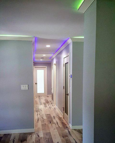
RGBW (Red, Green, Blue, White) strips are also gaining traction, but use them with caution. While they offer endless color options, the "white" channel in cheaper RGBW strips often has a lower CRI and a weird tint. For serious design, stick to dedicated tunable white systems that use high-quality phosphors to generate clean, adjustable whites. They’re more expensive upfront, but they last longer and perform better.
Integration is key. In 2026, lighting doesn’t exist in a vacuum. It talks to your thermostat, your blinds, and your security system. Imagine your cove lights warming up automatically as your smart blinds close at sunset. Or dimming to 10% when your movie starts. This level of automation requires planning. Run the right controls infrastructure during construction. Don’t try to retrofit smart controls into a dumb system later; it’s a headache. Work with a professional who understands protocols like DALI, Zigbee, or Matter. It ensures your lighting system remains compatible as technology evolves.
At the end of the day, cove lighting is about subtlety. It’s the art of illumination without visibility. When you get the color temperature right, you don’t notice the lights. You just notice that the room feels good. It feels inviting, functional, and alive. Whether you’re aiming for the cozy warmth of a 2700K living room or the crisp clarity of a 4000K kitchen, the choice sets the tone for everything else in the space.
Don’t be afraid to experiment, but do your homework. Test samples in the actual space at different times of day. Check the CRI. Mind the installation details. And remember that light is not just a utility; it’s a material. It shapes how we see, feel, and live. By treating color temperature with the respect it deserves, you turn a simple architectural detail into a powerful design tool. So, next time you’re planning a renovation or a new build, look up. The answer might just be hiding in the cove.