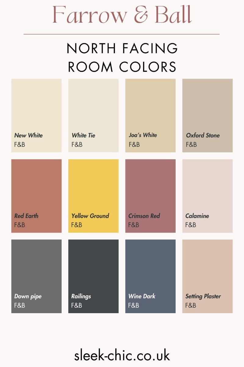
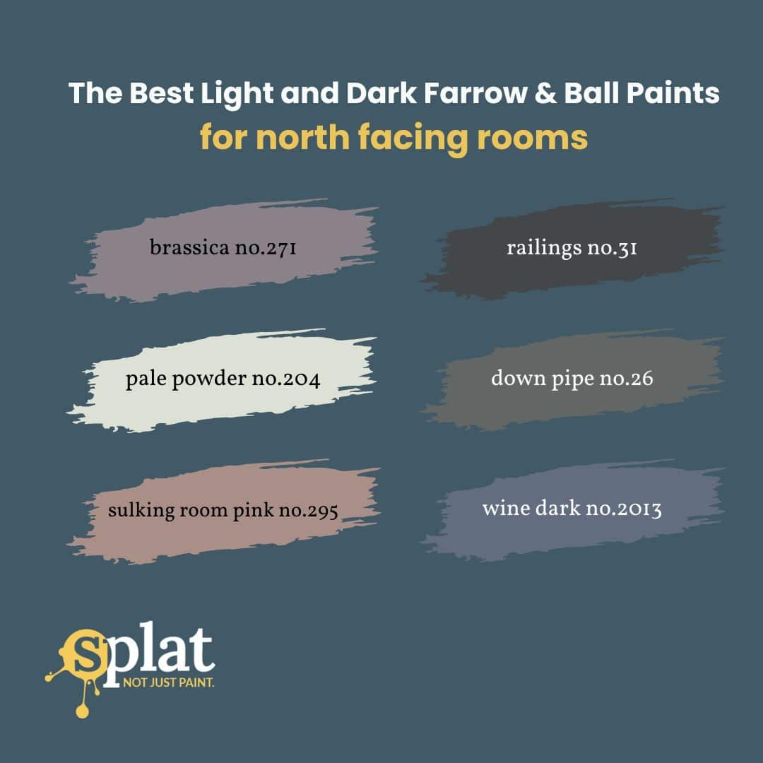
Ever walked into a room that just felt… cold? Not temperature-wise, necessarily, but vibe-wise. The walls looked grey, the shadows stretched long and blue, and no matter how many lamps you turned on, it felt like the sun had forgotten this corner of the house. If you’re nodding along, you’re probably dealing with north-facing light. It’s tricky stuff. In 2026, we are seeing a massive shift back toward embracing these spaces rather than fighting them, but the paint choice is still the make-or-break factor.
North light is notorious for bringing out the cool, blue undertones in everything it touches. A crisp, stark white that looks amazing in a sunny southern exposure can look like hospital scrubs in a north room. It’s harsh. Uninviting. But here is the good news: Farrow & Ball has mastered the art of the "warm white." These aren’t just whites; they are complex neutrals with hidden depths of yellow, red, or beige that act like a built-in heater for your eyes. Choosing the right one isn’t about picking the brightest shade. It’s about finding the one that holds its own against the gloom.
Let’s be real for a second. Painting a north-facing room is high stakes. You can’t just grab the first tube off the shelf. You need a color that understands the assignment. This guide breaks down exactly which shades are winning hearts (and walls) in 2026, why they work, and how to stop guessing and start loving your dimmest rooms.
Why North Light Plays Tricks on Your Eyes
To pick the right paint, you have to understand the enemy. Or rather, the light. North-facing rooms receive indirect sunlight. They don’t get those direct, warming rays that bounce around and brighten up a space. Instead, they get a consistent, cool, bluish ambient light. It’s steady, sure, but it lacks warmth. When this cool light hits a standard white paint, it strips away any warmth the paint might have had, leaving behind a flat, chilly surface.
In 2026, interior designers are talking less about "brightening" these rooms with artificial light and more about working with the natural quality of the shadow. The goal isn’t to make a north room look like a south room—that’s impossible and usually ends up looking fake. The goal is to make the north room feel cozy, intentional, and soft. This is where the chemistry of paint comes in. Farrow & Ball uses high-quality pigments that react differently to light than cheaper alternatives. Their whites have what experts call "undertones."
Think of undertones like the secret ingredient in a recipe. You might not taste the vanilla extract directly, but without it, the cake tastes flat. Similarly, a white paint might look white at first glance, but if it has a hint of yellow or red underneath, it will glow warmly when the blue north light hits it. It counteracts the chill. Without those warm undertones, the wall just reflects the blue sky back at you. It’s a simple concept, but getting the balance right is an art form. That’s why so many people in 2026 are turning to specific heritage shades that have stood the test of time.
The Heavy Hitter: Dimity No. 2003
If there is one color that keeps coming up in conversations about north-facing rooms this year, it’s Dimity. And for good reason. Dimity is often described as a "white," but let’s be honest—it’s barely white. It’s a very pale, warm neutral that sits comfortably between beige and grey. In a south-facing room, Dimity can look almost creamy or even slightly pinkish. But in a north-facing room? It shines. It takes that cool light and softens it, creating a backdrop that feels gentle and grounded.
Why does it work so well? Dimity has subtle red and yellow undertones. When the blue north light hits those warm notes, they don’t disappear; they mellow out. The result is a wall color that doesn’t fight the light but harmonizes with it. It stops the room from feeling sterile. In 2026, we are seeing a lot of people pair Dimity with darker wood tones and brass fixtures. The warmth of the metal and the wood pops against the soft neutrality of the paint, creating a layered, expensive look without trying too hard.
It’s also incredibly versatile. You can use it in a bedroom for a restful, cocoon-like feel, or in a living room where you want things to feel open but not cold. One thing to watch out for, though: lighting matters. If you have really poor artificial lighting in the evening, Dimity can sometimes look a bit muddy. But during the day? It’s magic. It’s the kind of color that makes you want to sit down and read a book. It’s quiet. Unpretentious. And it handles the north light better than almost any other "white" in the Farrow & Ball lineup.
The Clean Classic: James White No. 2010
Sometimes, you don’t want beige. You want white. Actual white. But you still need it to survive the north face. Enter James White. This is the go-to for people who love a crisp, clean aesthetic but are terrified of their walls turning blue. James White is a true white, but it’s not stark. It has a very subtle green-grey undertone that sounds weird on paper but works beautifully in practice. Wait, green? Yes. But it’s so faint that it mostly just serves to neutralize the purple or blue casts that north light can create.
In 2026, James White is having a moment in modern minimalist homes. It pairs exceptionally well with black accents, concrete floors, or sleek, modern furniture. It provides that gallery-wall feel without the clinical chill. Unlike Dimity, which hugs you, James White stands back and lets the room breathe. It’s airy. Light. But it doesn’t feel empty. The secret is in the depth. Farrow & Ball’s formulation gives it a richness that flat whites lack. It reflects light efficiently, which helps bounce whatever ambient light you have around the room.
However, a word of caution. James White is less forgiving than Dimity. If your north-facing room is extremely dark—like, no windows or small windows—you might find James White looks a bit too cool in the corners. It works best in north rooms that still get a decent amount of sky light. It’s also a fantastic choice for trim and ceilings in north-facing rooms. Painting your skirting boards and ceiling in James White while using a warmer color on the walls can create a lovely contrast that lifts the whole space. It’s crisp, clean, and surprisingly warm for such a bright shade.
The Structured Neutral: School House White No. 291
School House White is another contender that’s gaining serious traction in 2026. As the name suggests, it has a utilitarian, clean vibe. It’s often compared to James White, but it’s slightly warmer and has a bit more body to it. It’s a stone-white, if you will. In north-facing rooms, School House White acts as a stabilizer. It doesn’t try to be overly cheerful or artificially bright. Instead, it offers a sense of calm structure. It’s perfect for rooms where you want to highlight architectural details, like moldings or fireplaces.
The reason it works in the north is its balance. It has enough warmth to avoid looking icy, but it’s neutral enough not to look yellow or dated. It’s a chameleon. In the morning, it might look cool and fresh. By afternoon, as the light shifts (even in a north room, the quality of light changes), it warms up slightly. This dynamic quality keeps the room feeling alive. Designers are loving it for hallways and entryways that face north. These are transitional spaces that need to feel welcoming but not overwhelming. School House White delivers that welcome mat vibe without shouting.
Pairing is key here. School House White loves texture. Think linen curtains, wool rugs, and natural stone. Because the color itself is quite restrained, it allows textures to take center stage. In a north-facing room, where visual interest can sometimes fall flat due to low contrast, adding texture against a School House White background creates depth. It’s a sophisticated choice for those who find Dimity too beige and James White too stark. It’s the Goldilocks of north-facing whites. Just right.
The Soft Embrace: Pointing No. 2004
Let’s talk about Pointing. If Dimity is a whisper, Pointing is a soft sigh. It’s a very pale grey with warm undertones, often categorized as a white by those who want a bit more definition than a pure white offers. In 2026, Pointing is being hailed as the ultimate "moody but bright" option for north rooms. It’s darker than the others we’ve mentioned, which might sound counterintuitive for a dark room. But hear me out. Sometimes, going slightly darker absorbs the harshness of the cool light and creates a cozy, enveloping atmosphere.
Pointing has a distinct earthy quality. It hints at stone and clay. In a north-facing room, this earthiness grounds the space. It prevents the room from feeling like it’s floating in a void of blue light. Instead, the walls feel solid and reassuring. It’s particularly effective in bedrooms or studies where you want a sense of retreat. The warmth in Pointing comes from its red-brown undertones, which are subtle but powerful against the north light. They glow softly, adding a layer of richness that pure whites can’t achieve.
Of course, this isn’t for everyone. If you’re looking for maximum brightness, Pointing might feel too heavy. But if you’re tired of fighting the darkness and want to lean into the coziness, it’s a winner. It pairs beautifully with deep greens, navy blues, or even charcoal. In 2026, we’re seeing a lot of monochromatic schemes using Pointing on walls and a slightly darker shade on trim. It creates a seamless, tailored look that feels very current. It’s brave, but it pays off. The room feels curated, not just painted.
Practical Tips for Testing in 2026
Okay, so you’ve got some names. Now what? Don’t just buy a gallon and hope for the best. That’s a recipe for disaster. The first rule of painting north-facing rooms is: sample, sample, sample. But not just any sample. In 2026, Farrow & Ball offers large adhesive samples that you can stick directly on the wall. Use them. Paint a small patch if you must, but the large samples are less messy and easier to move around. Place them on different walls. See how they look in the morning, at noon, and at night.
Lighting changes everything. A color that looks perfect at 10 AM might look terrible at 8 PM. North light is most consistent during the day, but artificial light at night will change the game completely. Make sure you test your whites under the bulbs you actually use. Warm white bulbs (2700K-3000K) will enhance the warm undertones of paints like Dimity and Pointing. Cool white bulbs (4000K+) will kill that warmth and make even the warmest white look blue. Stick to warm bulbs. It’s non-negotiable for north rooms.
Also, look at the sheen. Farrow & Ball’s Estate Emulsion is popular for its matte, chalky finish, which is beautiful but can absorb light. In a dark north room, consider using Modern Emulsion, which has a slight sheen and is more durable. That tiny bit of reflectivity can help bounce light around the room. Don’t forget the ceiling. Painting the ceiling in the same white as the walls (or a slightly lighter version like James White) can help lift the lid off the room. Avoid stark white ceilings if your walls are warm; it creates a harsh line. Keep it cohesive.
Choosing the right white is personal. It’s about how you want to feel in the space. Do you want energy and airiness? Go for James White or School House White. Do you want comfort and softness? Dimity is your friend. Do you want depth and mood? Try Pointing. There is no single "best" color, only the best color for your room and your life. In 2026, the trend is toward authenticity. We aren’t trying to trick the eye anymore. We are choosing colors that honor the light we have.
Take your time with this. Live with the samples for a few days. Notice how the room feels when you walk in. Does it feel cold? Does it feel inviting? Trust your gut. The data and the trends are helpful, but your reaction is the most important metric. If a color makes you smile, it’s the right one. If it makes you shiver, keep looking. North-facing rooms can be some of the most beautiful spaces in a home, provided you treat them with respect and the right palette.
Remember, paint is relatively cheap to fix if you get it wrong. Living with a color you hate is expensive in terms of happiness. So, invest the time upfront. Talk to the staff at your local decorator’s merchant. They see these colors every day and can offer local insights. Maybe the north light in your area is slightly different than elsewhere. Local knowledge is gold. And don’t be afraid to break the rules. If you love a cool white, use it. Just know what you’re signing up for.
At the end of the day, your home should be a refuge. North-facing rooms offer a unique, quiet quality of light that can be incredibly peaceful. With the right Farrow & Ball white, you can transform that potential chill into a serene, sophisticated sanctuary. Whether it’s the gentle hug of Dimity or the crisp clarity of James White, there’s a shade out there that’s waiting to turn your cold room into your favorite spot. Happy painting. And dont forget to wipe your brush properly.