You know that moment. You’re standing in the hardware store, holding a tiny chip of paper that promises "Soft Warm White." It looks perfect. Creamy. Inviting. Like a hug in color form. You buy three gallons, spend a Saturday painting, and step back to admire your work. But wait. Why does your living room look like it’s been dipped in strawberry milk? Or worse, why does it feel sterile, like a dentist’s office waiting room?
You aren’t losing your mind. And you certainly aren’t bad at decorating. The culprit is almost always the same sneaky little thing: undertones. Specifically, the temperature of those undertones. It’s the silent saboteur of home design. In 2026, we have more color options than ever before, which ironically makes choosing the right one harder. But here is the good news. You don’t need a degree in color theory to fix this. You just need to stop guessing and start testing.
The difference between a room that feels "off" and one that feels "home" often comes down to a single degree of warmth or coolness. It’s subtle, but our eyes pick up on it instantly. When the undertone clashes with your light, your furniture, or your flooring, the whole room vibrates in a way that makes you uneasy. Let’s break down exactly how to spot these temperatures and use a simple test to get it right every single time. No more wasted paint. No more regret.
The Hidden Language of Undertones
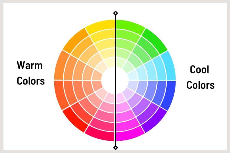
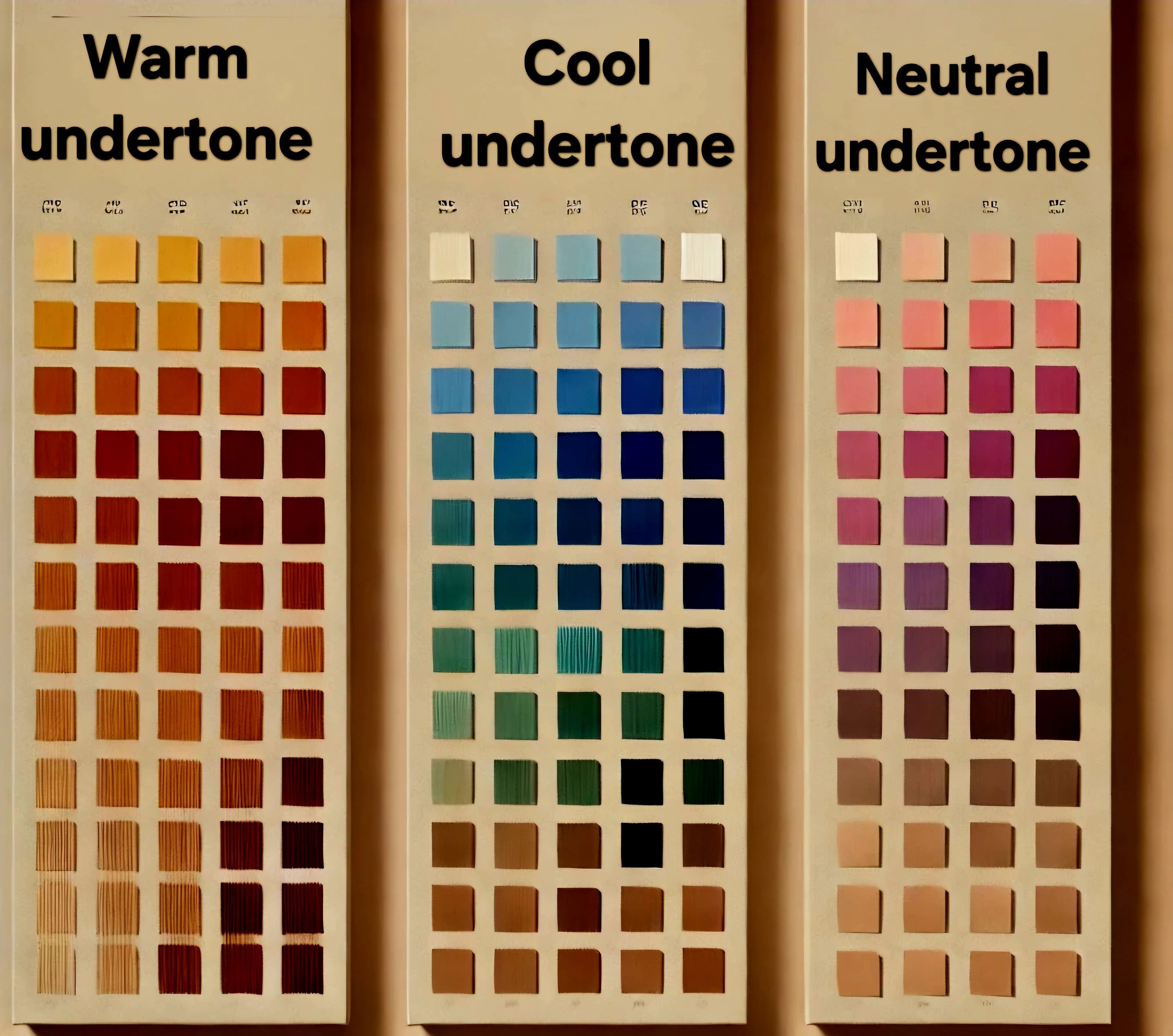
So, what actually is an undertone? Think of paint color like a person wearing sunglasses. The main color is the face you see first—blue, beige, gray. But the undertone is the tint of the lenses. It changes how everything else looks. A "gray" paint isn’t just gray. It’s gray with a hint of blue (cool), a hint of green (cool), or a hint of purple (which can go either way, but usually leans cool). A "beige" isn’t just beige. It’s beige with yellow (warm), pink (warm), or orange (warm).
This is where the betrayal happens. You pick a gray because you want a modern, crisp look. But if that gray has a tiny bit of green in it, and you put it next to a red brick fireplace, things get muddy. Fast. The green and red fight each other. The result is a wall that looks dirty, not chic. Understanding that every color has a temperature is the first step to stopping the guesswork. It’s not about the color itself; it’s about what’s hiding underneath it.
In recent years, designers have moved away from the stark, pure whites of the early 2010s. We crave depth now. But depth means complexity, and complexity means undertones are playing a bigger role. If you ignore them, they will ignore your vision. You have to acknowledge that a "white" white doesn’t really exist in nature. Everything leans somewhere. Once you accept that, you stop fighting the paint and start working with it. It’s a shift in mindset that saves hours of frustration.
The Paper Test: Your New Best Friend
Here is the simplest, most effective trick in the book. It’s called the Paper Test, and it requires nothing more than a sheet of standard printer paper. Yep, the bright, bleached white stuff you use for invoices or school projects. This paper is your control group. It is neutrally white (mostly). When you hold a paint swatch next to it, the truth comes out.
Grab your top two or three paint contenders. Hold the bright white paper directly against the swatch. Look closely. Does the paint swatch look yellow or creamy compared to the paper? If so, it’s warm. Does it look blue, gray, or slightly purple compared to the paper? Then it’s cool. It’s that simple. Your eye needs a reference point to detect the subtle shifts. Without the bright white paper, your brain tries to normalize the color, making it hard to see the bias.
Try this with grays especially. Gray is the chameleon of the paint world. Put a swatch of "Agreeable Gray" or similar popular neutral next to the white paper. You might be shocked to see it lean slightly green or beige. Now try a "Repose Gray." It might pop as distinctly blue or violet. This visual comparison strips away the marketing names and shows you the raw temperature. It takes five seconds, and it prevents the "strawberry milk" disaster before you even open a can.
Lighting Is the Lie Detector
You can pick the perfect warm or cool tone, but if your lighting is wrong, the color will still fail. Light has temperature too. Natural sunlight changes throughout the day. Morning light is cooler and bluer. Late afternoon light is warmer and golden. Artificial light? That’s a whole other beast. LED bulbs come in "daylight" (cool/blue), "soft white" (warm/yellow), and everything in between.
If you have a north-facing room, you get consistent, cool, indirect light all day. If you paint that room a cool gray, it will feel icy and uninviting. You need a warm undertone to balance the cool light. Conversely, a south-facing room gets blasted with warm, yellow sunlight. If you paint it a warm beige, it might look overly orange or muddy by noon. A cool undertone can help crisp it up. This is why the same paint color looks amazing in your friend’s house but terrible in yours. The light is different.
In 2026, smart lighting is everywhere, which adds another layer. You can change your bulb temperature with an app. This is actually a huge advantage. Test your paint samples under different lighting settings. Turn your lights to "daylight" mode. Then switch to "warm" mode. Watch how the paint shifts. If a color looks great in warm light but turns neon blue in daylight, you know it’s too cool for your space. Use your lighting as a tool to reveal the color’s true nature, not just as a way to see in the dark.
Fixed Elements Anchor Your Choice
Paint doesn’t exist in a vacuum. It lives next to your floor, your cabinets, your countertops, and your sofa. These are your fixed elements. You probably aren’t ripping out your oak floors or replacing your granite counters just to match a new wall color. So, the paint has to play nice with what’s already there. This is where the warm vs. cool test gets practical.
Look at your flooring. Is it a warm honey oak? A cool ash wood? A red-toned cherry? If your floors are warm, you generally want to either complement them with warm walls or create a deliberate contrast with cool walls. But be careful. A cool gray on warm orange-y floors can make the floors look more orange, sometimes in an unpleasant way. It amplifies the undertone of the wood. If you don’t love the orange punch of your floors, a warm beige wall might blend too much, making the room look flat.
Countertops and backsplashes matter too. Marble often has cool gray veining. Granite might have specks of black, gold, or red. Hold your paint swatches against these surfaces. Do they clash? Do they disappear? You want harmony. If your countertop has cool blue veins, a warm peachy wall might create a visual vibration that hurts your eyes. Stick to cools or neutrals that respect the stone. The goal is for the eye to travel smoothly around the room, not get stuck on a jarring transition between wall and floor.
The Three-Swatch Rule for Real Life
Never, ever rely on a tiny chip from the store. Those chips are misleading. They are too small to show how light hits the surface, and they are printed on glossy paper, which reflects light differently than matte or eggshell paint on drywall. To truly stop guessing, you need to see the color in your actual space, at a large scale. This is where the Three-Swatch Rule comes in.
Pick your top choice, plus one shade warmer and one shade cooler. Buy sample pots (or large peel-and-stick samples, which are huge in 2026 for their convenience). Paint large squares—at least 12×12 inches—on different walls in the room. One near a window, one in a darker corner, one next to your fixed elements. Live with them for at least 48 hours. Watch them in the morning, at noon, and at night with your lamps on.
You will likely find that your "perfect" choice looks weird in the evening, while the "too cool" option looks just right when the sun goes down. This real-world data is invaluable. It removes the abstraction of the store aisle and grounds the decision in your daily life. Don’t rush this part. The cost of a few sample pots is tiny compared to the cost of repainting an entire room because you guessed wrong. Patience pays off in pigment.
After you’ve done the paper test, checked the lighting, analyzed the floors, and lived with the samples, you might still feel torn. This is normal. Color is emotional. Sometimes, the "correct" choice based on theory doesn’t feel right in your heart. That’s okay. Design rules are guidelines, not laws. If a cool gray makes you feel calm and focused, and that’s what you need in your home office, then it’s the right color, even if the room faces north.
However, make sure your gut feeling isn’t just resistance to change. We often cling to what we know. If you’ve had beige walls for ten years, a crisp cool white might feel "cold" initially just because it’s different. Give yourself time to adjust. But if a color consistently makes you feel anxious or uneasy, listen to that. Your home should be a sanctuary. The technical side—warm vs. cool—is there to serve your comfort, not to dictate it.
In the end, the best test is how you feel when you walk into the room. Does it breathe? Does it feel cohesive? If you’ve followed the steps above, you’ve eliminated the major technical errors. What’s left is personal preference. And that’s the fun part. You’ve stopped guessing. You’ve started knowing. That confidence changes everything. It turns a stressful chore into a creative act. And honestly, isn’t that what home decorating should be?
So, take a breath. Grab that sheet of printer paper. Look at your swatches with fresh eyes. You’ve got this. The mystery of the undertone is solved. Now go make your space beautiful, on your terms. No more strawberry milk walls. Just the perfect shade of you.