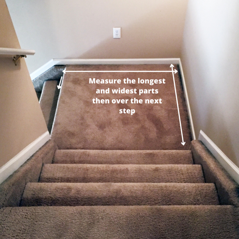
You know that awkward little pause when you’re walking up the stairs? That flat bit of floor where you catch your breath before tackling the next flight. For years, we’ve treated it like a no-man’s-land. A blank void. Or worse, a dumping ground for laundry baskets and shoes we forgot to put away. It’s strange, really. We spend hours curating our living rooms and perfecting our bedroom aesthetics, yet this transitional space gets ignored. It’s just "there." But what if it wasn’t? What if that small square footage could actually be the coolest part of your home?
It’s easy to feel stuck. You want it to look nice, sure. But you also don’t want to trip over a vase every time you’re rushing to answer the door. The balance between "styled" and "cluttered" is thin. Especially in 2026, where homes are getting smarter but often smaller, every inch counts. We aren’t just decorating for looks anymore; we are decorating for flow. For sanity. The secret isn’t adding more stuff. It’s about choosing the right stuff. And knowing when to stop. Let’s talk about how to turn that forgotten landing into a moment of delight, without turning it into an obstacle course.
The Golden Rule of Vertical Space
When floor space is tight—and let’s be honest, most landings are barely big enough to turn around in—you have to look up. Literally. The biggest mistake people make is trying to furnish a landing like it’s a mini living room. They drag up a chair, a side table, maybe a rug. Suddenly, you can’t walk through. The solution? Get off the floor. Vertical styling is your best friend here. It draws the eye upward, making the space feel larger and airier, while keeping the walking path clear.
Think about built-in shelving or floating ledges. These are game-changers. According to recent design trends from sources like Design Swan and Home Briefings, using vertical space for storage or display is the number one way to maximize style without the bulk. You can install slim floating shelves to hold a few cherished books, a small plant, or a piece of sculptural art. Because they don’t touch the ground, they don’t visually "weigh down" the area. It feels light. Intentional. If you have the budget for custom work, built-in bookshelves that wrap around the corner of the landing can turn a dead zone into a tiny library nook. It’s functional, but it doesn’t steal your walking room.
But be careful. Just because you can fill every shelf doesn’t mean you should. This is where the clutter creeps back in. Stick to a rule of thirds. Fill one-third of the shelf space, leave two-thirds empty. This negative space is crucial. It lets the eye rest. If you crowd those floating shelves with knick-knacks, you’ve just moved the clutter from the floor to the wall. Keep it sparse. Maybe one large ceramic bowl, a single framed print leaning against the wall, and a trailing pothos plant. That’s it. Simple. Clean. Effective.
Function Meets Form: Smart Storage Solutions
Let’s get real for a second. Sometimes, you actually need the landing to do some heavy lifting. Maybe you live in a two-story house with zero entryway closet. Or maybe you’re tired of carrying laundry up and down because there’s nowhere to stage it. In these cases, styling has to include function. But "storage" doesn’t have to mean ugly plastic bins. In fact, 2026 is all about seamless integration. The goal is storage that looks like decor.
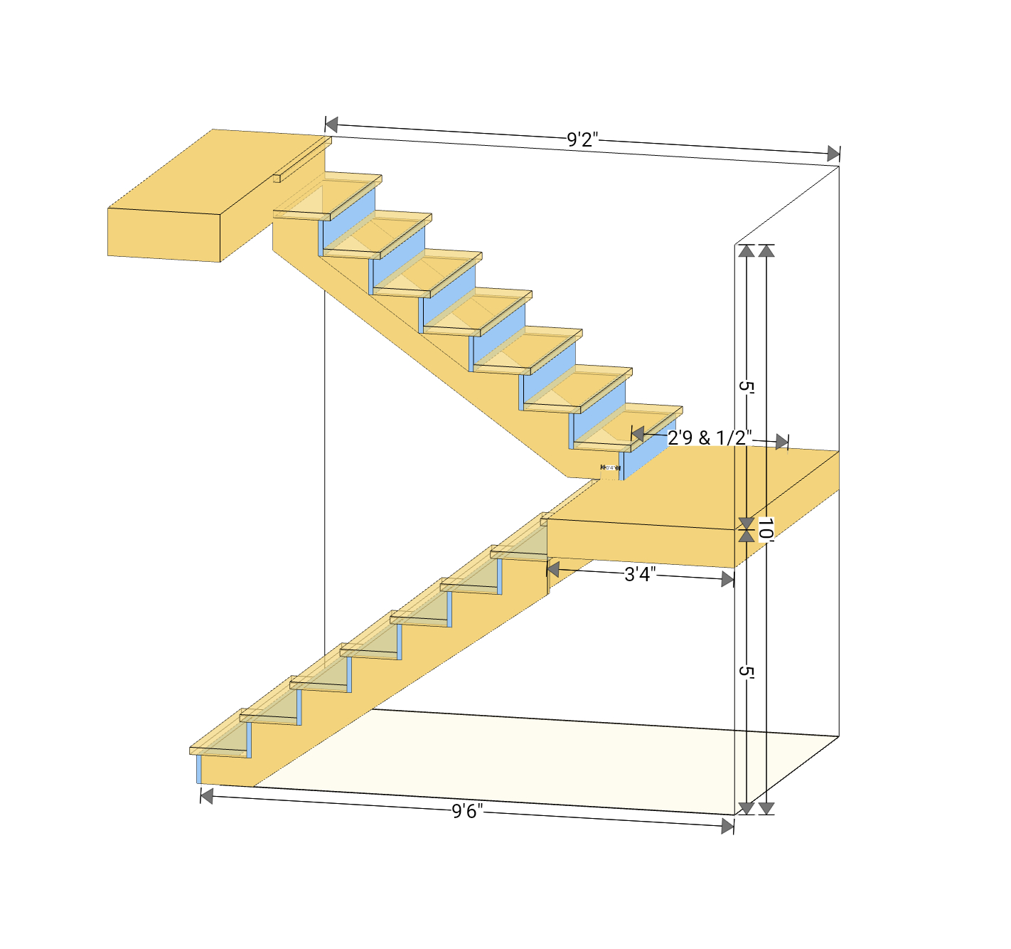
Consider a sleek storage bench. If your landing is wide enough (usually at least 36 to 48 inches deep), a narrow bench with hidden compartments can be a lifesaver. You can sit on it to tie your shoes, and stash blankets or shoes inside. The key here is proportion. Don’t buy a bulky, overstuffed ottoman. Look for something with clean lines and legs. Legs are important! Seeing the floor continue underneath a piece of furniture makes the space feel bigger. It’s a classic designer trick. Apartment Therapy recently highlighted how lifting furniture off the ground changes the entire feel of a small transition space. It reduces visual weight.
If a bench is too much, think about vertical cabinets or tall, narrow cupboards. These use the same footprint as a small plant stand but offer way more utility. You can hide away vacuum cleaners, ironing boards, or extra linens. The trick to avoiding the "closet" vibe is the finish. Match the cabinet color to your wall color. When the storage blends into the background, it disappears. It becomes part of the architecture rather than a piece of furniture sitting in the middle of the room. This is subtle, but powerful. It keeps the space feeling open, even when it’s packed with useful stuff. Just remember to keep the top of the cabinet clear. No piling up mail or keys. That’s how the slide into chaos starts.
The Power of the Gallery Wall
If you’re hesitant to add any furniture at all, or if your landing is truly tiny (we’re talking 3×3 feet tiny), then walls are your canvas. A gallery wall is perhaps the most popular way to style a landing for good reason. It adds personality, color, and interest without taking up a single inch of floor space. But here’s the thing: a bad gallery wall can feel chaotic. A good one feels curated. The difference lies in cohesion.
Don’t just hammer nails randomly. Plan it out. Lay your frames on the floor first. Mix sizes, but keep a common thread. Maybe all black frames. Or all black-and-white photos. Or all botanical prints. Consistency creates calm. Southern Living designers often suggest using the staircase itself as part of the composition. As you walk up, the art should guide your eye. You might start with larger pieces at the bottom and move to smaller ones as you ascend, or vice versa. It creates a sense of movement. It makes the climb feel less like a chore and more like a journey through a mini museum.
Lighting plays a huge role here, too. A dark gallery wall feels heavy. Add a small, battery-operated picture light or a sconce if you have wiring. The glow highlights the art and makes the landing feel warm and inviting, especially at night. It’s a small detail that makes a big impact. And please, avoid the temptation to fill every inch of the wall. Leave some breathing room around the edges. If the art goes all the way to the ceiling and the floor, it can feel suffocating. Frame the space, don’t choke it. Also, make sure the glass is secure. You don’t want a frame slipping and shattering when someone brushes past it. Safety first, always.
Mirrors: The Illusion of Space
Sometimes, the problem isn’t that the landing is ugly. It’s that it feels cramped. Dark. Closed in. This is common in older homes or interior staircases without windows. Enter the mirror. It’s the oldest trick in the book, but it works for a reason. A well-placed mirror can double the visual space. It bounces light around. It makes a narrow landing feel twice as wide. But you have to choose the right mirror.
Avoid small, scattered mirrors. They look cluttered. Go for one statement piece. A large round mirror softens the hard angles of the stairs and walls. A tall, arched mirror adds elegance and height. Position it opposite a window if possible, to capture natural light. If there’s no window, position it to reflect a nice view from another part of the house, or a beautiful light fixture. The reflection becomes part of the decor. It’s dynamic. It changes throughout the day as the light shifts.
In 2026, we’re seeing a trend toward antique or distressed mirrors. They add character and warmth, preventing the space from feeling too sterile or modern. A gold-leaf frame can add a touch of glamour without being overpowering. Just be mindful of placement. You don’t want to create a funhouse effect where people see themselves distorted as they walk by. And definitely avoid placing mirrors at head-height if the landing is narrow. You don’t want anyone accidentally elbowing the glass. Hang it slightly higher, or choose a shape that tucks safely against the wall. It’s about enhancing the space, not creating hazards.
Bringing Life Indoors: Plants and Organic Elements
Staircases can feel rigid. Straight lines. Hard wood. Cold metal railings. Adding plants introduces softness. Life. It breaks up the monotony. A single, striking plant can transform a sterile landing into a welcoming spot. But again, scale is everything. A massive fiddle leaf fig might look great in a showroom, but on a small landing, it’s a tripping hazard. It blocks the path. It collects dust.
Opt for vertical greenery. A hanging pothos or philodendron cascading from a high shelf adds lushness without using floor space. It draws the eye up. It feels airy. If you prefer floor plants, choose something tall and narrow, like a snake plant or a slender olive tree. Keep it in a lightweight pot. Heavy ceramic pots are dangerous if knocked over. Consider wall-mounted planters or a small hanging rack. These keep the greenery off the ground entirely.
Light is the other factor. Most interior landings are dark. Be realistic about what will survive. If there’s no natural light, don’t torture a real plant. Use a high-quality faux plant. Seriously. The technology in 2026 is incredible. You can get silk plants that look indistinguishable from the real thing. No watering. No dropping leaves. No guilt. Or, rotate a real plant in from a sunnier spot every week. Give it a vacation. The goal is to add texture and color, not to become a full-time gardener. A touch of green, even if it’s fake, softens the hard edges of the architecture. It makes the space feel cared for. Alive.
We often forget that landings are transitional zones. We move through them quickly. But good lighting slows us down. It makes us notice the space. More importantly, it keeps us safe. Tripping on stairs is no joke. A dimly lit landing is a recipe for disaster. But overhead lights can be harsh. They create shadows. They feel clinical. The secret is layered, ambient lighting.
Sconces are perfect for landings. They take up zero floor or table space. They provide soft, eye-level light. Choose fixtures that direct light upward and downward, washing the wall with a gentle glow. This highlights any art or texture on the walls without glaring in your eyes. If you can’t install wired sconces, use plug-in versions. Hide the cord behind furniture or use a cord cover painted to match the wall. It’s a small effort for a huge payoff.
Table lamps are another option, but only if you have a console table or shelf. Choose a lamp with a slim base. Avoid big, bulky shades. The light should be warm—around 2700K to 3000K. Cool white light feels like a hospital. Warm light feels like home. In 2026, smart bulbs are standard. Program your landing lights to dim in the evening. It creates a cozy atmosphere as you head up to bed. It signals a transition from the busy day to rest. It’s a subtle psychological cue. And never, ever rely on a single bare bulb. It’s uninviting. It casts weird shadows. Layer your light. Soften the corners. Make the space feel safe and serene.
So, where does this leave us? Styling a staircase landing isn’t about filling it up. It’s about editing. It’s about choosing one or two strong elements—a mirror, a shelf, a plant—and letting them shine. It’s about respecting the flow of movement. Keeping the path clear. Making sure every item has a purpose, whether that purpose is beauty, function, or both. When you stop seeing the landing as wasted space and start seeing it as a pause button, the possibilities open up.
Don’t rush it. Try one thing. See how it feels. Walk up and down the stairs a few times. Does it feel cramped? Does it feel better? Adjust. Remove something if needed. Less is almost always more in these tight spots. The goal is a space that feels intentional, not accidental. A space that makes you smile as you pass through, rather than one you ignore or stumble over. You’ve got this. Your landing is waiting to be discovered.